
NEW
Font size
 Worksheets
Introduction to Graphic Design Components (#1)
Total questions: 12
Worksheet time: 6mins
The representation of objects such as symbols, photographs, or illustration is known as ______.
Imagery
Typography
Colour
Layout
The hue perceived by the eye such as value and saturation is known as ______.
Imagery
Typography
Colour
Layout
The style and appearance of text is known as ______.
Imagery
Typography
Colour
Layout
The placement or arrangement of design elements is known as ______.
Imagery
Typography
Colour
Layout

You are making a poster for a Haunted House. Which font in the picture would be the BEST for that?
Casual
Neutral
Exotic
Graphic
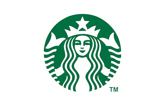
Imagery is a representation of objects. We are surrounded by Imagery in our everyday life. The image is a popular logo that most people are familiar with. What businesses logo is this?
Tim Hortons
Starbucks
Second Cup
The Red Brick
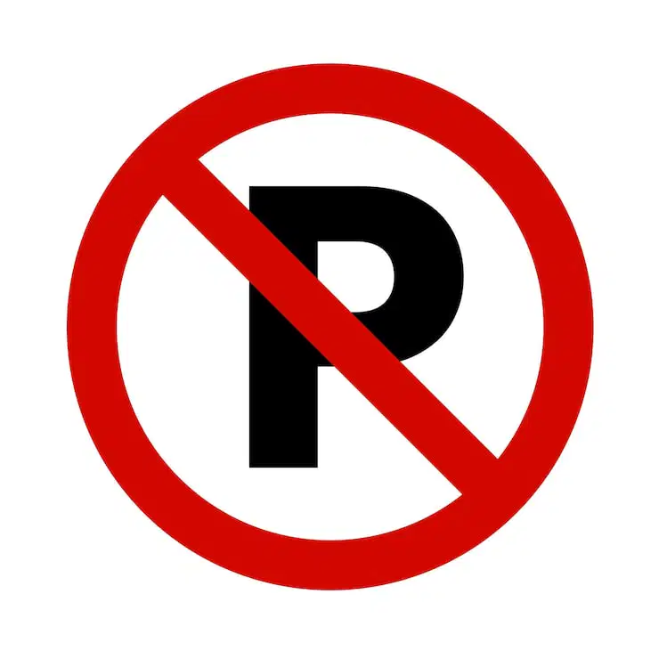
Imagery is a representation of objects. We are surrounded by Imagery in our everyday life. The image is a road sign that most people are familiar with. What is the meaning of this sign?
No Parking
Stop
Yield
No Entry
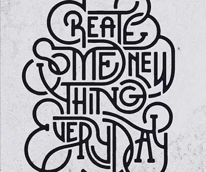
Typography is the style and appearance of texts. We are surrounded by Typography in our everyday life. This image uses text that overlaps with each other. What is the message of this image?
Create Some New Thing EveryDay
Create New Day Some Thing Every
Create Something New Everyday
Create SomeThing Every New Day
Colour is the hue perceived by the eye. Colour is around us in our everyday lives and we might not think about the colours we select, but graphic designs do. For example, Coca-Cola uses the colour ___ for their branding. This colour can be associated with bold, passion, excitement, and power.
Red
Purple
Yellow
Green
Colour is the hue perceived by the eye. Colour is around us in our everyday lives and we might not think about the colours we select, but graphic designs do. For example, Ford uses the colour ___ for their branding. This colour can be associated with responsibly, trust, peace, and order.
Red
Navy
Yellow
Green
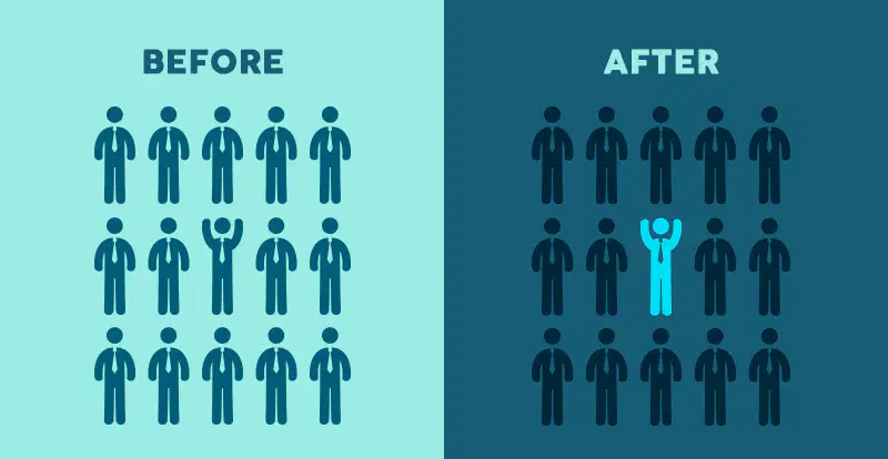
Colour is the hue perceived by the eye. Colour is around us in our everyday lives and we might not think about the colours we select, but graphic designs do. If you look at this image, which design draws more attention to the person who is different?
"Before"
"After"

Layout is the placement or arrangements of design elements. If you look at this image, which design uses alignment that directs the eye better?
"Before"
"After"

