
 Worksheets
Introduction to Graphs
Total questions: 99
Worksheet time: 50mins
Which statement best describes a bar graph?
Lines connect points over time
Slices of a circle show parts
Vertical or horizontal bars show quantities
Small pictures stand for numbers
What does a line graph mainly show?
Trends over time using connected points
Parts of a whole using circle slices
Groups of data using equal bars
Pictures that count items quickly
Which graph is most useful for showing parts of a whole?
Bar graph
Line graph
Pie chart
Histogram
In a pictogram, what represents the quantities?
Numbers only
Symbols or pictures
Thin line segments
Shaded circle slices
How is a histogram different from a regular bar graph?
It uses grouped data in bins
It shows single measurements
It compares favorite items
It uses circle slices instead

Which part of a graph explains what the graph shows?
Title
Labels
Scales
Legend
What does the x-axis usually represent on a simple bar graph like the fruit chart?
Numbers or measurements
Categories or groups
Trends over months
Parts of a whole
Which statements are true about good graph scales?
Intervals should be consistent
Numbers must be clear to read
Scales can change randomly
Zero is never included
Match each graph type to what it is best used for.
Bar graph: comparing quantities
Line graph: showing proportions
Pie chart: showing trends
Pictogram: measuring distances
Look at a simple bar graph. Which part shows the different things being compared, like apples, bananas, and grapes?
X-axis at the bottom
Y-axis on the side
Graph title at the top
Bars in the middle
In a bar graph, what does the Y-axis usually show when counting students’ favorite fruits?
Number of students
Types of fruits
Color of bars
Date of survey
Which sentence best explains the purpose of the graph title?
It tells what the whole graph is about
It decides the color of the bars
It measures the height of the bars
It labels every single bar
Choose all the items that are labels on a bar graph.
Apples, Bananas, Grapes on the X-axis
Number marks 0 to 6 on the Y-axis
The word ‘Title’ above the graph
Paragraph explaining how to read
Why are scales important on the Y-axis of a bar graph?
They show equal steps for fair comparison
They make the bars look colorful
They hide numbers to avoid confusion
They change the types of categories
Which statement is true about bars in a bar graph?
Bars represent the data for each category
Bars are only decorations around the graph
Bars replace the axes and the title
Bars change categories into numbers by themselves
Look at a pie chart showing pets: Dogs slice is biggest with 6, Cats slice shows 3, Fish slice shows 1. Which pet is the least owned?
Dogs are least owned
Cats are least owned
Fish are least owned
All pets are equal
A pie chart divides a circle into slices for each category. What does a bigger slice mean?
Smaller proportion of data
Larger proportion of data
Equal share of all data
No data for that slice
Which statement best explains why a pie chart helps with pet data showing Dogs=6, Cats=3, Fish=1?
It shows exact ages of pets
It shows proportions clearly
It shows pet names list
It shows bar heights only
Select all features that help make any graph clear and easy to read.
Title for the graph
Axes and their labels
Random colors only
A sensible scale
Why is choosing the right type of graph important when showing data?
It makes data harder to see
It helps show data clearly
It removes the need for labels
It hides mistakes in data
Which is a good reason to use a graph when sharing data with your class?
It makes numbers easy to understand quickly
It hides information so others cannot see
It always uses more words than pictures
It makes small data look more complicated
Which choices show how graphs help you learn? Select all that apply.
They highlight trends and patterns clearly
They allow quick comparisons between groups
They confuse simple facts with extra details
They summarise large amounts of data visually
You want to compare favourite fruits of four classes. Which graph purpose fits this task best?
Showing comparisons between groups of data
Hiding the smallest numbers from the view
Making the picture colourful without meaning
Replacing numbers with long paragraphs
Why is choosing the right type of graph important?
It helps the message be clear and effective
It lets you avoid checking the data at all
It makes every graph look exactly the same
It stops people from asking any questions
Which statement best describes a table in Microsoft Excel?
A structured format with rows and columns
A drawing tool used only for pictures
A single long paragraph of typed notes
A random list without any headings
What are two helpful features of Excel tables? Select all that apply.
Clear headings for each column
Automatic formatting and easy filtering
Hiding data so it cannot be analysed
Turning numbers into unrelated shapes
What is a table in Microsoft Excel?
A structured grid that organizes data with headers
A picture that decorates the worksheet page
A long text note written inside one cell
A tool for changing the computer desktop background
Which step comes FIRST when creating a table in Excel?
Open Excel and start a new workbook
Click Insert and choose the Table option
Type data into rows and columns
Select the cells that contain your data
You have typed names and ages into rows with clear headings. What should you do NEXT to make a table?
Highlight the cells with your data
Delete extra worksheets quickly
Print the sheet to check layout
Resize the window for a better view
When inserting a table, why would you check the box 'My table has headers'?
So Excel knows the first row has column titles
So the table will print with bright colors
So the sheet locks and cannot be edited
So every cell will become a merged cell
Which actions are part of creating a table in Excel?
Enter data with clear headings
Select the range of data cells
Go to Insert and click Table
Delete the first row of data
After creating a table, where can you change its style and look?
Use the Table Design tab
Open the Home tab only
Right‑click the desktop
Type a formula in A1
Which best describes the count function when looking at a list of items?
It adds all numbers in the list together
It tells how many items are in the list
It draws a picture using the list data
It finds the biggest number in the list
You have numbers 4, 6, and 3. Using the sum function, what is the total value?
Thirteen in total value
Seven in total value
Nine in total value
Fifteen in total value
Why do we use graphs when analyzing data?
To make numbers disappear from tables
To quickly see patterns and compare values
To change data into random numbers
To count items without any numbers
What is the first thing you should have before making a graph in Excel?
A table with data values ready
A blank sheet with colors only
A paragraph describing numbers
A picture of the result you want
Which Excel graph type is best for showing how many of each fruit students like?
Bar or column chart works well
Pie chart is always wrong here
Line chart is only for ages
Scatter chart shows no categories
Look at a bar chart of fruits: Grapes 5, Strawberry 3, Banana 2. Which statement is true?
Grapes have the highest number
Bananas have the highest number
Strawberries and bananas are equal most
All fruits have the same number
When you change numbers in the data table linked to a graph, what happens in a dynamic graph?
The graph updates automatically
Nothing changes until next year
Only the colors change randomly
You must redraw the graph manually
Which step comes right after selecting the data range to graph?
Choose a suitable graph type
Delete all headings first
Print the worksheet quickly
Sort by color of cells
Why are clear labels and headings important on a graph?
They help readers understand easily
They make the file heavier only
They hide the numbers from view
They change the data values
Which two actions help make a good-looking, easy-to-read graph?
Use simple, uncluttered design
Match graph type to data
Add many extra decorations
Use tiny labels hard to read
In the fruit example with a column chart, which axis label is a good choice for the x-axis?
Types of fruit is suitable
Number of students fits x-axis
Random words look creative
Blank axes look professional
If you accidentally select only the numbers without the fruit names, what problem might appear in your graph?
Missing category labels on bars
Bars become rainbow colored
Graph turns into a table view
Excel closes without saving
What does a trend line with an upward arrow in a graph usually mean?
Values are generally increasing
Values are always decreasing
Values are frozen at zero
Graph type is incorrect

Which choice BEST explains why choosing the right graph helps people understand data?
It makes data easier to understand clearly
It adds extra colors to the picture
It hides parts that are not important
It turns numbers into long sentences

You want to compare amounts for four different pets in one day. Which graph type would be the best match for this data?
A bar graph comparing categories
A line graph showing months
A pie chart showing time passing
A pictograph showing weather
Which two tips help keep a graph easy to read?
Use clear labels and headings
Avoid clutter on the graph
Use many fonts and decorations
Mix different scales randomly
What does the word Trend mean in graphs?
Patterns or changes in data over time
A list of all the category names
A single largest number in the set
A tool used to draw straight lines

In a graph, what are Axes used for?
Horizontal and vertical lines measuring data
Pictures that decorate the background
Arrows that point to the answers
Notes that explain the graph story
Which statement about a Key/Legend is correct?
It explains elements like slices or bars
It totals all the values together
It shows part of a whole only
It changes numbers into words
Which word names the two lines that meet at a right angle to form the edges of a graph?
Axes
Trend
Proportion
Legend
What does the key, also called a legend, show on a graph?
The meaning of colors or symbols
The tallest bar in the chart
The exact numbers for each bar
The title of the whole graph
Which term means the whole amount when you add all categories together on a graph?
Grand total
Axis label
Data point
Scale number
Select all the choices that describe a trend on a graph.
A pattern that goes up over time
A pattern that goes down over time
The names written under the bars
A line that shows no change across
Which option best explains proportion in graphs?
How one part compares to the whole
The order of the category names
The color chosen for each bar
The shape made by the axes
Which graph is best for comparing amounts in different categories, like number of books read by each class?
Bar graph compares categories clearly
Line graph shows categories clearly
Pie chart compares categories clearly
Map chart compares categories clearly
What do line graphs mainly help you see?
Changes over time as a trend
Parts of a whole as slices
One big total as a number
Exact locations on a map
On a line graph about weekly temperatures, what is usually on the x-axis?
Time periods like days
Measured values like °C
Different cities compared
Totals for the week
On a line graph, what does the y-axis usually show?
Measured values like temperature
Time periods like months
Kinds of animals as labels
Directions like north or south
Which statement about pie charts is true?
The whole pie equals all the data
Each slice shows a time period
Bars show each category size
Lines connect points for patterns
If a pie chart slice is larger than another, what does it mean?
It represents a bigger proportion
It was recorded later in time
It shows higher speed changes
It is measured on the x-axis
You want to track how your height changes each year. Which graph should you choose?
Line graph for trends over time
Bar graph for parts of a whole
Pie chart for trends over time
Picture chart for exact totals
You surveyed pets in your class: dogs, cats, birds, fish. Which graph best shows how much each pet type makes up of the class total?
Pie chart shows proportions well
Line graph shows proportions well
Scatter plot shows proportions well
Area graph shows proportions well
Which two features together describe a line graph correctly?
Points connected by lines
Slices representing parts
Time on the x-axis
Bars of equal width
Legend for slice colors
Match the graph to its best use:
Bar graph for comparing categories
Line graph for showing trends
Pie chart for showing proportions
Bar graph for daily temperature
Pie chart for tracking height
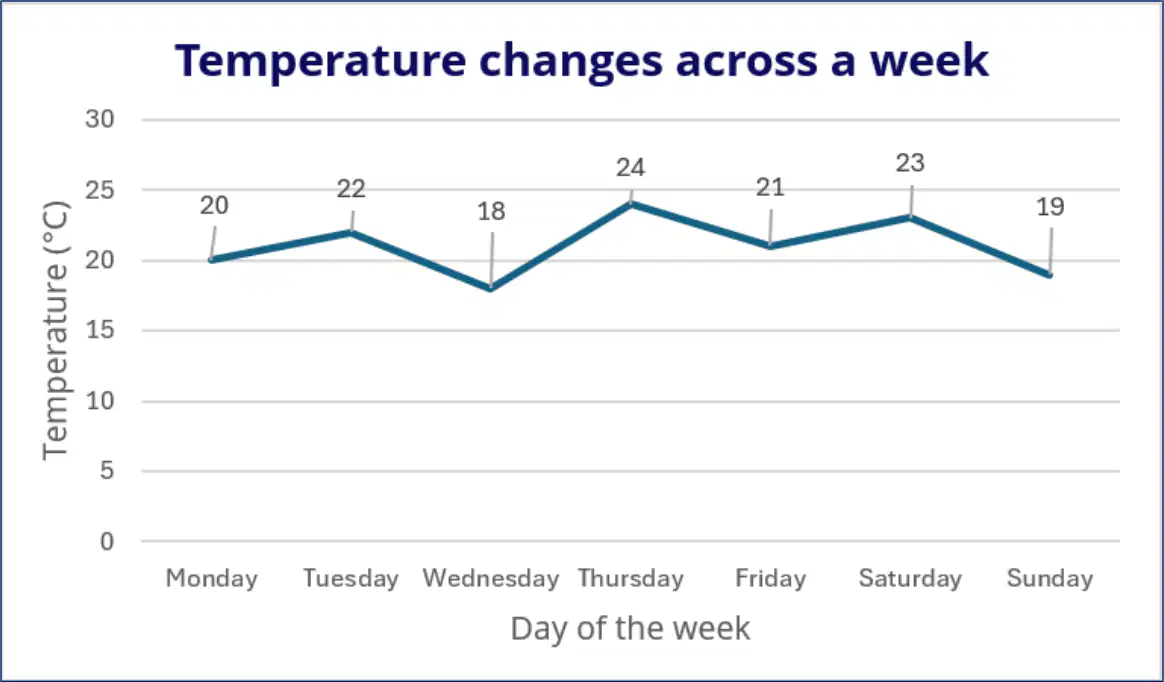
Look at the line in the temperature chart: Monday 20°C, Tuesday 22°C, Wednesday 18°C. What happened from Tuesday to Wednesday?
Temperature decreased by four
Temperature increased by four
Temperature stayed the same
Temperature doubled value

A pie chart shows 12 dogs, 8 cats, 5 birds, 10 fish, and 5 other pets. Which slice is the largest?
Dogs slice is largest
Cats slice is largest
Birds slice is largest
Other slice is largest
Which graph is best for showing how a plant’s height changes each week over two months?
Bar graph comparing categories by week
Line graph showing change over time
Pie chart showing parts of a whole
Scatter plot showing two measurements
You surveyed classmates about favorite fruits: apples, bananas, grapes, and oranges. Which graph should you use to compare how many chose each fruit?
Bar graph comparing categories clearly
Line graph tracking time changes
Pie chart showing two variables
Scatter plot for random patterns
A pie chart is most useful when you need to:
Compare categories over many months
Show how each part fits a whole
Look for patterns between two numbers
Display ups and downs over time
Which situations are good for a scatter plot?
Exploring link between study time and scores
Tracking daily temperature for a week
Checking relation of height and shoe size
Showing favorite colors in class
An area graph is helpful when you want to:
Compare totals stacking over time
Show single snapshot categories
Display exact parts of a pizza
List items without number changes
Which benefit of using graphs helps you quickly understand what the numbers mean?
Faster data interpretation
Longer data typing
Random number guessing
Hiding the information
Why are graphs useful when you want to compare values, like votes for fruits?
They show differences at a glance
They make numbers disappear
They mix all values together
They turn data into long words
Select all benefits that graphs can provide.
Identifying patterns in data
Effective visual presentation
Saving time when reading data
Confusing the information shown
Which step should you do first before inserting any chart in Excel?
Enter data into a clear table
Choose bright colours for bars
Resize each column and row
Add a title to the worksheet
When selecting a data table for a chart, what must be included in the selection?
Only number cells are needed
Include headers and all rows
Select the first column only
Click any single cell anywhere
Which action helps avoid mistakes when selecting your data range?
Hide the worksheet gridlines
Double-check for missing points
Insert a blank row on top
Sort the table alphabetically
You want to compare how many votes each fruit received. Which chart is best for this task?
Bar chart with clustered bars
Pie chart with exploded slice
Line chart with smooth lines
Doughnut chart with inner hole
What is the correct path to create a clustered bar chart after selecting data?
Home tab then Format Cells
Insert tab then Bar Chart
Data tab then Sort Range
View tab then Page Breaks
Which statements are true about pie charts?
They show proportions of a whole
They are ideal for showing trends
They can use contrasting colours
They compare categories over time
To make a pie chart in Excel, which option should you choose from the chart menu?
2-D Pie from chart options
3-D Column from charts
2-D Line from charts
Clustered Bar from charts
Which step is part of customizing a new chart for clarity?
Delete the category labels
Add a descriptive chart title
Hide all value markers
Remove every axis and grid
When is a line chart most useful with this fruit votes data?
When tracking votes across months
When viewing one day totals only
When comparing two colours only
When printing in black and white
Which cells should NOT be included when selecting data for a chart?
Empty rows outside the table
The column headers row
All fruit names column
All vote numbers column
Which Excel chart type is best for showing changes over time with data points marked?
Line with markers chart
3-D area stacked chart
Clustered column bars
Doughnut style pie
You selected a data table and clicked the Insert tab. What should you choose next to make a line graph with dots on each value?
Select Line with Markers
Pick 3-D Pie option
Press Recommended Charts
Choose PivotTable first
Why are line graphs useful when working with numbers from different days?
They show trends over time
They group parts of a whole
They hide small differences
They change numbers automatically
Which actions are good ways to customize a chart in Excel?
Double-click elements to edit
Try different graph types
Add clear titles and labels
Use random colours every time
Ignore how the audience reads
To add data labels to a line graph so values show on points, what should you do?
Enable data point labels
Insert a new worksheet
Switch to 3-D surface
Delete the legend box
A class wants to show parts of a whole, like how votes split among fruits. Which chart type should they choose?
Pie chart display
Line with markers
3-D area chart
Scatter with lines
Which set shows best practices for making graphs easy to read?
Clear titles used
Matching colour scheme
Audience-friendly layout
Unlabeled axes kept
Mixed fonts everywhere
Which change can make a graph easier to understand for your classmates?
Add clear axis labels and units
Use many random colors everywhere
Hide the graph title and legend
Make bars and lines very tiny
You make a chart title that says, "Data". What is a better title choice?
Monthly rainfall in our town
Stuff from science class today
Things we measured last week
Interesting numbers from experiments
Which options are good ways to customize a graph for clarity?
Choose readable colors with contrast
Add helpful data labels to bars
Remove all labels to save space
Use a legend when colors repeat
Why are graphs important when sharing information with others?
They help visualize complex information
They replace all numbers forever
They are prettier than paragraphs
They always prove something true

A bar chart uses dark blue and black bars that look the same. What should you do?
Pick colors with stronger contrast
Keep colors similar for style
Remove the legend completely
Shrink bars so differences vanish
Which steps can help your graph make a lasting impression?
Practice building neat charts often
Use clear titles and axis labels
Add labels that match the data
Crowd the chart with decorations

