
 Worksheets
Graphic Design Semester 1 Quiz
Total questions: 41
Worksheet time: 21mins

Why are color harmonies important?
Using color harmonies, you can prevent offending members of certain groups of people.
Using color harmonies, you can evoke certain emotions, create a mood, or add context to an image.
Using color harmonies, you can make people like your chosen sports teams more.
Using color harmonies, you can change a viewers opinion on color.

Which colors are cool colors?
Red, Yellow, Blue
Blue, Green, Violet (Purple)
Orange, Green, Violet
Red, Orange, Yellow
What does the term "hue" refer to in color theory?
The brightness of a color
The lightness or darkness of a color
The purity or intensity of a color
A color or shade

What is the effect of using a monochromatic color scheme in design?
It creates high contrast and vibrancy.
It tends to be visually cluttered and confusing.
It offers a soothing and harmonious look.
It evokes a sense of chaos and unpredictability.

Which color scheme involves two colors that are opposite each other on the color wheel?
Analogous
Complementary
Triadic
Monochromatic

Which color scheme is considered the most harmonious and is based on three colors that are equally spaced on the color wheel?
Complementary
Analogous
Triadic
Split-complementary

A Analogous color harmony is
Uses 2-4 colors that are next to each other on the color wheel. This is one of the simplest and most appealing color harmonies, and works best if you choose one dominant color and use the other colors as accents.
A color scheme is similar to a complementary color scheme, except one of the colors is split into two nearby colors.
Two base colors on opposite sides of the color wheel
One base color

Whichever color harmony you choose, using ONE _________ will create a sense of balance in your design. You can choose one main color and use the rules of color harmonies to find other colors that work as accents or smaller details in your design.
Simple Color
Dominate Color
Color Palettes
Compressed Colors
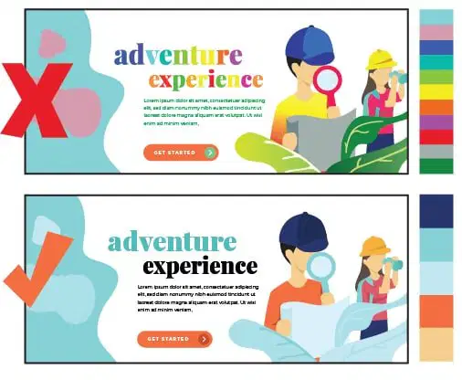
________ is best. Adding too many colors in your design can quickly become overwhelming or chaotic to the viewer. Choosing just a few colors and applying these color rules can create art that is bold, simple, and yet still interesting.
Simple Color
Dominate Color
Color Palettes
Compressed Colors

This image uses what color scheme
warm
cool
primary
Very bright, energetic colors are great color choices for a formal document.
True
False
Shades are colors that have had what color added to them?
white
black
tan
purple
By mixing equal amounts of primary colors you create orange, green, or violet. These colors are known as
analogous colors
triadic colors
complementary colors
secondary colors
Colors that are bold and energetic and should be used if an element in your design needs to "pop" are
warm colors
hot colors
cool colors
neutral colors
Two colors that are across from each other on the color wheel are
primary colors
secondary colors
analogous colors
complementary colors
When designing graphics, such as logos, you should consider how each color choice goes with each other.
True
False
Tints are colors that have had what color added to them?
black
white
tan
blue
Yellow text on a white background is a good color combination.
True
False
Hue is another word for
color
saturation
tint
shade
This term refers to the purity or intensity of color in an image.
saturation
hue
value
analogous
The term that refers to the lightness or darkness of a color is known as the
value/tone
saturation
hue
multiplier
The RGB color model is used for graphics created for
web sites
print documents
brochures
flyers
The CMYK color model is used for
documents that are going to be printed
web sites
Green and red are:
complementary colors
warm colors
cool colors
analogous colors
Designers use typography to communicate what to an audience.
Serif
client's message
Baseline
Descenders
What is Graphic Design?
The practice of planning and showing ideas using visual and textual content.
The use of color to enhance an image.
Using typography to show the vibe of the topic.
Painting and drawing on paper.

Where can you find Graphic Design?
Magazines
Websites
Cereal boxes
All that apply

This font is an example of:
italicized
serif
sans serif
typography

The font used in this image is:
serif
sans serif
In graphic design, what is contrast?
making two elements different
arranging words and groups of words in a way that allows the reader's eye to access the content easily and in a way that makes sense
grouping related items together
refers to lining up the top, bottom, sides or middle of text or graphic elements on a page
What is the term for guiding a reader's eye to whatever is most important?
hierarchy
leading
tracking
What is the limit to the number of different fonts you should use in a design?
1
2
3
4

what is the function of the paint bucket
fill an area with a solid color
allows you to pick any color
creates a perfect blend between two or more colors
splatters the color by dripping it
Which word is just another word for color?
saturation
hue
value
Which word refers to the intensity of a color?
saturation
hue
value

Which color scheme does the image represent?
analogous
monochromatic
triadic
complementary
split complementary

Which color scheme does the image represent?
analogous
monochromatic
triadic
complementary
split complementary
What does Resolution indicate in an image?
The number of colors used
The size of the image in inches
How many pixels are in an image, usually measured in dots per inch (dpi)
The type of graphic


