Worksheets
[WEB3] 1. Responsive
Total questions: 20
Worksheet time: 11mins

What should be filled in the blue circle?
User preference style
Viewport & Form factor
Macro Layout
Container styles
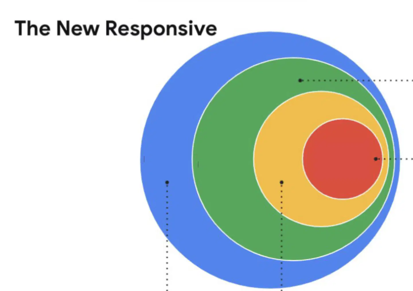
What should be filled in the green circle?
User preference style
Viewport & Form factor
Macro Layout
Container styles
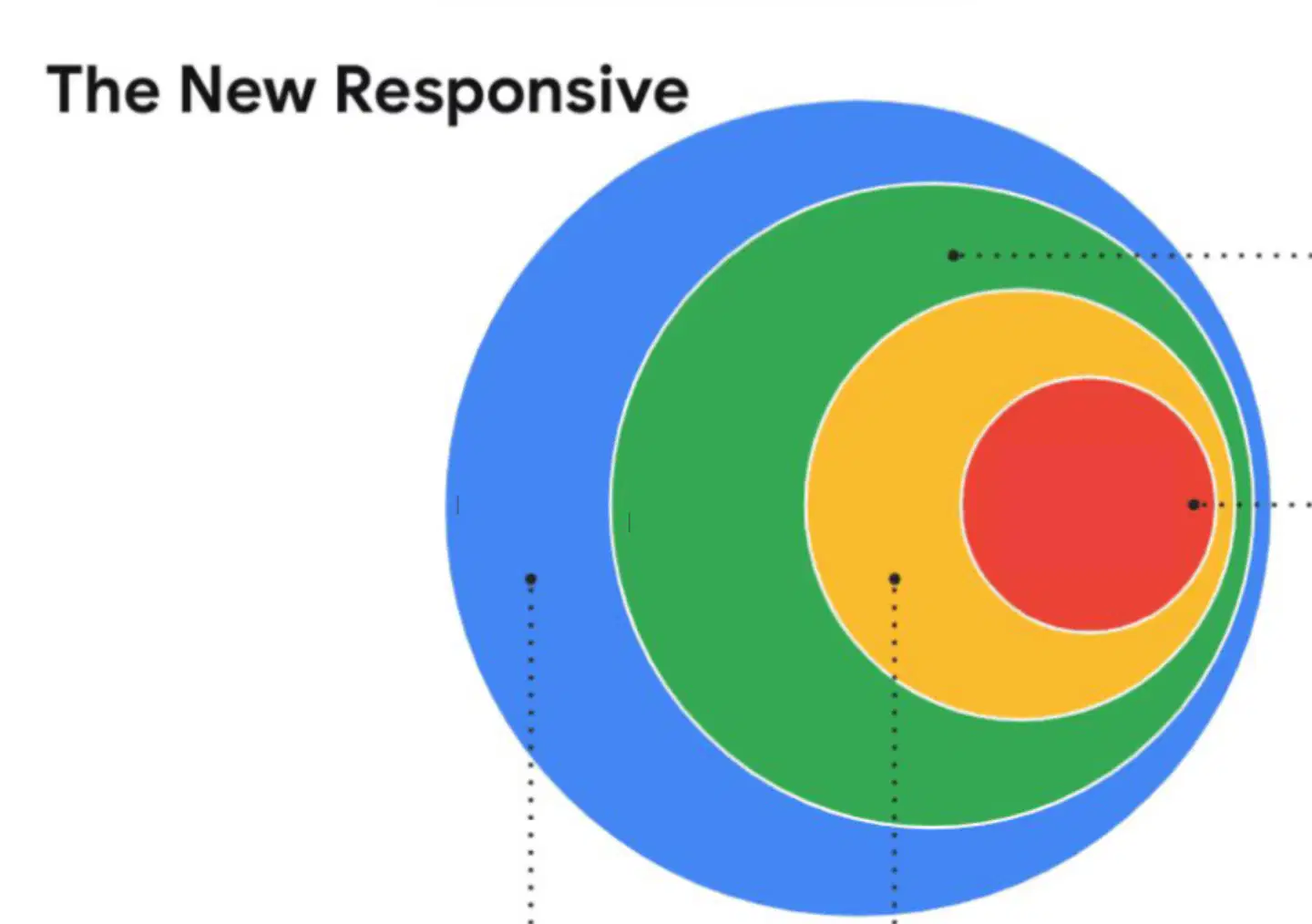
What should be filled in the yellow circle?
User preference style
Viewport & Form factor
Macro Layout
Container styles
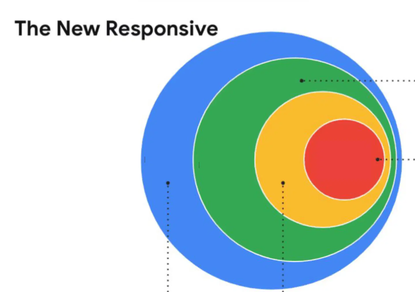
What should be filled in the red circle?
User preference style
Viewport & Form factor
Macro Layout
Container styles
What are the types of Media queries?
screen
all
size
What are the features of Media queries?
width, height
prefers-reduced-motion,
prefers-reduced-data
orientation
aspect-ratio
prefers-color-scheme
Which is the correct way write a media queries combination?



Which one is using the correct syntax?
@media (min-width: 400px){..}
@media (width >= 400px){..}
@media min-width: 400px {..}
@media (min-width: 400){..}
While coding, you should start with
mobile first
desktop first
Why do we use em as a Media query unit?
For better performance: Em units are relative and cause the browser to recalculate layouts more efficiently than fixed px units in media queries.
For consistency with page zoom: Em-based media queries scale breakpoints when users zoom the page (Ctrl +/-), while px does not, ensuring layouts adapt to zoom levels.
"You can use any CSS length units in your media queries. If your content is mostly image-based,
[A] might make the most sense. If your content is mostly text-based, it probably makes more
sense to use a relative unit that's based on text size, like [B]."
What should be filled in the [A] and the [B]?
[A]: pixels
[B]: em or ch
[A]: em or ch
[B]: pixels
Except for em, which unit is also recommended to use for media queries?
rems
%
User preferences include:
Light/dark mode
Reduced motion
High contrast
Screen resolution
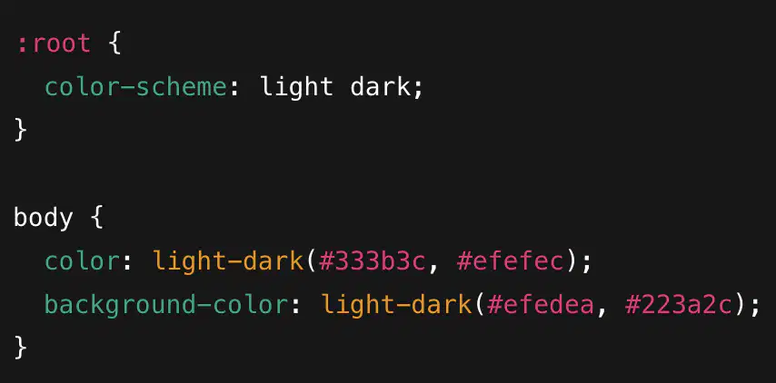
Which one uses the correct syntax for light-dark color function?


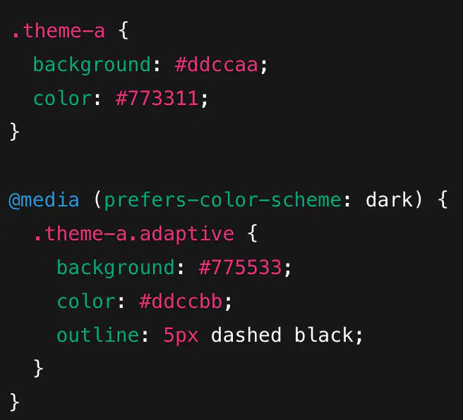
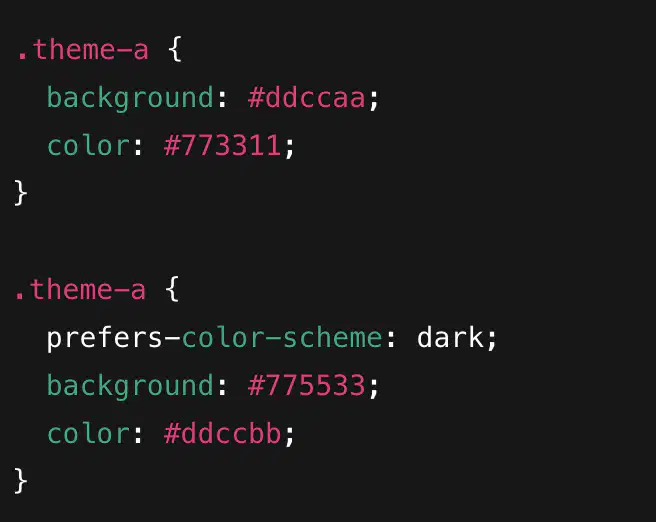
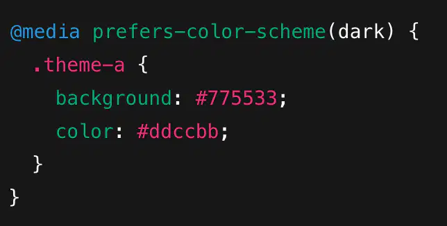
Which one uses the correct syntax for prefers-color-scheme css feature?
"- The user has not asked for reduced motion
- Animations and transitions are allowed
- This value evaluates as false
- Usually you don’t need to write it explicitly unless you want special behavior"
This is about:
@media (prefers-reduced-motion: no-preference) {...}
@media (prefers-reduced-motion: reduce) {..}
"- The user wants less motion
- Animations should be removed or minimized
- This value evaluates as true"
This is about:
@media (prefers-reduced-motion: no-preference) {...}
@media (prefers-reduced-motion: reduce) {..}
@media (prefers-reduced-motion){...} is the same as:
@media (prefers-reduced-motion: no-preference) {...}
@media (prefers-reduced-motion: reduce) {..}
Which of these can be a value for the prefers-contrast feature?
no-preference
more
less
custom
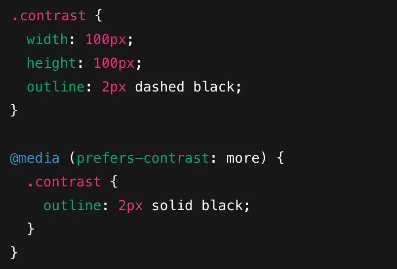
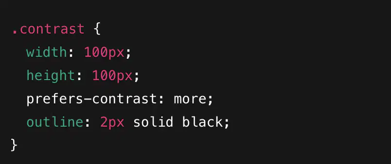
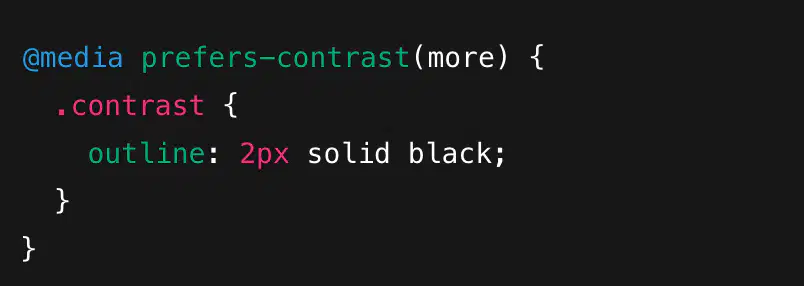
Which one uses the correct syntax for prefers-contrast css feature?