
Font size
 Worksheets
Why Grids Matter & Grid Types
Total questions: 50
Worksheet time: 25mins

Which benefit of using grids is highlighted by the poster comparison labeled Before and After?
Makes text harder to read
Removes all visual rhythm
Creates structure and hierarchy
Adds random decoration elements

Grids help layouts look premium mainly because they improve which design quality?
Animation frame rate
Photo resolution size
Readability and balance
Color saturation control

Select all outcomes grids can provide in a layout.
Structure and rhythm
Balance and hierarchy
Lower image quality
Instant confusion
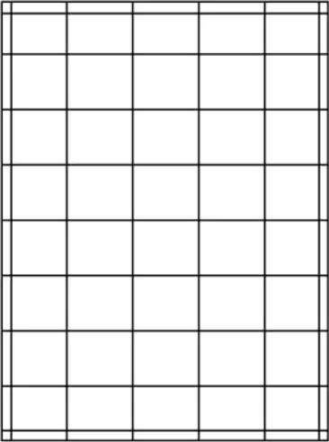
A modular grid is best described as a layout system made of what?
One baseline only
Multiple equal modules
Single wide column
Freehand diagonals
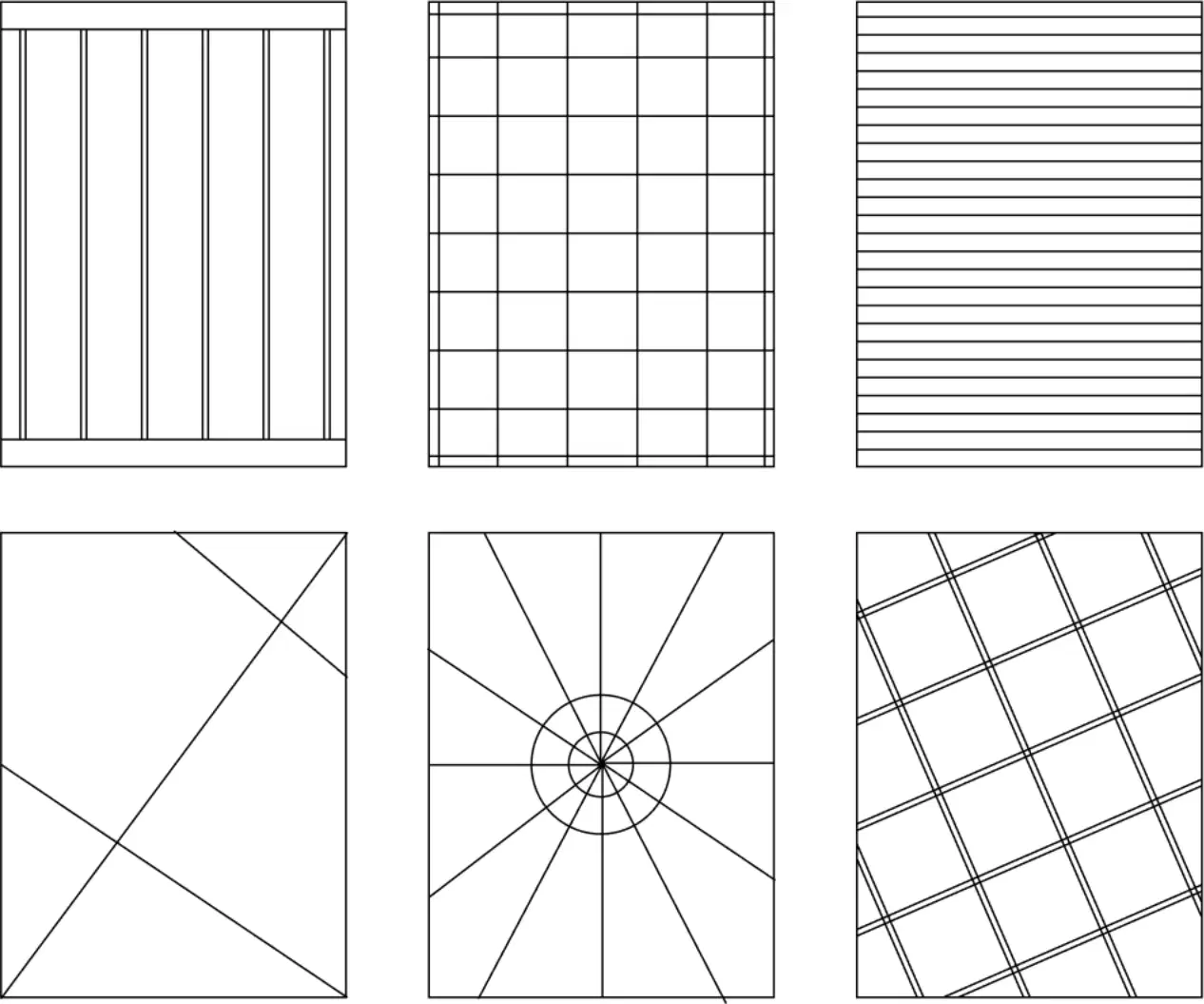
Which grid type organizes content along vertical sections side by side?
Column Grid
Radial Grid
Baseline Grid
Axial Grid
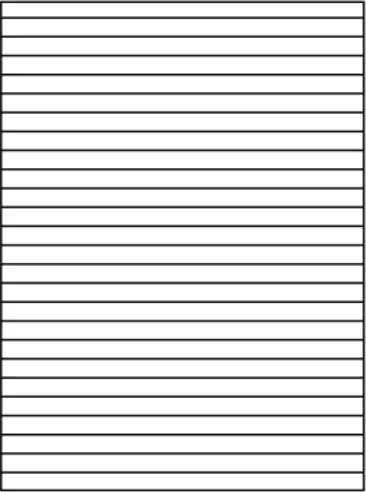
Which grid type aligns elements to repeating horizontal text lines for consistent spacing?
Manuscript Grid
Hierarchical Grid
Radial Grid
Baseline Grid
Choose the grid types that use directional guides rather than rectangular modules.
Diagonal Grid
Radial Grid
Modular Grid
Axial Grid
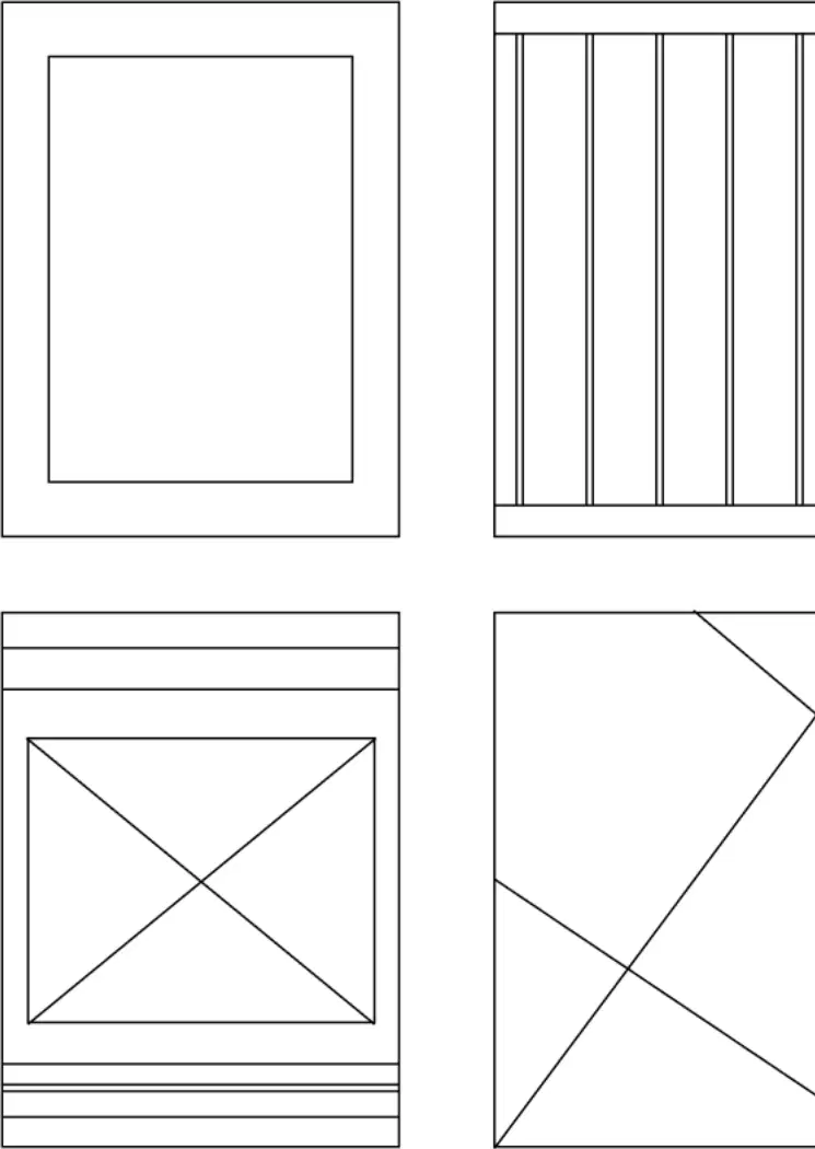
Which grid is a simple single-column layout often used for books or essays?
Baseline Grid
Manuscript Grid
Hierarchical Grid
Radial Grid
Which grid best suits long, continuous reading with a single block of text?
Multi-column responsive website grid
Manuscript grid single-column layout
Modular grid combining rows and columns
Column grid with flexible hierarchy
A magazine wants varied text and image placements while keeping alignment. Which grid should be chosen?
Manuscript grid one text block
Column grid for flexible layouts
Baseline grid only for type
Random layout without guides
What defines a modular grid compared to a column grid?
Removes margins to maximize area
Uses only columns for structure
Centers content without gutters
Adds rows to columns forming modules
Where is a manuscript grid commonly used?
Social posts and icons
Blogs and magazines
Books and reports
Posters and dashboards
Which layouts benefit most from a modular grid?
E-commerce product pages
Image galleries and dashboards
Long-form novels and essays
Poster designs needing blocks
In a column grid, how does hierarchy typically appear?
Centering all elements equally
Through varying column spans
By removing all gutters
Using only one text size
A designer needs a simple page for an article with minimal images. Which choice fits best?
Irregular freeform layout
Column grid with twelve columns
Manuscript grid single column
Modular grid with many modules
Which statement about grids is accurate?
Modular grids cannot handle images
Manuscript grids support complex hierarchy
All grids remove margins entirely
Column grids help align flexible content
Why might a poster use a modular grid?
To force one continuous text flow
To keep everything centered only
To organize content into repeatable blocks
To avoid using columns or rows
Which best describes a baseline grid in page layout?
Aligns text to horizontal rhythm lines
Places elements around a circular center
Stacks content on a central vertical axis
Uses freeform blocks without strict rules
What benefit is most closely linked to using a baseline grid?
Perfect readability and consistency
Extra colors and textures
Automatic image cropping
Faster printing and shipping
A hierarchical grid is usually chosen when which situation occurs?
All text lines share equal height
Everything must align to one axis
Content sizes vary across sections
The page only has a single headline
Where are hierarchical grids commonly seen?
Textbooks, dictionaries, atlases
Billboards, road signs, traffic maps
Newspapers, portals, cards, modern UI
Blueprints, technical drawings, CAD
Select all statements that correctly describe axial grids.
They are great for posters with strong direction
They ignore alignment to increase contrast
The axis can be vertical, horizontal, or diagonal
Elements align along one central axis
Which design goal is best supported by a baseline grid?
Allowing random block placements
Highlighting one oversized image
Creating dramatic diagonal movement
Maintaining horizontal rhythm in text
Which grid type is least strict about uniform columns and rows?
Axial grid
Modular grid
Hierarchical grid
Baseline grid
You’re designing a poster that needs a clear sense of direction. Which grid should you choose?
No grid for freestyle layout
Hierarchical grid for card stacks
Baseline grid for line spacing
Axial grid for central alignment
Match each grid type to its key feature.
All of the above statements
Baseline: aligns text to rhythm lines
Hierarchical: flexible, content-driven blocks
Axial: alignment along a central axis
Which project is most suitable for a radial grid?
Spreadsheet tables and charts
Architectural floor plans
Mandala illustrations and logos
Long-form book text pages
A diagonal grid uses angled lines to build layouts. Which angle set is typical for this grid?
75°, 80°, and 90°
10°, 20°, and 30°
5°, 15°, and 25°
30°, 45°, and 60°
What visual effect do diagonal grids commonly create?
Minimalism, empty negative space
Randomness, chaos, distortion
Calm, symmetry, static balance
Motion, energy, dramatic impact
Which applications commonly use diagonal grids? Select all that apply.
Posters and album covers
Recipe cards and grocery lists
Tech branding and fashion layouts
Instruction manuals and legal forms
You are designing a poster that should feel dynamic and energetic. Which grid choice and reasoning pair is best?
Diagonal grid, angled lines add motion
Radial grid, concentric circles reduce motion
Column grid, strict symmetry removes energy
Baseline grid, text rows slow the composition
Where do elements in a radial grid appear to move from?
A single central origin point
Multiple scattered corner points
One side edge of the canvas
Random midpoints on a path
Which design goal matches a radial grid better than a diagonal grid?
Building zigzag pathways for type
Tilting blocks to imply fast motion
Creating staggered steps across diagonals
Highlighting a focal center with rays

What is a key reason designers use a 12‑column grid on websites like Apple’s homepage?
It automatically writes headlines and captions
It creates flexible layouts for different content
It hides navigation elements from most users
It guarantees faster page loading for images

On the Apple homepage, what does baseline rhythm help achieve across text blocks and buttons?
Hidden layers that only appear on scroll
Extra bold fonts to make everything louder
Random padding that feels playful and chaotic
Even vertical spacing for a steady visual beat

Which combination best explains the premium feel shown:
Modular content sections
Consistent spacing rhythm
Unpredictable alignment choices
12‑column grid structure
If a card spans 3 columns in a 12‑column grid, how many equal‑width cards fit in one row without gaps?
Two cards across the row
Four cards across the row
Three cards across the row
Six cards across the row
Which step should come first when setting up a page grid?
Set page margins
Draw baseline rhythm
Add gutter spacing
Choose column count
What is the purpose of gutters in a grid?
Align text baselines
Resize outer margins
Divide page edges
Separate columns evenly
Which combination lists all four steps to build a grid?
Lock page size, export file
Choose fonts, add color
Add gutters, add baseline rhythm
Set margins, choose columns
In a simple two‑column grid, where should gutter spacing be placed?
Outside the margins
Inside each module
Below the baseline
Between the columns
Which action helps maintain consistent visual rhythm across a layout?
Ignoring baselines
Adding baseline rhythm
Using random spacing
Adding too many modules
A designer sets narrow margins and very wide gutters. What problem might occur?
Text follows the baseline
Content touches page edges
Modules stay evenly spaced
Columns become misaligned
Which pair shows a common grid mistake and its correction?
Too many modules → balanced modules
Ignoring baseline → text on baseline
Misaligned text → aligned to columns
Random spacing → consistent spacing

Look at the two layouts labeled Wrong and Correct. What makes the Correct layout better?
Thicker margins everywhere
More empty space
Elements snap to the grid
Larger title size
Which choice should you avoid when organizing a grid?
Using consistent spacing
Aligning text to baselines
Adding too many modules
Setting clear margins
When is adding a baseline rhythm necessary?
Never recommended
Always mandatory
Optional for text-heavy pages
Only for image-only layouts

Which software is best known for layout design and strong grid systems for magazines or brochures?
Adobe InDesign
Adobe Photoshop
Canva free plan
Figma starter kit

Which tools are commonly used for implementing grid systems in design? Select all that apply.
Adobe InDesign for page grids
Illustrator for vector grids
Video editing apps for motion grids
Figma for interface grids

Which option describes Canva’s role when working with grids for a beginner project?
Primary tool for vector grids
Industry-only prototyping grids
Best for complex print grids
Useful for basic grids

