Search Header Logo
  1. Resource Library
  2. Math
  3. Probability And Statistics
  4. Frequency Tables
  5. 3.2 Frequency
3.2 Frequency

3.2 Frequency

Assessment

Presentation

Mathematics

6th - 8th Grade

Medium

CCSS
6.SP.B.4, 2.MD.D.9, 3.MD.B.4

+2

Standards-aligned

Created by

Christina Sandoval

Used 27+ times

FREE Resource

8 Slides • 6 Questions

1

3.2 Frequency

By Christina Sandoval

2

Unit 3, Lesson 2: Frequency

I can utilize line plots, frequency tables, and histograms display data.

3

Unit 3, Lesson 2: Frequency

  • frequency - the number of data items in an interval  

  • frequency table - a table that shows data values grouped into intervals and the frequency for each interval  

  • histogram - a type of bar graph that displays data from a frequency table where the height of the bar shows the frequency of the interval it represents

  • line plot - a line plot is a graph that shows the shape of a data set with X's above each data value on a number line

4

Line Plot

  • You can also draw a line plot to show each of the values in the frequency table.

  • Notice, there is an x placed above each value for the number of times the value Occurs.

  • For example, there are three students whom are 5'4 so, there are three x's above the 5'4 on the line plot.

  • Sometimes, this is referred to as a dot plot and instead of x's placed above each value, there will be dots.

media
media

5

Frequency Table

  • You can organize data by the frequency of the values.

  • When we organize data this way, it helps us easily assess how the data is grouped and you can quickly see if there are any gaps, outliers, and which values occur most frequently.

  • To the right is a frequency table that shows the heights of 10 8th grade students.​

  • Notice the tally marks add up to 10 (representing the 10 students).​

media

6

Frequency Table cont'd

​Here is a frequency table to represent a group of values rather than an individual value.

media

7

Histograms

  • ​A histogram is a type of bar graph that displays data from a frequency table where the height of the bar shows the frequency of the interval it represents.

  • You can use information from the frequency table from the previous slid (and below)e to create a histogram.

media
media

8

Multiple Choice

Question image
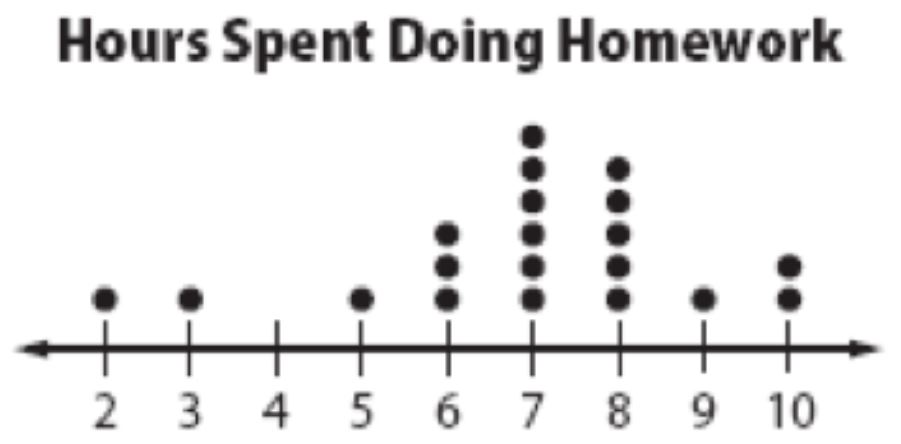
How many students spent 7 hours doing homework that week?
1
1
2
3
3
5
4
6

9

Multiple Choice

Question image
What is the highest score in the class?
1
88%
2
100%
3
13
4
98%

10

Multiple Choice

Question image
How many students spent over 40 minutes but under 60 minutes studying?
1
22 Students
2
30 Students
3
8 Students
4
5 Students

11

Multiple Choice

Question image
How many people were polled?
1
33
2
6
3
35
4
4

12

Multiple Choice

Question image

How many students sent between 10 and 19 text?

1

25

2

22

3

15

4

45

13

Multiple Choice

Question image

How many students sent more than 29 text messages?

1

45

2

25

3

95

4

199

14

Let's go back to the LL Room!

We'll take a look at some problems on your Quick Check.

media

3.2 Frequency

By Christina Sandoval

Show answer

Auto Play

Slide 1 / 14

SLIDE