
Line Graphs
Presentation
•
Mathematics
•
8th Grade
•
Practice Problem
•
Easy
+7
Standards-aligned

kathie george
Used 29+ times
FREE Resource
8 Slides • 33 Questions
1
2

3

4

5

6

7

8
Multiple Choice

What type of graph is this?
9
Multiple Choice

What is the main purpose of a line graph?
10
Multiple Choice
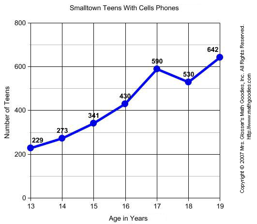
What label is along the y-axis in this graph?
11
Multiple Choice
What is the general trend of this line graph?
12
Multiple Choice
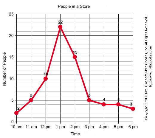
At what time were the greatest amount of shoppers at the store?
13
Multiple Choice
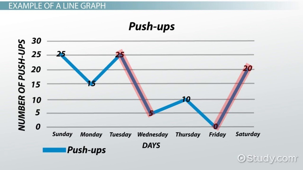
Between which two days was the greatest decrease in push-ups?
14
Multiple Choice

How many loaves of bread were left over on Wednesday?
15
Multiple Choice

What year did the postal rate reach 5 cents?
16
Multiple Choice

What year were 5 pieces of mail sent per person?
17
Multiple Choice

What was the deer population density in 2013?
18
Multiple Choice

Did more gray wolves live in Montana in 1982 or 1981?
19
Multiple Choice

What day were the fewest cups of coffee sold?
20
Multiple Choice

What month did Puddles reach 6 kilograms?
21
Multiple Choice

Did Brian watch more movies in June or in February?
22
Multiple Choice

How much did a gallon of gas cost in February?
23
Multiple Choice
24
Multiple Choice
25
Multiple Choice

A restaurant recorded the number of pizzas sold each month for one year. The data are shown in the graph below. During which month did the restaurant sell 40 pizzas?
26
Multiple Choice

At what rate did the temperature decrease between the 20th and 25th minutes of the experiment?
27
Multiple Choice
28
Multiple Choice

Which year on the graph did Finland win 5 medals?
29
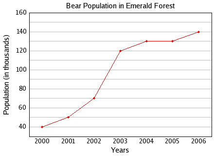
Multiple Choice
What was the bear population in 2001?
30
Multiple Choice

Between which two years did the bear population remain constant or the same?
31
Multiple Choice
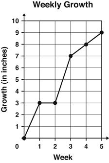
The graph shows the number of inches a plant grew each week.
Between which 2 weeks did the plant grow the MOST?
32
Multiple Choice
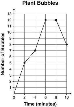
During an experiment, students counted the number of bubbles given off by water plants every 2 minutes during a 10-minute period. The results are graphed below.
At which two times were the same number of bubbles given off?
33
34
Multiple Choice
35
Multiple Choice
36
Multiple Choice
37
Multiple Choice
38
Multiple Choice
39
Multiple Choice
40
Multiple Choice
41
Multiple Choice
Show answer
Auto Play
Slide 1 / 41
SLIDE
