
Scatter Plots
Presentation
•
Mathematics
•
9th Grade
•
Medium
+3
Standards-aligned
SARAH HANKINS
Used 74+ times
FREE Resource
10 Slides • 15 Questions
1
A scatter plot is a graph that is used to show data between two variables, also known as bivariate data.
For ex: height and weight.
Scatter plots show patterns, trends, and correlations between variables that could impact each other.
Scatter Plots
2
Positive Association | Negative Association | No Correlation |
|---|---|---|
Both variables are increasing. | One variable is increasing, the other is decreasing. | There is no relationship between the variables. |
Types of Correlation
3
Multiple Choice
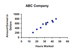
What type of correlation does this graph have?
positive
negative
none
all of the above
4
Multiple Choice
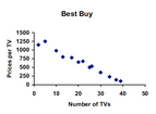
What is the correlation?
Negative correlation
No correlation
Positive correlation
5
Scatter Plots can be described as linear and non-linear models. They are not perfectly linear or non-linear but they follow a trend.
Linear vs. Non-linear Models
6
Match
Non-linear Correlation
No Correlation
Positive, Linear Correlation
Negative, Linear Correlation
Non-linear Correlation
No Correlation
Positive, Linear Correlation
Negative, Linear Correlation
7
Multiple Choice
Graph A
Graph B
Graph C
Graph D
8
Correlation tests for a relationship between two variables. However, seeing two variables moving together does not necessarily mean we know whether one variable causes the other to occur. This is why we commonly say “correlation does not imply causation.”
9
Study Time and Grades
As study hours increase, grades increase. There is a positive correlation between hours and grades.
So....Do hours spent studying cause higher grades?
10
Ice Cream Sales and Shark Attacks
As ice cream sales increase, shark attacks increase. As ice cream sales decrease, shark attacks decrease.
So....ice cream sales cause shark attacks?
11
5G and COVID cases
There is a correlation between areas with 5G and high COVID cases.
So......Does 5G cause COVID?
12
Multiple Choice
This implies that one variable has a direct affect on the other variable.
Correlation
Causation
13
Multiple Choice
Correlation or Causation?
The number of times you come to tutoring and your test scores improving
Correlation
Causation
14
Multiple Choice
Correlation or Causation?
The inches of snowfall and the number of heart attacks
Correlation
Causation
15
Outliers | Clusters |
|---|---|
An outlier is a data point in a scatter plot that does not follow the trend of the data. | A group of data points that are closely grouped together. |
outlier
cluster
16
Multiple Choice
What are the coordinates of the outlier?
(1,9)
(9,1)
(2,2)
y=x
17
To show the overall trend of a data set, we can use a Line of Best Fit.
A line of best fit should:
Follow the trend of the data
Split the data in half
Help to estimate or predict values that are not already given in the set.
Line of Best Fit
18
Multiple Choice
19
Multiple Choice
A
B
C
D
20
Correlation coefficient (r) formulas are used to find how strong a relationship is between data. The formulas return a value between -1 and 1, where:
1 indicates a strong positive relationship.
-1 indicates a strong negative relationship.
A result of zero indicates no relationship at all.
21
Multiple Choice
Estimate the correlation coefficient for this scatterplot.
A) r = 1.2
B) r = 0.89
C)r = 0
D) r = -0.89
22
Multiple Choice
Estimate the correlation coefficient for this scatterplot.
A) r = -0.9
B) r = 1
C) r = 0.9
D) r = -1
23
Multiple Choice
Average time spent listening to music per day and average time spent watching TV per day. r=−.17
strong positive
strong negative
weak positive
weak negative
24
Multiple Choice
Score on science exam and number of words written on the essay question. r=.28
strong positive
strong negative
weak positive
weak negative
25
Multiple Choice
Number of steps taken per day and number of kilometers walked per day. r=.92
strong positive
strong negative
weak positive
weak negative
A scatter plot is a graph that is used to show data between two variables, also known as bivariate data.
For ex: height and weight.
Scatter plots show patterns, trends, and correlations between variables that could impact each other.
Scatter Plots
Show answer
Auto Play
Slide 1 / 25
SLIDE
Similar Resources on Wayground
20 questions
y=mx+b
Lesson
•
9th Grade
20 questions
Classifying Polynomials
Lesson
•
9th Grade
20 questions
Exponential Functions Intro
Lesson
•
9th Grade
19 questions
Inverse Operations
Lesson
•
9th Grade
19 questions
Writing Linear Equations
Lesson
•
9th Grade
19 questions
Correlation and Correlation Coefficient
Lesson
•
9th Grade
18 questions
Literal Equations
Lesson
•
9th Grade
20 questions
Characteristics of Exponential Functions
Lesson
•
9th Grade
Popular Resources on Wayground
10 questions
5.P.1.3 Distance/Time Graphs
Quiz
•
5th Grade
10 questions
Fire Drill
Quiz
•
2nd - 5th Grade
20 questions
Equivalent Fractions
Quiz
•
3rd Grade
15 questions
Hargrett House Quiz: Community & Service
Quiz
•
5th Grade
20 questions
Main Idea and Details
Quiz
•
5th Grade
20 questions
Context Clues
Quiz
•
6th Grade
20 questions
Inferences
Quiz
•
4th Grade
15 questions
Equivalent Fractions
Quiz
•
4th Grade
Discover more resources for Mathematics
20 questions
Graphing Inequalities on a Number Line
Quiz
•
6th - 9th Grade
10 questions
Exploring Basic Probability Concepts
Interactive video
•
6th - 10th Grade
11 questions
Adding and Subtracting Polynomials
Quiz
•
9th Grade
20 questions
Rational and Irrational Numbers, Perfect Squares, & Perfect Cube
Quiz
•
9th Grade
12 questions
Exponential Growth and Decay
Quiz
•
9th Grade
10 questions
Factoring Quadratic Expressions
Quiz
•
9th Grade
16 questions
Identifying Angles
Quiz
•
7th - 12th Grade
25 questions
Complementary and Supplementary Angles
Quiz
•
7th - 10th Grade