Search Header Logo
  1. Resource Library
  2. Science
  3. Physics
  4. Graphing
  5. Graphing Lesson
Graphing Lesson

Graphing Lesson

Assessment

Presentation

Science

8th Grade

Medium

NGSS
MS-PS3-1, MS-ESS1-3, MS-LS1-5

+6

Standards-aligned

Created by

Jennifer Napolitano

Used 28+ times

FREE Resource

1 Slide • 24 Questions

1

media

2

Multiple Choice

You want to make a graph for an experiment you did about plant growth over a two week period of time. What type of graph would you use?

1

bar graph

2

line graph

3

pictograph

4

pie chart

3

Multiple Choice

The purpose of graphs, charts and tables is to
1

help scientists visualize results from an experiment.

2

make the experiment look nice.

3

practice what I learned in Math class.

4

Practice my drawing skills.

4

Multiple Choice

Jacob wants to record his results for the temperature of each day in the past week. What graph or table should he use? 

1

Data table

2

Bar graph

3

histogram 

4

Line graph

5

Multiple Choice

The Independent Variable is represented on which Axis?

1

A

2

X

3

B

4

Y

6

Multiple Choice

Question image

If you get at least 6 hours of sleep, you will do better on tests than if you get less sleep.
What is the independent variable in this experiment?

1

Amount of Sleep

2

Test Scores

3

Amount of Coffee

4

Type of Bed

7

Multiple Choice

Question image

If you get at least 6 hours of sleep, you will do better on tests than if you get less sleep.
What is the dependent variable in this experiment?

1

Test Scores

2

Amount of Sleep

3

Amount of Coffee

4

None of the Above

8

Multiple Choice

Question image

Use the Graph: The dependent variable in this experiment is - 

1

Number of Bacteria

2

Time of Incubation

3

Culture Number

4

Type of Bacteria

9

Multiple Choice

Question image

Terrell hiked 10 miles on Sunday, 8 miles on Monday, 9 miles on Tuesday, 8 miles on Wednesday, 6 miles on Thursday, and 6 miles on Friday.  Terrell is crazy, but which line graph correctly shows the data?

1

Graph A

2

Graph B

10

Multiple Choice

Question image
Which axis runs horizontally?
1

x

2

y

11

Multiple Choice

Question image
Which axis runs vertically?
1

x

2

Y

12

Multiple Choice

What do we put at the top of a graph?
1

X axis

2

data table

3

title 

4

nothing

13

Multiple Choice

What do we use to pick the numbers for the scale? 
1

whatever we want

2

you must always count by tens

3

use your data to pick the scale

4

you don't need a scale

14

Multiple Choice

Question image

This explains what the whole graph is about.

1

the title

2

the axis labels

3

the key or legend

15

Multiple Choice

Question image

According to this graph, how many people visited this park in 1997?

1

60 visitors

2

60,000 visitors

3

6 million visitors

16

Multiple Choice

What graph/chart do you use for percentages? 

1

Bar graph 

2

Line Graph

3

Pie chart

4

data table

17

Multiple Choice

What graph do you use to represent time or distance?

1

Bar graph

2

Data table

3

pie chart

4

Line graph

18

Multiple Choice

A student wants to test the effects of type of exercise on heart rate.  On what axis will the type of exercise go on?

1

x

2

y

19

Multiple Choice

What do you need as part of your axis label?

1

variable and unit

2

just variable

3

just unit

4

neither variable nor unit

20

Multiple Choice

You want to see if watering your plant makes it grow faster.
Which axis does " amount of water" go on?

1

x-axis

2

y-axis

21

Multiple Choice

What controls or changes the independent variable?

1

The dependent variable

2

The scientist

3

The results

4

Nothing

22

Multiple Choice

Question image

What is the best title for this graph?

1

The effect of the number of trees on the type of tree

2

The change in type of trees over number of trees

3

Number of trees vs. Type of trees

4

A comparison of the number of trees for 5 different types of trees

23

Multiple Choice

Question image

What type of graph is this?

1

Pie chart

2

Histogram

3

Bar graph

4

Line graph

24

Multiple Choice

Question image

You need to take a survey at school to see which type of lunch food is most preferred by 7th grade students.


Which type of graph would be best to display the data?

1

Line Graph

2

Bar Graph or Pie Chart

3

Scatter Plot

4

Funnel Chart

25

Multiple Choice

Question image

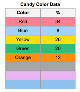
Based on the table provided, which type of graph would be best for the data?

1

Line graph

2

Bar Graph

3

Pie Chart

4

Scatter Plot

media

Show answer

Auto Play

Slide 1 / 25

SLIDE