
Unit 8 Review
Presentation
•
Mathematics
•
9th Grade
•
Medium
+14
Standards-aligned

Anna Wilson
Used 3+ times
FREE Resource
7 Slides • 40 Questions
1
2
Multiple Choice
3
Multiple Choice
4
Multiple Choice
5
6
Multiple Choice
7
Multiple Choice
8
Multiple Choice

9
Multiple Choice
10
Multiple Choice
11

12
13
Multiple Choice
14
Multiple Choice
15
Multiple Choice
16
Multiple Choice
17
Multiple Choice
18
Multiple Choice
19

20

21
Multiple Choice

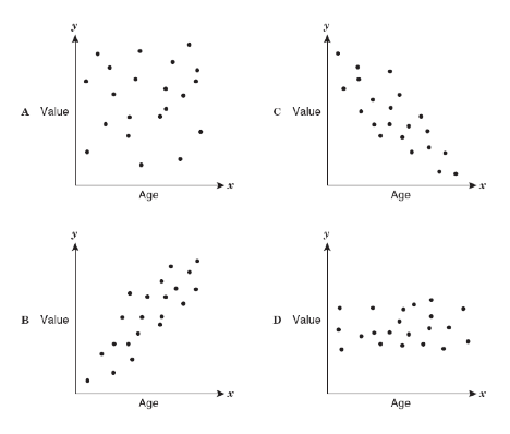
What is the correlation for the following Scatter Plot.
22
Multiple Choice

What is the correlation for the following Scatter Plot.
23
Multiple Choice

Given the following Scatter Plot, select the option that is most likely the r value.
24
Multiple Choice

Determine the correlation of the points on the scatterplot.
25
Multiple Choice

The table shows the attendance at a flag football game for the first 8 games of the season. What is the correlation of the data?
26
Multiple Choice
27
Multiple Choice
28
Fill in the Blanks

Type answer...
29
30
Multiple Choice
31
Multiple Choice
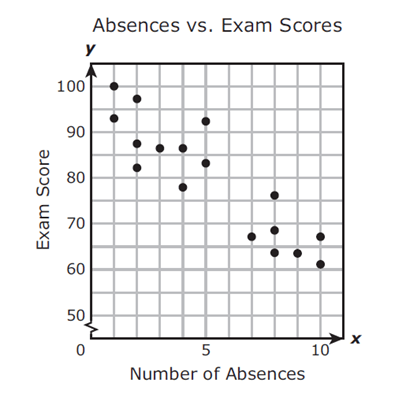
Mrs. Collins made a scatterplot to show the relationship between the number of absences and a student’s final exam score. Based on this scatterplot, a student with 12 absences should get approximately what score on the final exam?
32
Multiple Choice

33
Multiple Choice

34
Multiple Choice
35
Multiple Choice

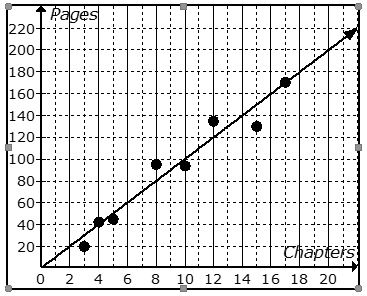
What is the equation of the line of best fit?
36
Multiple Choice

Is this line an accurate line estimate of best fit for the data?
37
Multiple Choice

38
Match
39
Multiple Choice

40
Multiple Choice

Calculate the line of best fit.
41
Multiple Choice
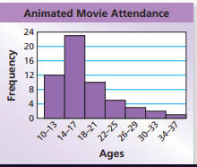
What is the shape of the data?
42
Multiple Choice

The data for the latest test is shown in this graph. Select the true statement.
43
Multiple Choice

Which statement best describes this distribution?
44
Multiple Choice
45
Multiple Choice
46
Multiple Choice
47
Multiple Choice
Show answer
Auto Play
Slide 1 / 47
SLIDE
