
Intro to Scatterplots
Presentation
•
Mathematics
•
8th Grade
•
Medium
•
CCSS
HSS.ID.B.5, 8.SP.A.1, 8.EE.B.5
+4
Standards-aligned

Catherine Chambers
Used 224+ times
FREE Resource
27 Slides • 16 Questions
1

2

3
Multiple Choice

Which Scatterplot best represents the data?
4

5

6

7
Multiple Choice
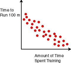
What type of relationship does this scatter plot show?
8
Multiple Choice
What is the type of relationship?
9
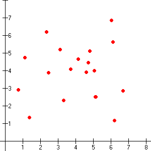
Multiple Choice

Which scatter plot shows no relationship?
10
Multiple Choice

Which scatter plot shows a negative relationship?
11
Multiple Choice
Which scatter plot show a positive relationship?
12

13

14

15

16

17

18

19

20

21

22

23

24

25

26

27

28

29

30

31

32

33
Multiple Choice

The police department tracked the number of ticket writers and number of tickets issued for the past 8 weeks. The scatter plot shows the results. Which statement is true?
34
Multiple Choice

Which statement best describes the relationship shown in this scatter plot?
35
Multiple Choice
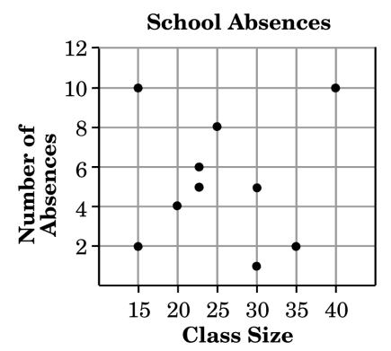
The scatter plot shows the number of absences in a week for classes of different sizes. Trevor concluded that there is a positive correlation. Which statement best describes why Trevor's conclusion was incorrect.
36
Multiple Choice
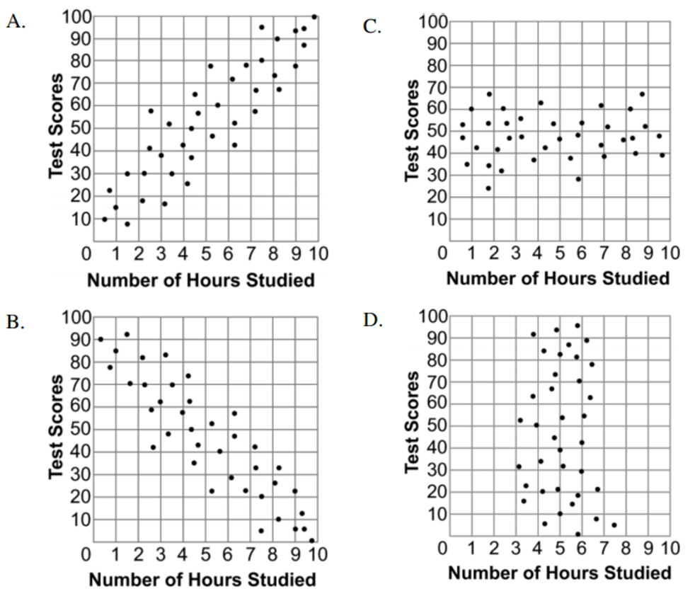
Which graph best shows a positive correlation between the number of hours studied and the test scores?
37
Multiple Choice
38
Multiple Choice
39
Multiple Choice
40

41
Multiple Choice

Which of the following lines represents the line of best fit for the scatter plot?
42
Multiple Choice

Which with is the line of best fit?
43
Multiple Choice

Which graph shows a line of best fit for the scatter plot?
Show answer
Auto Play
Slide 1 / 43
SLIDE
