Search Header Logo
G8.C16. Interpreting and discussing result

G8.C16. Interpreting and discussing result

Assessment

Presentation

•

Mathematics

•

8th Grade

•

Medium

Created by

Ama Atiby

Used 6+ times

FREE Resource

11 Slides • 50 Questions

1

Chapter 16:
Interpreting and discussing results
media

2

media

Starting Up Activity

3

Fill in the Blanks

media image

The frequency diagram shows the masses of the members of one family.

How many members of this family have a mass in the 80–120 kg group?


4

Fill in the Blanks

media image

How many members are in this family altogether?


5

Math Response

What fraction of the family members have a mass

in the 0–40 kg group?

Type answer here
Deg°
Rad

6

Fill in the Blanks

media image

120 people were asked how they travel to work.

The pie chart shows the results. What percentage of the people travel to work by car?

7

Math Response

120 people were asked how they travel to work.

The pie chart shows the results.

What fraction of the people travel to work by train?

Write your answer in its simplest form.

Type answer here
Deg°
Rad

8

Fill in the Blanks

media image

120 people were asked how they travel to work.

The pie chart shows the results.

How many of the people travel to work by bus?

9

Fill in the Blanks

media image

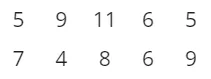
Work out the mode weekly wages.

10

Fill in the Blanks

media image

Work out the median weekly wages.

11

Fill in the Blanks

media image

Work out the mean weekly wages.

12

16.1 Interpreting and drawing frequency diagrams


media
media

13

media

14

Multiple Select

Question image

This table shows the results of a survey on the number of children per family in a small town.
Select all the statements that are true? 

1

Eight families had 4 children.

2

The maximum number of children in any family is 4.

3

Three families had 12 children.

4

‘7’ in the frequency column means a family had 7 children.

15

Fill in the Blanks

media image

How many learners altogether chose cycling?

16

Fill in the Blanks

media image

Suraya did a survey of the learners in her class to find out how many times a week they go to the gym. The frequency diagram shows the results.

How many learners are in Suraya’s class?

17

Math Response

The frequency diagram shows the scores out of 10 that Mr O’s class achieved in their latest spelling test.

Any learner scoring half the maximum score or less needs to take the test again.

How many learners need to take the test again?

Type answer here
Deg°
Rad

18

Math Response

The frequency diagram shows the scores out of 10 that Mr O’s class achieved in their latest spelling test.

How many people made fewer than two mistakes?

Type answer here
Deg°
Rad

19

Fill in the Blanks

media image

If everyone’s answer was recorded, how many people said they would not buy any of the brands?

20

Math Response

How much money was spent in total on the cards?

Type answer here
Deg°
Rad

21

Draw

Fill out the blank!

22

Multiple Choice

Question image

Which company had the greatest total earnings over the three years?

1

A

2

B

3

C

4

Both A and B

5

Both A and C

23

16.2 Time series graphs

media
media

24

Activity on COM

25

Multiple Choice

Question image

Choose the graph that matches this table showing changes in temperature during the night.Choose the graph that matches this table showing changes in temperature during the night.

1
2
3
4

26

Draw

Complete the tables for the data from the graph.

27

Draw

Complete the tables for the data from the graph.

28

Multiple Choice

Question image

Between which years did global emissions of carbon dioxide rise the most?

1

1965 and 1970

2

2000 and 2005

3

2005 and 2010

29

Fill in the Blanks

media image

What is the difference between the highest and lowest temperatures in December?

30

Fill in the Blanks

media image

By how much did the sales of Buzz Electronics rise between August and December?

31

16.3 Stem-and-leaf diagrams
media
media

32

Fill in the Blanks

media image

The stem-and-leaf diagram shows marks in a test.

Three people scored the same mark. What was that mark?

33

Fill in the Blanks

media image

The stem-and-leaf diagram shows marks in a test.

How many learners got more than 36 marks?

34

Fill in the Blanks

media image

This stem-and-leaf plot shows marks in a history test out of 100.

The range of the marks is:

35

Fill in the Blanks

media image

How many sheep were shorn altogether?

36

16.4 Pie Charts
media
media

37

media

38

Multiple Choice

Question image

The pie charts show the proportion of boys and girls in two swimming clubs.

There are 120 children in the Dolphins swimming club.

There are 72 children in the Seals swimming club.

Which swimming club has the greater proportion of girls?

1

Seals

2

Dolphins

39

Multiple Choice

Question image

The pie charts show the proportion of boys and girls in two swimming clubs.

There are 120 children in the Dolphins swimming club.

There are 72 children in the Seals swimming club.

Which swimming club has the greater number of girls?

1

Seals

2

Dolphins

40

Math Response

60 people were asked which breakfast they preferred. How many chose baked beans and eggs?

Type answer here
Deg°
Rad

41

Math Response

The pie chart shows what percentage of pizza topping each ingredient makes up. What percentage of the pizza topping is mushrooms?

Type answer here
Deg°
Rad

42

Multiple Choice

Question image

Approximately how much more is spent on salaries than on stationery?

1

$45 000

2

$30 000

3

One third more

4

Three times

43

Fill in the Blanks

media image

Today, 24 birds visited my garden.

Representing this information in a pie chart, what size angle would represent the Indian king parrots?

Ans :

o

44

Math Response

Calculate of 712\frac{7}{12} of 360°.

Type answer here
Deg°
Rad

45

Multiple Choice

Question image

What fraction of this circle does not represent food? 

1

12\frac{1}{2}

2

13\frac{1}{3}

3

14\frac{1}{4}

4

49\frac{4}{9}

46

Math Response

The sector for corn represents 720 tonnes. How many tonnes does the sector for wheat represent?

Type answer here
Deg°
Rad

47

Multiple Choice

Question image

Two shops compare their sales in January.

Shop A has total sales of $3500.

Shop B has total sales of $11 000.

Which shop sells a greater value of furniture?

1

Shop A

2

Shop B

48

16.5 Representing Data
media
media

49

Multiple Choice

What should you consider first when deciding on the most appropriate chart to use?

1

The type of data

2

The number of categories

3

The range of your data

4

The number of pieces of data

50

Multiple Choice

Lyndall surveyed her class about their favourite animals. Which of these types of graphs is the better one to display her data?

1

A line graph

2

A pie chart

51

Multiple Choice

These charts show the data from a survey of the methods of transport used to get to work.

If you wanted to find the exact number of people who travelled by car, which chart would be the most difficult to read?

1
2
3

52

Multiple Choice

What type of graph should you use to find a relationship between two sets of data?

1

Pie chart

2

Infographic

3

Stem-and-leaf diagram

4

Scatter graph

Answer

53

16.6 Using Statistics
media
media
media

54

Fill in the Blanks

media image

Find the mean of the data.

55

Multiple Choice

10    21    16    16    16    13    12    14    21    21    10

What would you give as the mode of these scores?

1

16 only

2

21 only

3

16 and 21

4

No mode

56

Fill in the Blanks

10, 17, 16, 16, 7, 13, 12, 14, 21, 12, 16

The range of these scores is

57

Fill in the Blanks

In five games of basketball, Orhan scored 15, 12, 5, 11 and 12 points.

Orhan's average (mean) score for these games was ...

58

Fill in the Blanks

Dima received the scores 20, 16, and 18 for three maths tests.

The mean of Dima's scores is ...

59

Fill in the Blanks

A sample is taken of maths test scores from two different classes in the same school stage.

The test was out of 20.

Class A: 3, 5, 8, 11, 13, 15, 17, 18

Class B: 6, 7, 7, 9, 14, 15, 20

What is the difference of both median?

60

Multiple Choice

Question image

Which is the modal class?

1

100 < h ≤ 120

2

120 < h ≤ 140

3

140 < h ≤ 160

4

160 < h ≤ 180

61

Open Ended

Question image

Reflection and Self-assessment

https://bit.ly/G8-Tulip

pattern-tertiary
Chapter 16:
Interpreting and discussing results
media

Show answer

Auto Play

Slide 1 / 61

SLIDE