Search Header Logo
graphing Lesson

graphing Lesson

Assessment

Presentation

Biology

9th - 12th Grade

Practice Problem

Medium

NGSS
HS-LS1-3, HS-LS2-4, HS-ESS2-4

+10

Standards-aligned

Created by

Sherwana Stewart

Used 2+ times

FREE Resource

12 Slides • 25 Questions

1

There are lots of parts of a graph

  • Title

  • X-Axis Label

  • Y-Axis Label

  • Scales

  • Legend

media

2

Title

  • Tells you what the graph is about

  • Includes the dependent and independent variables

media

3

X-Axis Label

  • Tells you what the x-axis (horizontal/bottom line) is showing

  • Independent Variable

  • Matches the different trails in the experiment

media

4

Multiple Choice

In an experiment to determine the effects of listening to loud music on test scores, what would the x-axis label be?

1

Type of music

2

Test score

3

Volume of music

4

Grade in class

5

Trends in Graphs

As the time increases the mass of chalk decreases.

media

6

Trends in Graphs

As time increases, the speed increases.

media

7

Trends in Graphs

As time increases, the speed increases.

media

8

Multiple Choice

Question image

Describe the trend shown in the graph.

1

As the volume decreases, the mass stays the same.

2

As the mass decreases, the volume increases.

3

As the volume increases, the mass increases.

4

As the mass increases, the volume stays the same.

9

Multiple Choice

Question image

What conclusions can you draw from this graph?

1

The deer population went down over time.

2

The deer population went up over time.

3

The deer population went up quickly, then down, but then stayed the same.

4

There are less deer because of hunters

10

Multiple Choice

Question image

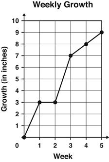
The graph shows the number of inches a plant grew each week.

Between which 2 weeks did the plant grow the MOST?

1

Week 1 and Week 2

2

Week 2 and Week 3

3

Week 3 and Week 4

4

Week 4 and Week 5

11

Multiple Choice

The variable that is measured.

1

Controlled Variable

2

Dependent Variable

3

Independent Variable

12

Multiple Choice

The one factor that a scientist changes during an experiment.

1

Controlled Variable

2

Dependent Variable

3

Independent Variable

13

Multiple Choice

Changes in the _________ variable causes changes in the _________ variable.
1
independent; dependent
2
dependent; independent

14

Multiple Choice

Question image
This graph provides evidence to support the claim that
1
the enhanced greenhouse effect is occurring
2
the greenhouse effect is occurring
3
humans are changing the planet
4
CO2 is decreasing but temperature is increasing

15

Multiple Choice

Question image
The x-axis shows
1
time
2
temperature
3
carbon dioxide
4
parts per million

16

Multiple Choice

On which axis is the independent variable found?
1
z-axis
2
w-axis
3
y-axis
4
x-axis

17

Multiple Choice

Display that shows change over time
1
Line Graph
2
Line Plot
3
Box Plot
4
Histogram

18

Multiple Choice

Question image
How many students have blue for a favorite color?
1
11
2
12
3
14
4
17

19

Multiple Choice

Question image

the pie chart shows the different types of vehicles involved in road accidents in a city last years.

which type of vehicles had the highest number of road accidents last year?

1

Motorcycle

2

Cars

3

Good Vehicles

4

Buses

20

media

21

Alan has embarked on a new exercise program on his new treadmill. The graph at the right shows his heart rate during one of his daily 40 minute workouts.

media

22

Multiple Choice

Question image

At what point was his heart rate constant?

1

0 to 5 mintues

2

5 to 10 minutes

3

10 to 30 minutes

4

30 to 40 minutes

23

Multiple Choice

Question image

At what point was his heart rate increasing quickly?

1

0 to 5 mintues

2

5 to 10 minutes

3

10 to 30 minutes

4

30 to 40 minutes

24

Multiple Choice

Question image

At what point was his heart rate decreasing?

1

0 to 5 mintues

2

5 to 10 minutes

3

10 to 30 minutes

4

30 to 40 minutes

25

Multiple Choice

Question image

At what point was his heart rate increasing slowly?

1

0 to 5 mintues

2

5 to 10 minutes

3

10 to 30 minutes

4

30 to 40 minutes

26

Multiple Choice

Question image

The graph at the right shows Dylan's motorcycle trip from his home to his friend's home in another city.

During which time interval did Dylan stop for lunch

1

Between hours 0 and 1

2

Between hours 1 and 2

3

Between hours 2 and 3

4

Between hours 3 and 5

27

Multiple Choice

Question image

The graph at the right shows Dylan's motorcycle trip from his home to his friend's home in another city.

During which time interval did the distance increase the fastest

1

Between hours 0 and 1

2

Between hours 1 and 2

3

Between hours 2 and 3

4

Between hours 3 and 5

28

Multiple Choice

Question image

Which is story would be represented by the graph

1

A

2

B

3

C

4

D

29

Data Table: Used to organize & record data that is collected.

  • Can be used to help identify trends in data

  • Tables are organized according to the independent and dependent variables in the experiment

  • Dependent variable changes as a result of a change in the independent variable

  • Independent variable will be listed in rows

  • Dependent variable will be in columns

  • Most data is arranged from smallest to largest

media

30

Data Talbes

  • The information in each column is identified with a heading at the top of the column

  • When units are used, they are included at the top of the column

  • Data tables should always have a title that clearly communicates what is being shown in the table

  • The title should refer to the variables in the experiment

media

31

Multiple Choice

Question image

What is the independent variable in the data table?

1

concentration of hormone solution (%)

2

Diameter of cell clump after 24 hours (mm)

32

Multiple Choice

Question image

What is the dependent variable in the data table?

1

concentration of hormone solution (%)

2

Diameter of cell clump (mm)

33

Line Graphs show a relationship between two variables

  • Line graphs are particularly useful for showing changes in variables over time

  • Lines graphs are used when variables are continuous; meaning they have value including fractional values 

  • For example, the height of a growing plant changes continuously

  • As a plant grows from 10 cm to 11 cm, its height can be 10.2 cm, 10.537 cm, or any other value between 10 and 11

media

34

Multiple Choice

Question image

What is the independent variable shown in the graph?

1

Time ( min)

2

Blood insulin levels (mg/ml)

35

Line graphs are useful to represent trends

  • Two values are inversely related or have a negative correlation in the value of one variable is associated with a decrease in the value of the other variable

media

36

Multiple Choice

Question image

What is the dependent variable shown in this graph?

1

Time (min)

2

Blood glucagon levels (pg/ml)

37

Multiple Choice

Question image

Which of the following statements does the graph support?

1

Patau Syndrome has a higher incidence of occurrence than Edwards Syndrome

2

Edwards Syndrome affects affects 111/100,000 births

3

More children are affected by Edwards Syndrome than Down Syndrome

4

Down syndrome affects 111/100,000 births

There are lots of parts of a graph

  • Title

  • X-Axis Label

  • Y-Axis Label

  • Scales

  • Legend

media

Show answer

Auto Play

Slide 1 / 37

SLIDE