

Relief 25th June

Presentation
•
Science
•
8th Grade
•
Practice Problem
•
Hard

Chloe Startup
FREE Resource
27 Slides • 29 Questions
1

2
3
Multiple Choice
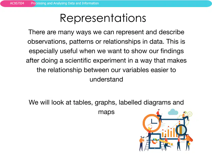
Which of the following is NOT mentioned as a way to represent data in the lesson?
Tables
Graphs
Labelled diagrams
Videos
4
Open Ended
Why is it important to use different types of representations, such as graphs and models, when analyzing patterns or relationships in data?
5
6
Multiple Choice
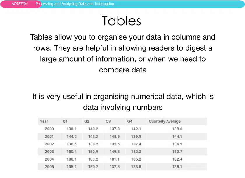
Which of the following is a key advantage of using tables to organize data?
They allow readers to digest large amounts of information easily.
They are only useful for textual data.
They make data less comparable.
They are not useful for numerical data.
7
8
Multiple Choice
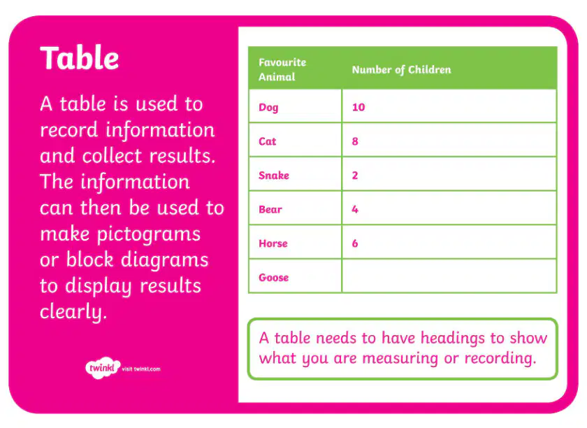
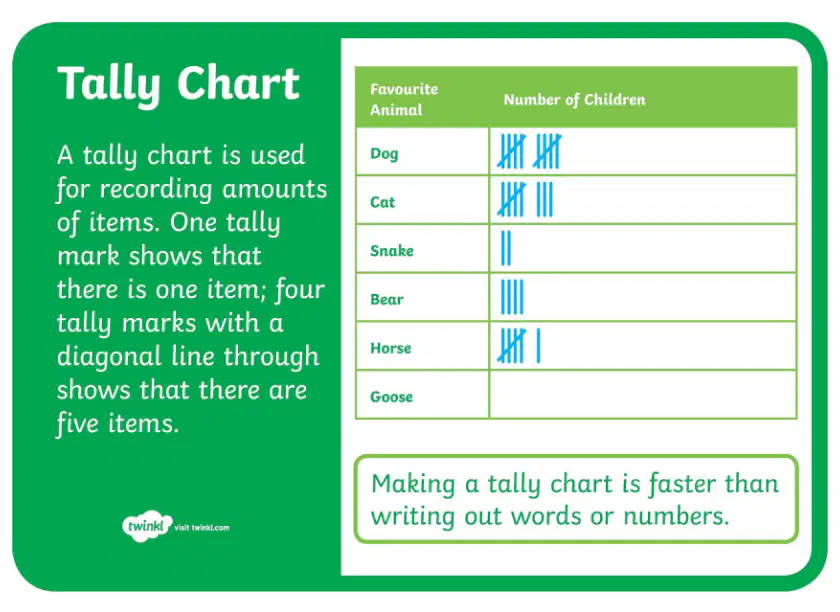
Based on the table of favourite animals, which animal was chosen by the fewest number of children?
Snake
Bear
Horse
Cat
9
10
Multiple Select
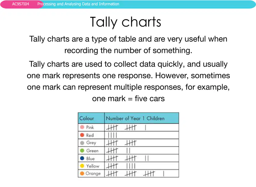
Which of the following statements about tally charts is correct?
Each tally mark always represents one response.
Tally charts cannot be used for numerical data.
Sometimes one tally mark can represent multiple responses.
Tally charts are not a type of table.
11
12
Open Ended
Explain the difference between a table and a tally chart in terms of how they record and present data.
13
14
Fill in the Blanks
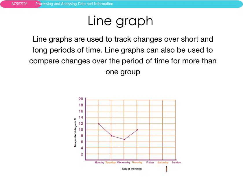
Line graphs are used to track changes over
Type answer...
15
16
Open Ended
Describe a scenario where using a line graph would be more effective than using a table or tally chart.
17
18
Multiple Choice
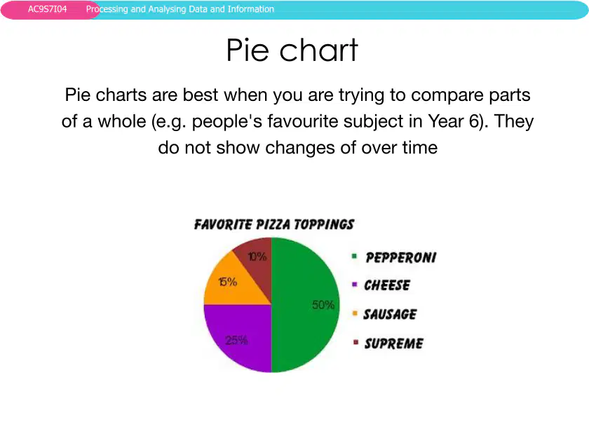
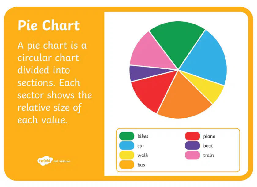
What is the main purpose of a pie chart?
To compare parts of a whole
To show changes over time
To display frequency of items
To show relationships between variables
19
20
Open Ended
Explain how a pie chart visually represents data and give an example of when you might use one.
21
22
Open Ended
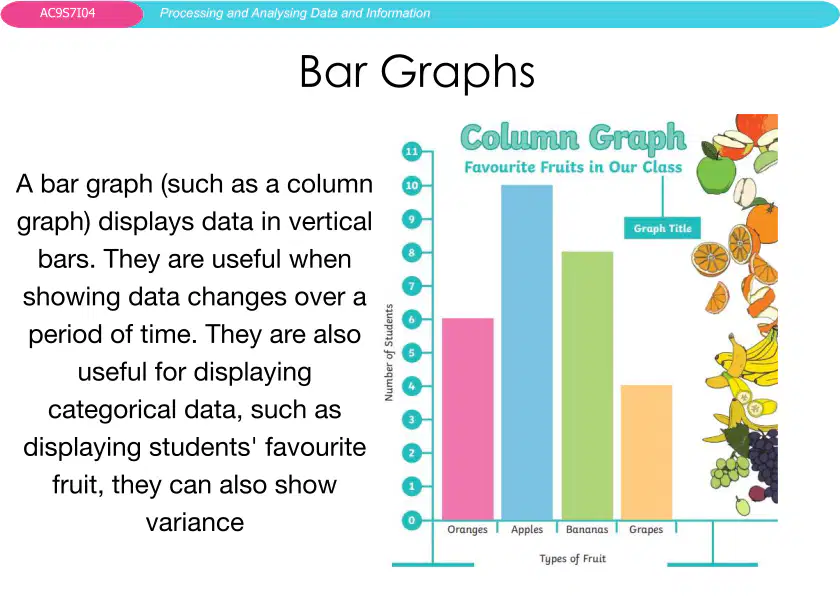
Describe the difference between a pie chart and a bar graph. When would you use each one?
23
Multiple Select
Which of the following are true about bar graphs?
They display data in vertical bars
They are useful for showing changes over time
They are best for comparing parts of a whole
They can show categorical data
24
25
26
Fill in the Blanks
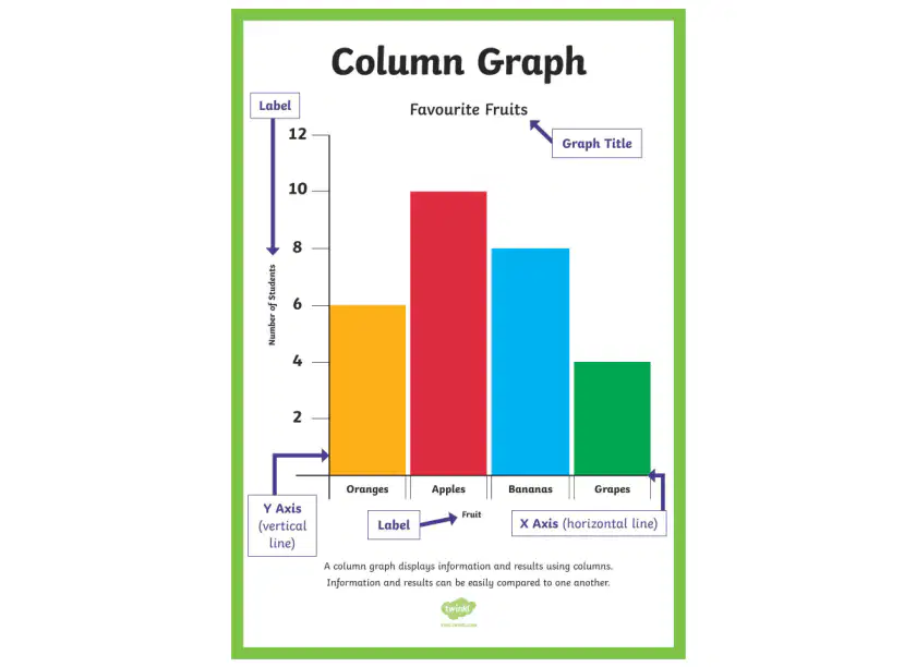
The vertical line on a column graph is called the
Type answer...
27
28
Multiple Choice
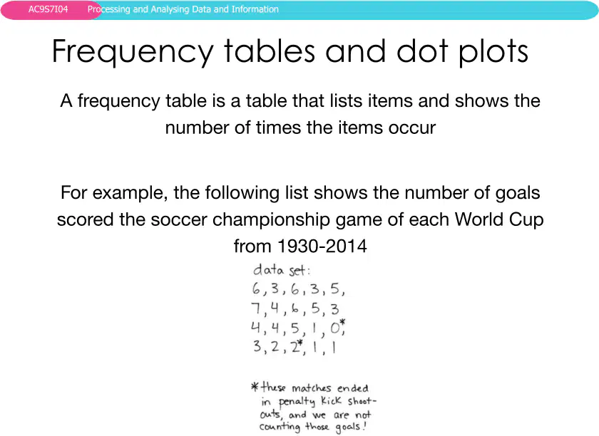
Which type of graph would be most suitable for showing the number of goals scored in each World Cup final from 1930-2014?
Pie chart
Bar graph
Frequency table
Line graph
29
30
Multiple Choice
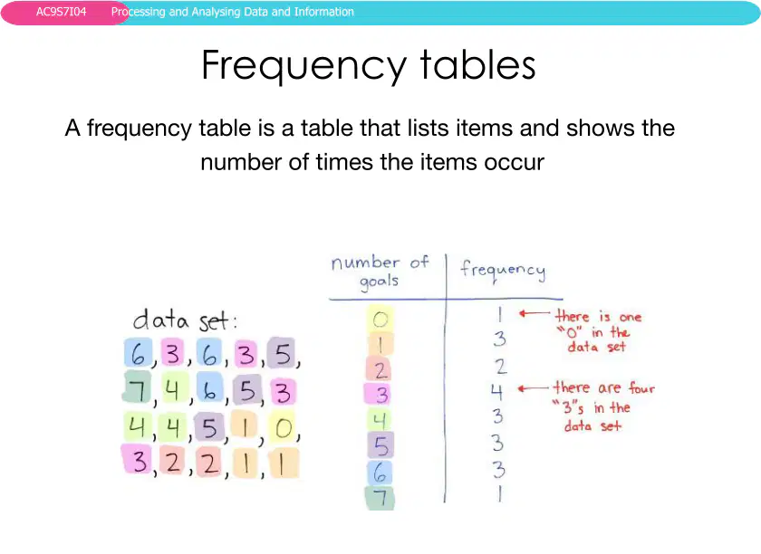
What is the main purpose of a frequency table?
To list items and show how many times each item occurs
To display data using dots
To show the relationship between two variables
To predict future outcomes
31
32
33
Open Ended
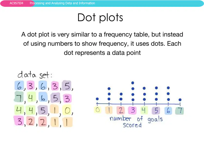
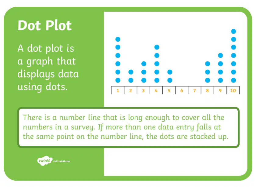
Compare and contrast frequency tables and dot plots. How does each method help in analyzing data?
34
Multiple Select
Which of the following statements about dot plots are correct?
A dot plot uses dots to represent data points.
Each dot in a dot plot represents a frequency of one.
Dot plots and frequency tables can represent the same data.
Dot plots are used to show trends over time.
35
36
Fill in the Blanks
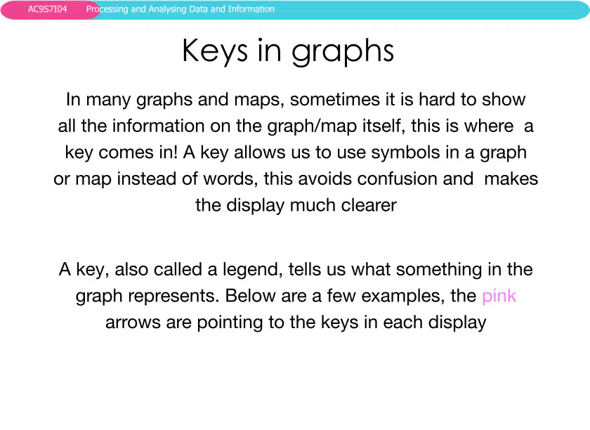
A key in a graph is also called a
Type answer...
37
38
Open Ended
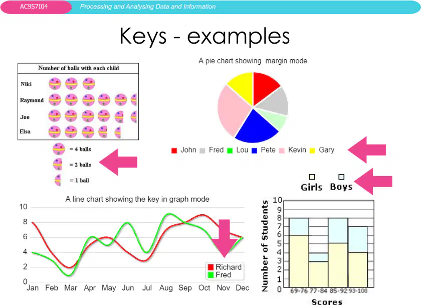
Explain how a key (legend) helps in understanding graphs and maps. Give an example from the images provided.
39
40
Multiple Choice
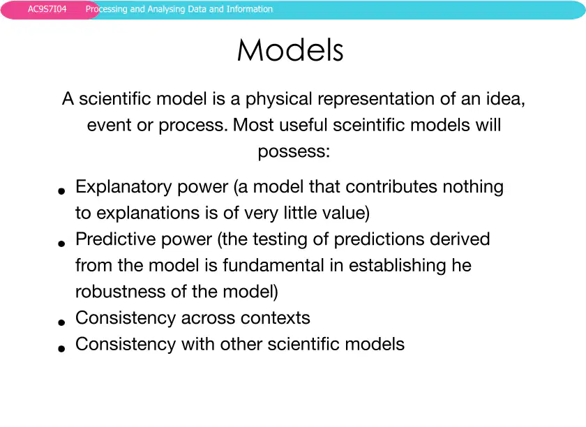
Which of the following is NOT a characteristic of a useful scientific model?
Explanatory power
Predictive power
Inconsistency across contexts
Consistency with other scientific models
41
42
Multiple Choice
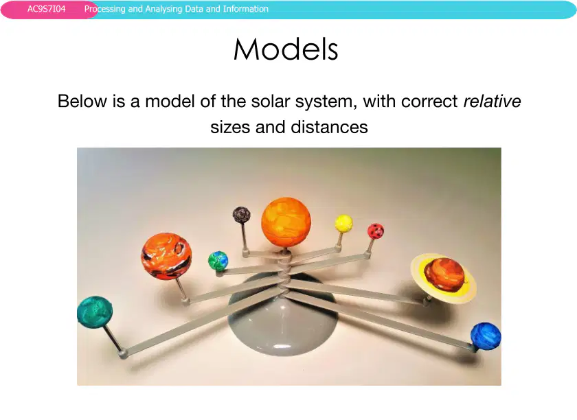
Which of the following best describes the purpose of the model shown in the image?
To show the exact appearance of planets
To represent the relative sizes and distances in the solar system
To display the chemical composition of planets
To show the temperature of each planet
43
44
Open Ended
What is a spreadsheet and how can it be used to analyze data?
45
46
Multiple Choice
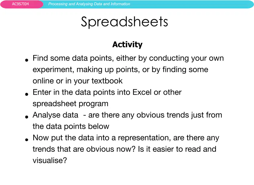
Based on the activities described, what are the steps involved in using a spreadsheet to analyze data?
Find data points, enter them into a spreadsheet, analyze trends, create a representation
Create a graph first, then enter data into a spreadsheet, analyze trends
Enter random numbers into a spreadsheet, print the table, draw a picture
Analyze data, then find data points, then enter into a spreadsheet
47
48
Fill in the Blanks
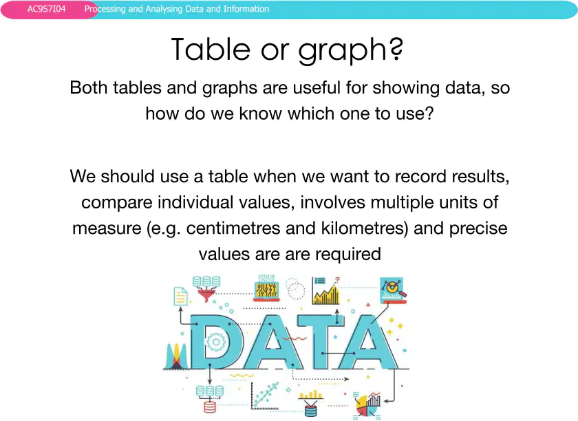
We should use a table when we want to record results, compare individual values, involve multiple units of measure, and when
Type answer...
49
50
Multiple Select
Which of the following are advantages of using graphs to represent data?
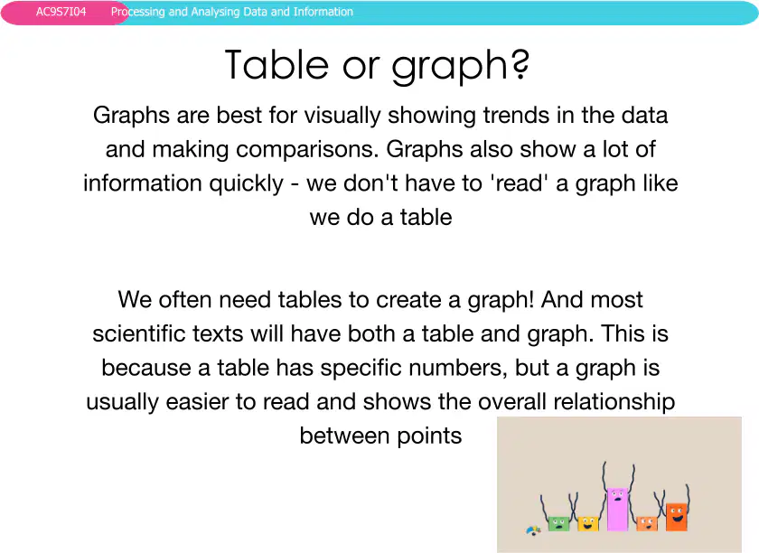
Graphs are best for visually showing trends and making comparisons
Graphs show a lot of information quickly
Graphs are always more accurate than tables
Graphs do not require any data from tables
51
52
Open Ended
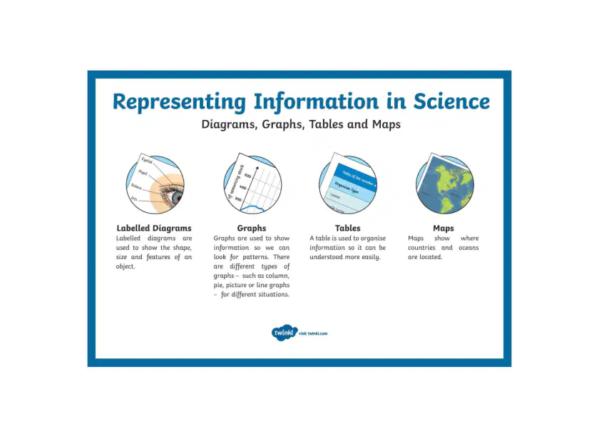
Compare and contrast the use of labelled diagrams, graphs, tables, and maps in representing scientific information. When might each be most useful?
53
54
Fill in the Blanks
Fill in the blank: Representing data using graphs, keys, and models helps us to identify
Type answer...
55
Open Ended
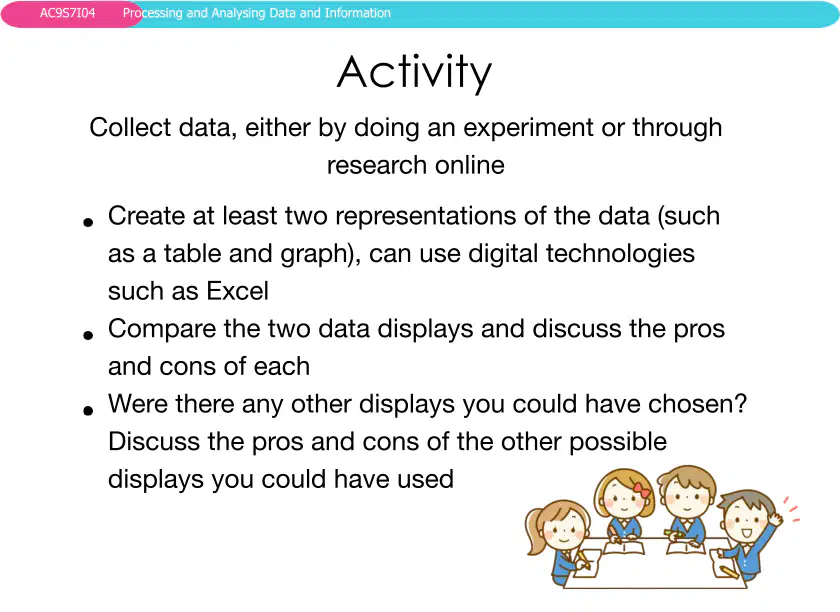
Why is it important to use different types of representations, such as graphs, tables, and diagrams, when analyzing data?
56
Multiple Choice
What are some advantages and disadvantages of using tables versus graphs to represent data?
Tables are easier to read for exact values, but graphs are better for visualizing trends.
Graphs are always more accurate than tables.
Tables take less time to create than graphs in all cases.
Graphs cannot be created using digital tools like Excel.
Show answer
Auto Play
Slide 1 / 56
SLIDE
Similar Resources on Wayground

50 questions
Plate Tectonics Review
Presentation
•
7th Grade
55 questions
Earth Science Review Lesson
Presentation
•
8th Grade
55 questions
Science TCAP Practice
Presentation
•
8th Grade
51 questions
Unit 1 Weather Review
Presentation
•
7th Grade
50 questions
Biomes and Ecosystems
Presentation
•
7th Grade
52 questions
PMA 1 Review Space Lesson
Presentation
•
8th Grade
49 questions
Evolution / Diversity of Life
Presentation
•
8th Grade
51 questions
Organization in the Biosphere
Presentation
•
8th Grade
Popular Resources on Wayground
10 questions
Safety Day 2026 – Student Review

Quiz
•
9th Grade
21 questions
Continents and Oceans
Quiz
•
6th Grade
20 questions
Parts of Speech
Quiz
•
5th Grade
16 questions
Subject & Predicate
Quiz
•
5th Grade
25 questions
Multiplication Facts
Quiz
•
5th Grade
12 questions
Map Skills
Quiz
•
3rd Grade
22 questions
Continents and Oceans
Quiz
•
5th Grade
15 questions
Rounding Decimals
Quiz
•
5th Grade
Discover more resources for Science
20 questions
Newton's Laws of Motion
Quiz
•
8th Grade
15 questions
potential and kinetic energy
Quiz
•
8th Grade
21 questions
Newton's Laws of Motion
Quiz
•
8th Grade
20 questions
Elements, Compounds and Mixtures
Quiz
•
8th Grade
10 questions
Exploring Chemical and Physical Changes

Interactive video
•
6th - 10th Grade
20 questions
Physical vs Chemical Changes
Quiz
•
8th Grade
20 questions
Conduction, convection, and Radiation Practice
Quiz
•
8th Grade
21 questions
Waves and Wave Properties
Quiz
•
6th - 8th Grade