Histogram Construction and Analysis
Interactive Video
•
Mathematics, Science, Computers
•
9th - 10th Grade
•
Practice Problem
•
Hard

Patricia Brown
FREE Resource
Read more
10 questions
Show all answers
1.
MULTIPLE CHOICE QUESTION
30 sec • 1 pt
What is the primary difference between a histogram and a vertical bar graph?
Histograms have gaps between bars.
Histograms represent data frequency distribution.
Vertical bar graphs have no gaps between bars.
Vertical bar graphs represent data frequency distribution.
2.
MULTIPLE CHOICE QUESTION
30 sec • 1 pt
What is the first step in constructing a histogram?
Label the x-axis with class boundaries.
Draw an x and y axis.
Calculate the frequency of each class.
Fill in the bars with color.
3.
MULTIPLE CHOICE QUESTION
30 sec • 1 pt
Why do we need to calculate class boundaries for a histogram?
To make the bars different widths.
To make the histogram colorful.
To ensure there are gaps between the bars.
To ensure consecutive bars touch each other.
4.
MULTIPLE CHOICE QUESTION
30 sec • 1 pt
How do you calculate the lower boundary of a class?
Subtract 1 from the lower limit.
Add 1 to the lower limit.
Subtract 0.5 from the lower limit.
Add 0.5 to the lower limit.
5.
MULTIPLE CHOICE QUESTION
30 sec • 1 pt
What does the squiggle on the x-axis represent?
A broken axis indicating scrunched values.
A decorative element.
A separator between different data sets.
A marker for the start of the data.
6.
MULTIPLE CHOICE QUESTION
30 sec • 1 pt
What should be done after marking the class boundaries on the x-axis?
Draw the bars for each class.
Label the y-axis with class names.
Calculate the total frequency.
Add colors to the bars.
7.
MULTIPLE CHOICE QUESTION
30 sec • 1 pt
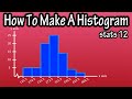
What is the frequency for class 3 in the example provided?
25
20
10
5
Access all questions and much more by creating a free account
Create resources
Host any resource
Get auto-graded reports
Continue with Google

Continue with Email
Continue with Classlink
Continue with Clever
or continue with
Microsoft
%20(1).png)
Apple
Others
Already have an account?
Popular Resources on Wayground

7 questions
History of Valentine's Day
Interactive video
•
4th Grade
15 questions
Fractions on a Number Line
Quiz
•
3rd Grade
20 questions
Equivalent Fractions
Quiz
•
3rd Grade
25 questions
Multiplication Facts
Quiz
•
5th Grade
22 questions
fractions
Quiz
•
3rd Grade
15 questions
Valentine's Day Trivia
Quiz
•
3rd Grade
20 questions
Main Idea and Details
Quiz
•
5th Grade
20 questions
Context Clues
Quiz
•
6th Grade
Discover more resources for Mathematics
20 questions
Graphing Inequalities on a Number Line
Quiz
•
6th - 9th Grade
20 questions
Exponent Properties
Quiz
•
9th Grade
15 questions
Combine Like Terms and Distributive Property
Quiz
•
8th - 9th Grade
20 questions
Function or Not a Function
Quiz
•
8th - 9th Grade
10 questions
Factor Quadratic Expressions with Various Coefficients
Quiz
•
9th - 12th Grade
10 questions
Elijah McCoy: Innovations and Impact in Black History
Interactive video
•
6th - 10th Grade
21 questions
Factoring Trinomials (a=1)
Quiz
•
9th Grade
5 questions
Triangle Congruence Theorems
Interactive video
•
9th - 12th Grade