Data Trends in Calcium Precipitation
Interactive Video
•
Chemistry
•
10th - 12th Grade
•
Practice Problem
•
Hard

Patricia Brown
FREE Resource
Read more
10 questions
Show all answers
1.
MULTIPLE CHOICE QUESTION
30 sec • 1 pt
What is the main focus of the ACT Science research summary question discussed in the video?
Understanding chemical reactions
Analyzing data trends
Learning about historical experiments
Memorizing scientific facts
2.
MULTIPLE CHOICE QUESTION
30 sec • 1 pt
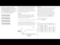
What does the x-axis represent in the graph from Figure 1?
Time in seconds
Total calcium precipitated
Temperature in Celsius
Total C204 added
3.
MULTIPLE CHOICE QUESTION
30 sec • 1 pt
How is the data for C204 represented in the graph?
In grams
In liters
In percentage
In 10 to the negative fifth moles
4.
MULTIPLE CHOICE QUESTION
30 sec • 1 pt
What is the main question being analyzed regarding calcium precipitation?
The color change of calcium
The total quantity of calcium precipitated
The speed of calcium precipitation
The temperature at which calcium precipitates
5.
MULTIPLE CHOICE QUESTION
30 sec • 1 pt
Where would the point for 30 times 10 to the fifth moles of C204 be located on the graph?
At the origin
At the top right corner
Somewhere around 30 on the x-axis
At the bottom left corner
6.
MULTIPLE CHOICE QUESTION
30 sec • 1 pt
What happens to the calcium precipitation trend at nine times ten to the negative fifth moles?
It increases rapidly
It fluctuates
It decreases
It stops
7.
MULTIPLE CHOICE QUESTION
30 sec • 1 pt
Why might some students find it difficult to interpret the data trend?
The graph is too small
The data trend is not moving
The data is in a foreign language
The graph is too colorful
Access all questions and much more by creating a free account
Create resources
Host any resource
Get auto-graded reports
Continue with Google

Continue with Email
Continue with Classlink
Continue with Clever
or continue with
Microsoft
%20(1).png)
Apple
Others
Already have an account?
