- Resource Library
- Math
- Probability And Statistics
- Data Visualization
- Data Visualization And Frequency Distributions
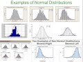
Data Visualization and Frequency Distributions
Interactive Video
•
Mathematics
•
9th - 10th Grade
•
Practice Problem
•
Hard

Thomas White
FREE Resource
Read more
9 questions
Show all answers
1.
MULTIPLE CHOICE QUESTION
30 sec • 1 pt
What is one of the main reasons for using data visualization?
To increase data size
To hide data from viewers
To visually convey data characteristics
To make data more complex
2.
MULTIPLE CHOICE QUESTION
30 sec • 1 pt
What is a frequency table used for?
To hide data variations
To display data in a pie chart
To calculate the mean of data
To list all possible data values and their frequencies
3.
MULTIPLE CHOICE QUESTION
30 sec • 1 pt
What are class boundaries in a frequency distribution?
The average of all class limits
The total number of classes
The numbers used to designate when a data value moves to the next class
The midpoint of each class
4.
MULTIPLE CHOICE QUESTION
30 sec • 1 pt
How do you determine the class width in a frequency distribution?
By dividing the total data by the number of classes
By multiplying the number of classes by the range
By subtracting the minimum data value from the maximum and dividing by the number of classes
By adding the maximum and minimum data values
5.
MULTIPLE CHOICE QUESTION
30 sec • 1 pt
What does a relative frequency distribution show?
The average data value in each class
The total sum of all data values
The percentage of data in each class
The exact number of data values in each class
6.
MULTIPLE CHOICE QUESTION
30 sec • 1 pt
What is the main difference between a histogram and a bar graph?
Histograms are used for discrete data, bar graphs for continuous data
Bar graphs are always taller than histograms
Histograms have touching bars, bar graphs do not
Histograms are always colored, bar graphs are not
7.
MULTIPLE CHOICE QUESTION
30 sec • 1 pt
What does it mean if a distribution is skewed to the right?
The data is evenly distributed
The distribution is symmetrical
The tail is longer on the left side
The tail is longer on the right side
Access all questions and much more by creating a free account
Create resources
Host any resource
Get auto-graded reports
Continue with Google

Continue with Email
Continue with Microsoft
or continue with

%20(1).png)
Apple
Others
Already have an account?
