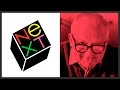
Understanding the NeXT Logo and Paul Rand's Design Philosophy
Interactive Video
•
Design
•
9th - 10th Grade
•
Practice Problem
•
Hard

Jennifer Brown
FREE Resource
10 questions
Show all answers
1.
MULTIPLE CHOICE QUESTION
30 sec • 1 pt
Who designed the NeXT logo in 1985?
Herb Lubalin
Paul Rand
Saul Bass
Milton Glaser
2.
MULTIPLE CHOICE QUESTION
30 sec • 1 pt
Which of the following logos was NOT designed by Paul Rand?
ABC
IBM
UPS
Apple
3.
MULTIPLE CHOICE QUESTION
30 sec • 1 pt
What shape inspired the design of the NeXT logo?
Cylinder
Sphere
Cube
Pyramid
4.
MULTIPLE CHOICE QUESTION
30 sec • 1 pt
Why did Paul Rand choose to use a lowercase 'e' in the NeXT logo?
To differentiate it from the word 'exit'
To emphasize the letter 'e' in education
To make it look more modern
To match the style of other logos
5.
MULTIPLE CHOICE QUESTION
30 sec • 1 pt
What angle was the NeXT logo designed to be at?
60 degrees
45 degrees
28 degrees
15 degrees
6.
MULTIPLE CHOICE QUESTION
30 sec • 1 pt
What was a key element of Paul Rand's presentation strategy for the NeXT logo?
Using a digital slideshow
Presenting a detailed booklet
Conducting a live demonstration
Creating a 3D model
7.
MULTIPLE CHOICE QUESTION
30 sec • 1 pt
What style of graphic design did Paul Rand incorporate into his work?
Art Nouveau
Swiss Style
Bauhaus
Pop Art
Access all questions and much more by creating a free account
Create resources
Host any resource
Get auto-graded reports
Continue with Google

Continue with Email
Continue with Classlink
Continue with Clever
or continue with
Microsoft
%20(1).png)
Apple
Others
Already have an account?
