Free Printable Population Age Structure Worksheets for Year 12
Explore Wayground's comprehensive Year 12 population age structure worksheets featuring free printables and PDFs that help students analyze demographic patterns, interpret population pyramids, and master essential geography concepts with detailed practice problems and answer keys.
Explore printable Population Age Structure worksheets for Year 12
Population age structure worksheets for Year 12 students available through Wayground (formerly Quizizz) provide comprehensive practice in analyzing demographic pyramids, dependency ratios, and population distribution patterns across different countries and time periods. These expertly designed resources strengthen critical analytical skills as students interpret graphical data, calculate demographic indicators, and evaluate the socioeconomic implications of varying age structures in both developed and developing nations. The collection includes detailed practice problems that guide students through population momentum concepts, birth and death rate analysis, and the examination of how historical events influence demographic transitions, with complete answer keys and free printable materials supporting independent study and classroom instruction.
Wayground (formerly Quizizz) empowers educators with millions of teacher-created population age structure resources that feature robust search and filtering capabilities, ensuring alignment with state geography standards and Year 12 curriculum requirements. The platform's differentiation tools enable teachers to customize worksheets for varying skill levels, while flexible formatting options provide both printable pdf versions and interactive digital activities that accommodate diverse learning environments. These comprehensive collections support strategic lesson planning by offering materials for initial skill introduction, targeted remediation for students struggling with demographic concepts, and enrichment activities for advanced learners ready to explore complex population forecasting and policy implications, making population geography instruction more effective and engaging.
FAQs
How do I teach population age structure to my students?
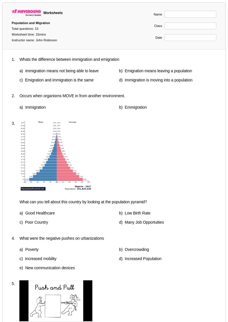
Start by introducing population pyramids as visual tools that display age and sex distribution within a country, then have students compare pyramids from developed and developing nations side by side. Walk students through the demographic transition model to explain how birth rates, death rates, and migration shift a population's shape over time. Anchoring the lesson in real-world examples — such as Japan's aging population versus Nigeria's youth-heavy structure — helps students connect abstract demographic data to economic and social outcomes.
What exercises help students practice interpreting population pyramids?
Effective practice tasks include calculating dependency ratios, identifying whether a pyramid reflects a growing, stable, or declining population, and predicting future trends based on current age-sex structures. Students also benefit from comparing pyramids across two or more countries and explaining what the differences reveal about economic development and social services. Practice problems that require students to read actual demographic data — rather than simplified diagrams — build the analytical skills assessed on AP Human Geography and IB Geography exams.
What mistakes do students commonly make when analyzing population age structure?
A frequent error is conflating the shape of a population pyramid with population size — students often assume a wide base always means a large total population rather than a high birth rate relative to other age groups. Students also struggle to distinguish between dependency ratio interpretation and raw age group percentages, leading to incorrect conclusions about economic strain. Another common misconception is assuming that a narrow base automatically signals population decline, when it may instead reflect falling birth rates in a country that still has strong overall population momentum.
How can I differentiate population age structure lessons for students at different skill levels?
For students who need additional support, simplify the pyramid by focusing only on broad age bands — youth, working-age, and elderly — before introducing more granular five-year cohorts. Advanced learners can extend their analysis to demographic projections and policy implications, such as how an aging population affects pension systems or healthcare spending. On Wayground, teachers can apply accommodations such as read aloud, reduced answer choices, and extended time to individual students, allowing the same core activity to serve the full range of learners without creating separate lesson plans.
How do I use Wayground's population age structure worksheets in my classroom?
Wayground's population age structure worksheets are available as printable PDFs for traditional classroom use and in digital formats for technology-integrated environments, giving teachers flexibility regardless of classroom setup. You can assign them as in-class practice, homework, or host them directly as a quiz on Wayground to collect student responses and monitor performance. Answer keys are included with each worksheet, supporting both teacher-led review and independent student self-assessment.
How does population age structure connect to economic development?
A population's age distribution directly influences its economic capacity — countries with a large working-age population relative to dependents (a demographic dividend) tend to experience faster economic growth, while those with high elderly or youth dependency ratios face greater pressure on social services and public spending. Understanding this connection helps students analyze why developing nations with high birth rates often struggle to fund education and healthcare, while aging developed nations face pension and labor shortages. This demographic-economic link is a core concept in AP Human Geography and IB Geography curricula.