Graphing and analyzing Data is a free printable mathematics worksheet for Grades 6–7 that helps students interpret data displays and frequency information. The 10 multiple-choice questions ask students to identify the mode in categorical data and frequency tables, interpret relative and cumulative frequencies, determine percentages, and use percentages or frequency data to find totals and subgroup counts.
Students also analyze age-group data by finding how many people meet conditions such as being at least or less than a specified age. This worksheet gives learners practice moving between categories, frequencies, percentages, and real-world quantities while selecting and justifying the best answer. It includes a complete answer key for efficient checking, review, or independent practice.
Worksheet settings
Font size
S
M
L
XL
Worksheets
Graphing and analyzing Data
Total questions: 10
Name
Class
Date
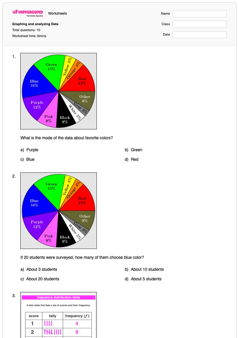
1.
What is the mode of the data about favorite colors?
a)
Purple
b)
Green
c)
Blue
d)
Red
2.
If 20 students were surveyed, how many of them choose blue color?
a)
About 3 students
b)
About 10 students
c)
About 20 students
d)
About 5 students
3.
Looking at the frequency table. What is the mode?
a)
A score of 3
b)
A score of 5
c)
A score of 2
d)
A score of 7
4.
What is the relative or cumulative frequency for 30 to 39 years?
a)
22
b)
16
c)
27
d)
7
5.
What is the relative or cumulative frequency for 40-49 years old?
a)
12
b)
22
c)
23
d)
25
6.
What percent of students choose Cars?
a)
10%
b)
9%
c)
11%
d)
14%
7.
How many students total do like hotdogs and burgers?
a)
60 students
b)
55 students
c)
45 students
d)
20 students
8.
If 120 students gave their answers. How many of them choose the History Museum?
a)
25 students
b)
36 students
c)
40 students
d)
50 students
9.
How many people is at least 50 years old?
a)
8 people
b)
10 people
c)
5 people
d)
3 people
10.
How many people is less than 70 years old?
a)
18 people
b)
16 people
c)
10 people
d)
9 people
Answer Key
Graphing and analyzing Data
Total questions: 10
1.
c)
Blue
2.
a)
About 3 students
3.
c)
A score of 2
4.
a)
22
5.
c)
23
6.
c)
11%
7.
b)
55 students
8.
b)
36 students
9.
b)
10 people
10.
a)
18 people
140 %
Browse by subjects
Browse by grades
Browse by format
FAQs
What does the Graphing and analyzing Data worksheet cover?
This Grade 6–7 mathematics worksheet uses 10 multiple-choice questions to practice identifying the mode from categorical data and frequency tables, interpreting relative or cumulative frequency, and calculating percentages and totals from data. Students apply these skills to survey results, preferences, and age-group information, building accuracy in reading data and connecting frequencies to real quantities.
How can I use this worksheet to teach students to analyze frequency data?
Introduce the worksheet by modeling how to locate the category or score with the greatest frequency, then distinguish that mode from the frequency itself. Next, guide students through one percentage-to-count example and one age-range example before assigning the remaining multiple-choice items. Ask students to explain which value in the data display supports each answer, especially for the relative or cumulative frequency and “at least” or “less than” questions.
What mistakes should I watch for when students complete this data analysis worksheet?
Students may choose the largest number shown instead of the category or score that occurs most often when identifying the mode. They may also confuse a frequency with a percentage, use the wrong total when converting a percentage to a number of students, or misread cumulative age groups when answering “at least” and “less than” questions. Have them identify the relevant category, unit, and comparison phrase before selecting an answer.
How do I assign and grade this Graphing and analyzing Data worksheet?
The worksheet is available as a printable PDF and as a digital quiz on Wayground, and it includes a complete answer key for grading the 10 multiple-choice questions. For printable submissions, you can scan student work with the Wayground for Teachers app to streamline grading. The PDF option can also support classes that are reducing screen time while students practice interpreting frequency tables and survey data.
How does this worksheet build data-analysis skills beyond identifying the mode?
After asking students to identify modes, the worksheet extends their reasoning to relative and cumulative frequency, percentages, combined totals, and counts within age ranges. These questions require students to interpret what a data value represents and use it to answer a real-world quantity question, rather than simply read a single entry from a table.
Where can I find more free worksheets like this on Wayground?
Wayground offers a comprehensive collection of free printable worksheets and practice problems across subjects, with downloadable PDFs and answer keys to help students master essential skills and concepts. Browse more resources at https://wayground.com/en-us/worksheets.

 Worksheets


