
Wayground
Graphing and Data Analysis - Printable Science Worksheets - Wayground

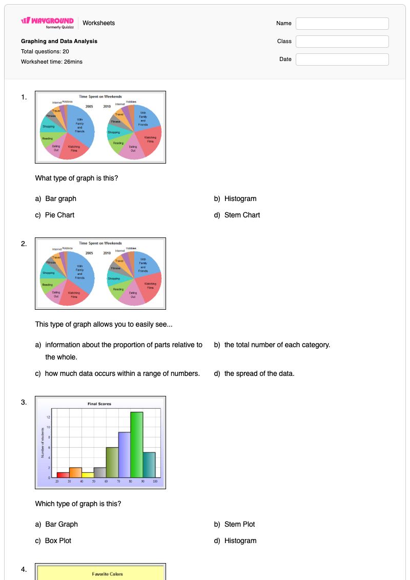
Graphing and Data Analysis

20 questions

6th - 8th Grade

Science

Graphing and Data Analysis is a free printable Science worksheet for Grades 6–8 that develops students’ ability to identify, interpret, and compare common data displays. Across 20 items—18 multiple-choice questions and 2 multiple-select questions—students recognize pie or circle graphs, histograms, bar graphs, line graphs, pictographs, and scatterplots, then connect each display to its purpose, such as showing parts of a whole or change over time. The worksheet also asks students to read values from graphs, make a prediction from a scatterplot, calculate range as the difference between the maximum and minimum, and determine median and percentages represented by data. It is useful for guided practice, independent review, or a formative check of middle school data-analysis skills. The worksheet is available as a free printable PDF and includes a complete answer key for efficient checking.

Worksheet settings

Font size

S
M
L
XL
Worksheets

Graphing and Data Analysis

Total questions: 20

Name
Class
Date
1.
What type of graph is this?
a)
Bar graph
b)
Histogram
c)
Pie Chart
d)
Stem Chart
2.

This type of graph allows you to easily see...

a)

information about the proportion of parts relative to the whole.

b)

the total number of each category.

c)

how much data occurs within a range of numbers.

d)

the spread of the data.

3.
Which type of graph is this?
a)
Bar Graph
b)
Stem Plot
c)
Box Plot
d)
Histogram
4.
How many more people like purple than red?
a)
3
b)
5
c)
7
d)
9
5.
What type of graph is this?
a)
Bar Graph
b)
Line Plot
c)
Pictograph
d)
Tally Chart
6.
Which type of graph shows change over time?
a)
bar graph
b)
line graph
c)
circle graph
7.
I have no axes at all. I help compare parts to a whole. What am I?
a)
Circle Graph
b)
Histogram
c)
Line Graph
d)
Bar Graph
8.
I have an x-axis and a y-axis. I help to track changes over time. What am I?
a)
Circle Graph
b)
Histogram
c)
Line Graph
d)
Dot Plot
9.
What type of graph is this?
a)
Line Graph
b)
Pictograph
c)
Bar Graph
d)
Histogram
10.

What type of graph is this?

a)

circle graph

b)

pictograph

c)

line graph

11.

Phil collected data from several of his friends about the number of hours they spent sleeping and the number of hours they spent playing video games on Saturday. He recorded the data in the scatterplot.


Based on the scatterplot, what is the best prediction of the number of hours one of Phil's friends spends sleeping when the friend spends 1 hour playing video games?

a)

9 hours

b)

11 hours

c)

7 hours

d)

8 hours

12.
1. Which of the following best describes the process of finding the range for a set of data?
a)
ADD the biggest and smallest numbers
b)
Place the number in order from least to greatest then find the middle.
c)
Find the difference between the Maximum and the Minimum.
d)
Find the average.
13.
6. Which city has a higher median?
a)
Millersburg
b)
Arcadia
14.
11. What percentage of the data is between 90 and 140?
a)
25 %
b)
50%
c)
75%
d)
100%
15.
What is the median?
a)
62
b)
58
c)
66
d)
60
16.

This type of data is limited to facts, statistics, figures, numerical information, percentages.

a)

Quantitative

b)

Qualitative

17.

This type of data includes but is not limited to words, pictures, discussions, audio and video recordings, comments, observations.

a)

Quantitative

b)

Qualitative

18.
Which method of collection would you use to collect this data ?
How often a slice of buttered bread lands 'butter down' when it is dropped 50 times?
a)
experiment
b)
observation 
c)
survey
19.
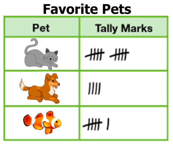
What type of graph is this?
a)
bar graph
b)
pictograph
c)
tally chart
20.

Information collected during an experiment is called

a)

prediction

b)

data

c)

labels

Answer Key

Graphing and Data Analysis

Total questions: 20

1.
c) Pie Chart
2.
a)

information about the proportion of parts relative to the whole.

3.
d) Histogram
4.
b) 5
5.
a) Bar Graph
6.
b) line graph
7.
a) Circle Graph
8.
c) Line Graph
9.
a) Line Graph
10.
b)

pictograph

11.
a)

9 hours

12.
c) Find the difference between the Maximum and the Minimum.
13.
b) Arcadia
14.
b) 50%
15.
a) 62
16.
a)

Quantitative

17.
b)

Qualitative

18.
a) experiment
19.
c) tally chart
20.
b)

data

FAQs

What does the Graphing and Data Analysis worksheet cover?

This Grade 6–8 Science worksheet uses 18 multiple-choice and 2 multiple-select items to assess graph identification and data interpretation. Students distinguish among pie or circle graphs, histograms, bar graphs, line graphs, pictographs, and scatterplots, explain what each display shows, read values, predict from a scatterplot, and analyze range, median, and percentages.

How can I use this worksheet to teach graph types and data analysis?

Begin by reviewing the purpose and visual features of each graph type, including axes, categories, parts of a whole, and change over time. Have students explain why a particular display fits each question before completing the identification items, then use the range, median, percentage, and scatterplot questions for guided practice in interpreting data rather than only naming graphs.

What mistakes should I watch for when students complete this worksheet?

Students may confuse histograms with bar graphs, or select a line graph without checking whether the data show change over time. Watch for errors in reading a circle graph as a total rather than a proportion, finding range by adding instead of subtracting the minimum from the maximum, and choosing a scatterplot prediction without matching the requested input value.

How do I assign and grade this Graphing and Data Analysis worksheet?

Wayground provides this worksheet as a printable PDF and as a digital quiz, with a complete answer key for all 20 items. You can grade printable submissions by scanning student work with the Wayground for Teachers app, or review responses from the digital quiz.

How can I differentiate this worksheet for my students?

Use the worksheet’s Advanced Settings to adjust font spacing or font size so graph labels, answer choices, and data-analysis prompts are easier to read. You can also enable a dyslexia-friendly font or translate the worksheet into another language while students work through the graph-identification and interpretation items.

Where can I find more worksheets like this on Wayground?

Wayground offers a comprehensive collection of free printable worksheets and practice problems across subjects, with downloadable PDFs and answer keys to support essential skills and concepts. Browse more resources at https://wayground.com/en-us/worksheets.