wayground logo

Free Printable Worksheets

Font size

S
M
L
XL
Worksheets

Year 11 GAIT term 1 week 4

Total questions: 110

Worksheet time: 1hrs 10mins

Name
Class
Date
1.

Colours that are opposite each other on the colour wheel are considered to be _______________________.

a)

bright

b)

complementary

c)

dull

d)

triadic

2.

What is this called?

a)

Colour Circle

b)

Colour Prism

c)

Colour Wheel

d)

Colour Spectrum

3.

What are these called?

a)

Tertiary Colours

b)

Primary Colours

c)

Secondary Colours

4.

What are these called?

a)

Tertiary Colours

b)

Secondary Colours

c)

Primary Colours

5.
what does red and blue make?
a)
purple
b)
orange
c)
green
6.
What does red and yellow make?
a)
purple
b)
orange
c)
green
7.
What are the three primary colors?
a)
purple, green, orange
b)
red, blue, yellow
c)
red, blue, green
d)
red, blue, orange
8.

Mixing primary and secondary Colours give us what?

a)

Monochromatic Colours

b)

Primary Colours

c)

Tertiary Colours

9.

When you mix a colour with BLACK you make a __________?

a)

Tint

b)

Tone

c)

Shade

10.
When you mix a color with WHITE you make a ___________?
a)
Tint
b)
Shade
c)
Tone
11.

What is NOT an example of a set of complementary colours?

a)

yellow and purple

b)

green and blue

c)

red and green

d)

orange and blue

12.

Which one is NOT a cool colour?

a)

purple

b)

green

c)

yellow

d)

blue

13.

Primary and Secondary colours are mixed to create what classification of colour?

a)

Secondary

b)

Complimentary

c)

Analagous

d)

Tertiary

14.

A non-saturated color is

a)

not very bright

b)

dry

c)

grey

d)

black

15.

Hue is another name for

a)

a funny laugh

b)

colour

c)

a type of print ink

d)

highlight

16.

Monochromatic colour scheme uses:

a)

1 colour

b)

2 colours

c)

3 colours

d)

4 colours

17.

A shade is a colour mixed with _____

a)

black

b)

white

c)

grey

d)

All of the above

18.

Analogous colours are

a)

Opposite each other in the colour wheel

b)

Equidistant from each other in the colour wheel

c)

Next to each other in the colour wheel

d)

Not on the colour wheel

19.

Red, blue and yellow are an example of what colour scheme?

a)

Split-complimentary

b)

Triad

c)

Monochromatic

d)

Tetradic

20.

The primary colours in a digital environment are

a)

red, green and yellow

b)

red, yellow and blue

c)

red, blue and green

d)

red, green and black

21.

An additive colour model starts with

a)

Black

b)

White

22.

The True Colour colour depth uses

a)

24 bits

b)

32 bits

c)

48 bits

d)

16 bits

23.

RGBA uses how many bits for each channel?

a)

32

b)

8

c)

16

d)

4

24.

A tint is a colour mixed with

a)

Grey

b)

Black

c)

White

d)

It's opposite

25.

What is a hue?

a)

A shade

b)

A tint

c)

A tone

d)

A colour

e)

A gradient

26.

What is the complementary colour of yellow-green?

a)

Blue Green

b)

Purple Blue

c)

Orange Red

d)

Purple Red

27.

Green, yellow green and what other colour are harmonious?

a)

Blue

b)

Yellow

c)

Purple

d)

Orange

28.

How do you work out a complementary colour?

a)

The remaining two primary colours mixed together

b)

The opposite colour on the colour wheel

c)

When you stare at the colour for a while, you blink the complementary colour

d)

All of the answers are correct

29.

How would you create a shade of red?

a)

Add black

b)

Add white

c)

Add grey

d)

All of the above

30.

What is a tint?

a)

Black added

b)

Grey added

c)

White added

d)

Shade added

31.

What is a tone?

a)

Black added

b)

White added

c)

Grey added

d)

Non of the above

32.

Which of the following is not a warm colour?

a)

Red Orange

b)

Orange Yellow

c)

Purple Blue

d)

Red purple

33.

Which of the following is not a warm colour?

a)

Red Orange

b)

Orange Yellow

c)

Purple Blue

d)

Red purple

34.

Which of the following is a cool colour?

a)

Green yellow

b)

Purple red

c)

Blue green

d)

Red orange

35.

What colour contrasts red?

a)

Yellow

b)

Orange

c)

Green

d)

Blue

36.

What colour contrasts purple?

a)

Green

b)

Yellow

c)

Blue

d)

Red

37.

What colour contrasts orange?

a)

Green

b)

Yellow

c)

Blue

d)

Red

38.

What colour harmonises with red?

a)

Blue

b)

Green

c)

Orange

d)

Yellow

39.

What colour harmonises with blue?

a)

Yellow

b)

Green

c)

Orange

d)

Red

40.
This block of text is
a)
justified
b)
unjustified
c)
script
d)
decorative
41.
Typeface family with a formal, handwritten appearance.
a)
Serif
b)
Sans Serif
c)
Script
d)
Decorative
42.
Typeface style that is "without" little bars.
a)
Serif
b)
Sans Serif
c)
Script
d)
Decorative
43.
Typeface family that is suggested only to be used as headings or subheadings and never in large bodies of text.
a)
Serif
b)
Sans Serif
c)
Script
d)
Decorative
44.
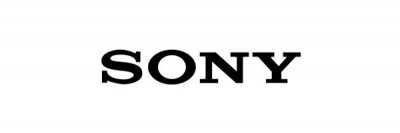
What type face style does this logo use?
a)
Serif
b)
Sans Serif
c)
Script
d)
Decorative
45.
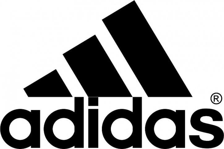
What type face style does this logo use?
a)
Serif
b)
Sans Serif
c)
Script
d)
Decorative
46.
What type face style does this logo use?
a)
Serif
b)
Old Style
c)
Script
d)
Decorative
47.
The imaginary line on which letters seems to be sitting.
a)
Baseline
b)
Meanline
c)
Cap height
d)
Bottom line
48.
The standard height of a lowercase x.
a)
Baseline
b)
x-height
c)
Cap height
d)
Bottom line
49.
The standard height of most capital letters.
a)
Baseline
b)
Meanline
c)
Cap height
d)
Bottom line
50.
The part of letters such as “h” and “k” that goes above the x-height of lower case letters?
a)
Ascender
b)
Descender
c)
Cap-height
d)
x-height
51.
What is the part of a letter (as in g p y) that goes below the baseline?
a)
Ascender
b)
Descender
c)
Cap-height
d)
x-height
52.
Typeface style that is most readable on printed media.
a)
Serif
b)
Sans Serif
c)
Script
d)
Decorative
53.
Typeface style with little bars.
a)
Serif
b)
Sans Serif
c)
Script
d)
Decorative
54.
Serif or Sans Serif?
a)
Serif
b)
Sans Serif
55.
Serif or Sans Serif?
a)
Serif
b)
Sans Serif
56.
Serif or Sans Serif?
a)
Serif
b)
Sans Serif
57.
Are these fonts Serif or Sans Serif?
a)
Serif
b)
Sans Serif
58.
Serif fonts do not have feet at the ends of the letters.
a)
True
b)
False
59.
Serif fonts do not have feet at the ends of the letters.
a)
True
b)
False
60.
Bad contrast in color can make your text unreadable and your eyes squint
a)
True
b)
False
61.
Which type of font is commonly used for headlines and mobile devices?
a)
Serif
b)
Sans Serif
62.
The arrow is pointing to what part of the type?
a)
Cap Height
b)
Descender
c)
X-Height
d)
Baseline
63.
The arrow is pointing to what part of the type?
a)
Ascender
b)
Descender
c)
X-Height
d)
Counter
64.
The arrow is pointing to what part of the type?
a)
Ascender
b)
Descender
c)
X-Height
d)
Counter
65.
The arrow is pointing to what part of the type?
a)
X-Height
b)
Ascender
c)
Baseline
d)
Counter
66.
Type height is measured in:
a)
inches
b)
points
c)
picas
d)
kilojoules
67.
Adjusting the spacing between letters is known as
a)
leading
b)
kerning
c)
nit-picking
d)
typesetting
68.
"Leading" refers to the:
a)
space between letters
b)
space between lines of text
c)
text alignment
d)
space between words
69.
The terms "typeface" and "font" mean the same thing.
a)
True
b)
False
70.
TRUE or FALSE: When designing text, it is typically best to select two or three fonts to create visual hierarchy.
a)
true
b)
false
71.
_______ can be curved, zig zag, or geometric (straight).
a)
color
b)
Space
c)
Form
d)
line
72.
What color scheme is used in this painting?
a)
Secondary colors
b)
Warm colors
c)
Cool Colors
d)
Primary Colors
73.
These colors are bright, vibrant, and alive.
a)
Hue
b)
Primary colors
c)
Cool colors
d)
Warm colors
74.

What is a self contained 2-dimensional defined area and can be geometric or organic?

a)

Shape

b)

Color

c)

Size

d)

Value

75.
What is the surface quality of a shape - rough, smooth, soft hard glossy etc.
a)
Texture
b)
Value
c)
Color
d)
Size
76.

A mark with length and direction, created by connecting two points.

a)

Rhythm

b)

Line

c)

Movement

d)

Space

77.

An element of design referring to the way the elements are arranged to create a feeling of stability in a work. (equal visual weight)

a)

Balance

b)

Space

c)

Form

d)

Emphasis

78.
What do we call the empty or open area between, around, above, below, and within objects?
a)
Balance
b)
Movement
c)
Rhythm
d)
Space
79.
The image is a good example of which element?
a)
pattern
b)
texture
c)
shape
d)
emphasis
80.

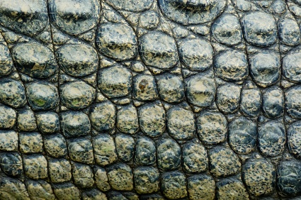
The ____________ surface characteristics of a work of art that are either felt or perceived visually.

a)

Line

b)

Form

c)

Texture

d)

Color

81.

The volume and shape of a three-dimensional work, or an image that gives the illusion of being three dimensional.

a)

Line

b)

Form

c)

Texture

d)

Color

82.

A feeling of equality in weight, attention, or attraction of the various elements within a composition as a means of accomplishing unity.

a)

Balance

b)

Symmetrical Balance

c)

Asymmetrical Balance

d)

Proportion

83.

This can be described as having equal "weight" on equal sides of a centrally placed axis.

a)

Balance

b)

Symmetrical Balance

c)

Asymmetrical Balance

d)

Proportion

84.

This is an example of

a)

balance

b)

line

c)

shape

d)

form

e)

texture

85.

This is an example of

a)

balance

b)

line

c)

shape

d)

form

e)

texture

86.

This is an example of

a)

balance

b)

line

c)

shape

d)

form

e)

texture

87.

This is an example of

a)

balance

b)

line

c)

shape

d)

form

e)

texture

88.

This is an example of

a)

balance

b)

line

c)

shape

d)

form

e)

texture

89.

Which of these is a representation of a shape?

a)
b)
c)
d)
90.

The white space in this image would be

a)

positive

b)

negative

c)

neutral

91.

Which image is not a good representation of texture?

a)
b)
c)
d)
92.
It is the weight distributed in the design by the placement of your elements.
a)
Balance
b)
Proximity
c)
Repetition
d)
Contrast
93.

What is an element in art that gives a sense of 3-dimensionality or depth (Shape + value = ???)

a)

color

b)

value

c)

form

d)

line

94.

is a straight one-dimensional figure having no thickness and extending infinitely in both directions

a)

lines

b)

shapes

c)

texture

d)

contrast

95.

It occurs when two or more related elements are displayed differently

a)

shapes

b)

colors

c)

texture

d)

contrast

96.
Line, color, value, texture, shape, form, and space are considered...
a)
elements of design
b)
principles of design
97.
Balance, pattern, movement, emphasis, rhythm, unity, and contrast are considered...
a)
principles of design
b)
elements of design
98.
Pattern uses the art elements in planned or random repetitions to enhance surfaces of paintings or sculptures.  Which of the examples given below is NOT a pattern?
a)
quilt
b)
grapefruit (sliced open)
c)
jewelry
d)
plain white canvas
99.
The principle of contrast refers to differences in values, colors, textures, shapes, and other elements.  Which company used contrast in commercials to promote a popular product?
a)
Apple
b)
Samsung
c)
Microsoft
d)
LG
100.
Rhythm is the __________ of visual movement--colors, shapes, or lines.  Fill in the missing word.
a)
repetition
b)
stopping
c)
replacing
101.
Visual movement is used by artists to direct viewers through their work, often to a certain point in the picture. This is called a...
a)
empty space
b)
back drop
c)
focal point
102.
The principle of balance refers to the distribution of visual weight in a work of art.  This famous image, popular in Chinese culture, is called...
a)
Yin & Yang
b)
Pisces symbol
c)
the Rooster
103.
The principle of emphasis is used by artists to create dominance & focus in their work.  Your eye is drawn to which color?
a)
red 
b)
green
104.
The principle of unity provides the cohesive quality that makes an art work feel complete & finished. The painting 'The Starry Night' was painted by which artist?
a)
Vincent Van Gogh
b)
Picasso
c)
Salvador Dali
105.
The element of space has depth, width, and height.  Actual space is a ___-dimensional volume that can be empty or filled with objects. Choose the best answer based on the image provided.
a)
1
b)
2
c)
3
106.
The element of texture refers to the surface quality, both simulated & actual, of artwork.  Texture describes how something...
a)
feels
b)
smells
c)
sounds like
107.
The element of value refers to light and dark. Value contrasts helps us to see & understand a 2-dimensional work of art. What popular fruit is shown in this image?
a)
pumpkin
b)
apple
c)
cucumber
108.
The element of color depends on light because it's made of light.  The whiter the light, the more true the colors will be.  Hue refers to the names of the colors. Which trio of colors are considered primary?
a)
green, orange, violet
b)
red, blue, yellow
109.
The element of form describes the volume & mass or the three dimensional aspects of objects that take up space. Which object is not shown in the following image?
a)
rectangular prism
b)
cube
c)
cylinder
110.
The element of line is a mark made by a pointed tool--brush, pencil, stick, pen, etc. and is often defined as a moving dot.  True or false?
a)
true
b)
false