
 Worksheets
Choosing a Graph
Total questions: 35
Worksheet time: 2hrs 2mins
You did a survey among 35 teenagers about their favorite sports. What graph should you use to represent the number of responses in each sport?
histogram
bar graph
pie graph
scatter plot
A class carried out an experiment to measure the length of 20 mango leaves. What graph can they use to show the results?
box plot
histogram
pie graph
scatter plot
A graph which can be constructed to show the population rate by each municipality of Ilocos Norte.
box plot
histogram
pie graph
scatter plot
Which among the following would be a good means to show the number of online votes gained by each Miss Universe Philippines candidate?
histogram
pie graph
bar graph
scatter plot
Amanda wants to know the percentage of her time in which she spends to do her each of her different daily activities. What graph is the most appropriate one that she should make?
stem-and-leaf
histogram
pie graph
scatter plot

Which graph is best display of data?
Bar Graph
Scatter plot
Histogram
Pie Chart

Which graph best shows the number of students who got B as a final grade?
Bar Graph
Pie Chart
Which statement below is the correct answer for the difference between bar graph and histogram?
Bar graph and Histogram is actually same
Histogram is better than bar graph to show discrete data
Histogram groups numbers into ranges, but bar graph doesn't
all statements above are true

John and Bob each made a scatter plot to represent the data in the table as shown below.
Who made the scatter plot correctly?
A. John only
B. Bob only
C. Both John and Bob
D. Neither John nor Bob

Which of the following is a conclusion that you can make based on the table?
A. As the average temperature increases, the snow cone sales increase.
B. As the average temperature increases, the snow cone sales decrease.
C. As the average temperature decreases, the snow cone sales increase.
D. There is no association between the temperature and the number of snow cone sales.
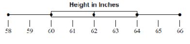
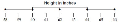
The _____ is a standardized way of displaying the distribution of data based on the minimum, first quartile, median, third quartile, and maximum of the data set.
Dot Plot
Histogram
Box Plot
Line Graph
Five Number Summary
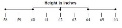
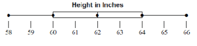
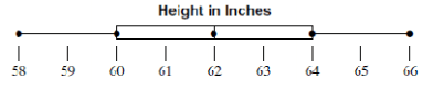
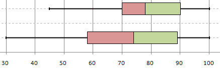

Students at Center Jr. High were surveyed and asked about their favorite school after work snack. The bar graph shows the results of the survey.
Based on the graph, which statement is true?
Twice as many students chose ice cream as chose fruit for their favorite snack.
Twice as many students chose chips/ dips as chose ice cream for their favorite snack.
The same number of students chose chips/ dips as chose cheese & crackers as their favorite snack.
Fifteen more students chose ice cream as chose cheese & crackers as their favorite snack.

Based on the graph,how many more sunny days than rainy days did this city have during the months of April, May, and June?


What type of association does this graph have?
Negative
no association
positive

What type of association does this graph have?
positive
negative
non linear
all of the above

Which sentence describes the relationship shown on this scatter plot?
As the temperature decreases, the visitors increase.
As the temperature increases, the number of visitors increases.
As the visitors increase, the temperature decreases.
No correlation

What type of association does this scatter plot show?
positive
negative
no correlation
nonlinear association

Which relationship could be represented by this scatter plot?
As the number of muffins in a box increases, the price increases.
As the speed of a car increases, the distance the car travels increases.
As the population of a city increases, the number of schools in the
city increases.
As the number of daylight hours increases, the number of night hours decreases.

The scatter plot shows the relationship between the number of chapters and the total number of pages for several books. Use the trend line to predict how many pages would be in a book with 19 chapters.
150 pages
170 pages
190 pages
210 pages


This pie chart shows the colour of hats that Tom owns. Which colour hat does he own the second most of?
red
blue
green
yellow
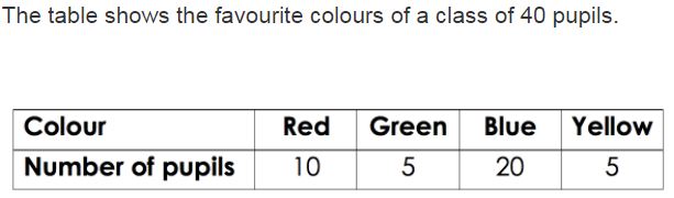
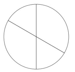
Which pie chart represents the same data as the table?
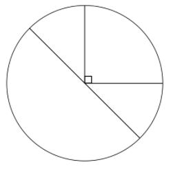
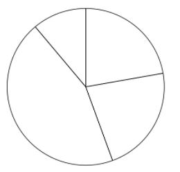
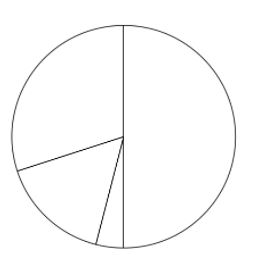

Global CO2 gas emissions in the year 2015 by country. What percent of Gas emissions was produced by the US?
14.3%
4.9%
29.4%
9.8%
What data display is the best to to show a person's age and income?
Scatter Plot
Bar Graph
Pie Chart
Box Plot
What data display is the best to show a person's height compared to their shoe size?
Scatter Plot
Pie Chart
Box Plot
Histogram

