Wayground logo

Free Printable Worksheets

Font size

S
M
L
XL
Worksheets

Unit 7: Lesson 1 and 2 Assignment

Total questions: 80

Worksheet time: 4hrs 4mins

Name
Class
Date
1.
Which of the following lists all parts of the five number summary?
a)
Mean, Median, Mode, Range, and Total
b)
Minimum, Quartile 1, Median, Quartile 3, and Maximum 
c)
Smallest, Q1, Q2, Q3, and Q4
d)
Minimum, Maximum, Range, Mean, and Median
2.
Find the Maximum of the following numbers:
84, 88, 72, 74, 98, 16, 94 
a)
16
b)
98
c)
84
d)
There is no maximum.
3.
Find the Minimum of the following numbers:
84, 88, 72, 74, 98, 16, 94 
a)
16
b)
98
c)
94
d)
There is no minimum.
4.

Find the Median (Q2) of the following numbers: 84, 88, 72, 74, 98, 16, 94 

a)
16
b)
98
c)
84
d)
There is no median.
5.

Find the Q1 (median of the lower half) of the following numbers: 84, 88, 72, 74, 98, 16, 94 

a)
72
b)
88
c)
94
d)
There is no Lower Quartile.
6.

Find the Q3 (median of upper half) of the following numbers: 84, 88, 72, 74, 98, 16, 94 

a)
72
b)
88
c)
94
d)
There is no Upper Quartile.
7.

What is the standard deviation for the data given:

{5, 10, 7, 12, 0, 20, 15, 22, 8, 2}

a)

6.89

b)

10.1

c)

7.26

d)

9

8.

What is the standard deviation for the data given:

{12, 13, 29, 18, 61, 35, 21}

a)

293.67

b)

15.87

c)

17.14

d)

41.98

9.

The data sets show the test scores of a group for the last two tests.

Test 1: {75, 75, 85, 80, 65, 70, 65} Test 2: {95, 85, 85, 90, 90, 95, 100}

Which data set had the SMALLER standard deviation?

a)

Test 1 with a standard deviation of 6.9

b)

Test 2 with a standard deviation of 6.9

c)

Test 1 with a standard deviation of 5.2

d)

Test 2 with a standard deviation of 5.2

10.
Four data sets are shown below.
Set 1: {10, 19, 38, 50, 51}
Set 2: {5, 21, 26, 39, 51}
Set 3: {9, 38, 50, 50, 51}
Set 4: {5, 28, 28, 28, 51}
Which data set has the largest standard deviation?
a)
Set 1
b)
Set 2
c)
Set 3
d)
Set 4
11.
What does this symbol represent?
a)
Standard Deviation
b)
Variance
c)
Mean Absolute Deviation
d)
Sigma
12.
All of the below sets have the same mean.
Set 1-Standard Deviation=3.1
Set 2-Standard Deviation=4.9
Set 3-Standard Deviation=1.7
Set 4-Standard Deviation=3.2
Which set of data probably has the points closest to the mean?
a)
1
b)
2
c)
3
d)
4
13.
If the standard deviation of a data set is 4, what is the variance?
a)
2
b)
16
c)
4
14.

In a population of five university students with GPAs of 2.5, 2.3, 1.7, 1.4, and 1.1, a sample of three students are considered. What would be the standard deviation of the resulting sampling distribution?

a)

0.53

b)

0.41

c)

0.35

d)

0.22

15.
What is the variance for the data given:
5, 10, 7, 12, 0, 20, 15, 22, 8, 2
a)
47.47
b)
102.01
c)
52.77
d)
81
16.

What is the variance of the sample data set?

a)

72

b)

21.4

c)

533.67

d)

395.7

17.
What does this symbol represent?
a)
Variance
b)
Standard Deviation
c)
Mean Absolute Deviation
d)
Sigma
18.

Given a variance of 64, what is the standard deviation?

a)

8

b)

4096

c)

0

d)

6.8

19.

The mass in kg of a sample of beams was taken and the results were 5.2, 5.2, 5.3, 5.6, 5.7. What is the standard error of the mean?

a)

0.01 kg

b)

0.09 kg

c)

-0.01 kg

d)

-0.09 kg

20.

What is the standard deviation of the data?

a)

0.88 cm

b)

0.90 cm

c)

0.94 cm

d)

1.02 cm

21.

What is the standard deviation of the data?

a)

0.01 g

b)

1.00 g

c)

1.03 g

d)

10.5 g

22.
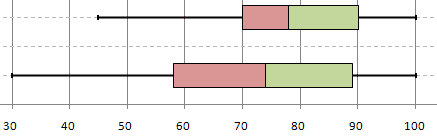
Which box and whisker plot has the highest median?
a)
Top plot
b)
Bottom plot
23.

Which is a true statement based on the box plots above

a)

The data for Team B have the greater range.

b)

The data for Team A are more symmetric.

c)

The data for Team B have the greater interquartile range.

d)

The data for Team A have the greater median.

24.

Which is a true statement based on the dot plots above?

a)

Set B has the greater range

b)

Set B has the greater median

c)

Set B has the greater mean

d)

Set A is less symmetric that Set B

25.

Which statement is true about the interquartile range?

a)

Class 1 has and interquartile range of 4 which is greater than the interquartile range of Class 2.

b)

Class 1 has and interquartile range of 5 which is greater than the interquartile range of Class 2.

c)

Class 1 has an interquartile range of 4, and Class 2 has an interquartile range of 5.

d)

Class 1 and Class 2 have an interquartile range of 14.

26.
Compare the centers and spreads. 
a)
 Math has a higher median (center) and a wider spread.
b)
 Math has a higher median (center) and a smaller spread.
c)
Math has a lower median (center) and a smaller spread.
d)
Math has a lower median (center) and a wider spread.
27.

A Mathematics quiz and a Science quiz are held at SMK Bestari in conjunction of the Mathematics and Science Week. 20 pupils take part in the quizzes. The diagram below shows two dot plots of the scores obtained by the pupils.


What is the difference between the highest and the lowest score obtained in the Science quiz?

a)

7

b)

9

c)

11

d)

13

28.

Which city, Nashville or Dallas, has the smallest minimum temperature?

a)

Nashville

b)

Dallas

29.

Which city, Nashville or Dallas, has the largest maximum temperature?

a)

Nashville

b)

Dallas

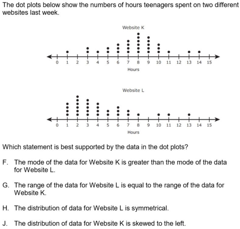
30.

Answer the question pictured.

a)

F

b)

G

c)

H

d)

J

31.

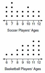
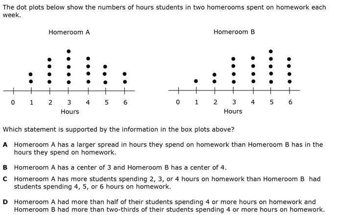
Noah conducted a survey on sports participation. He created the following two dot plots to represent the number of students participating, by age, in soccer and basketball.

Which statement about the given data sets is correct?

a)

The data for soccer players are skewed right. 

b)

The data for soccer players have less spread than the data for basketball players.

c)

The data for basketball players have the same median as the data for soccer players.

d)

The data for basketball players have a greater mean than the data for soccer players.
32.

Answer the question pictured.

a)

A

b)

B

c)

C

d)

D

33.
What type of association does this graph have?
a)
positive 
b)
negative
c)
none
d)
all of the above
34.
The scatter plot shows the relationship between the number of chapters and the total number of pages for several books.  Use the trend line to predict how many chapters would be in a book with 180 pages. 
a)
12 chapters
b)
15 chapters
c)
18 chapters
d)
21 chapters
35.
What type of correlation (association)?
The outside temperature and the amount of layers you wear. 
a)
Positive correlation
b)
Negative correlation
c)
No correlation
d)
All of the above
36.
The number of siblings you have and your weight. 
a)
Positive correlation
b)
Negative correlation
c)
No correlation
d)
All of the above
37.
As x increases, y increases
a)
correlation coefficient
b)
causation
c)
positive correlation
d)
negative correlation
38.
What is the correlation?
a)
Negative correlation
b)
No correlation
c)
Positive correlation
d)
All of the above
39.
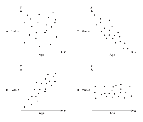
As the age of the car increases, its value decreases. Which scatterplot represents this relationship?
a)
A
b)
B
c)
C
d)
D
40.
What is a line of best fit used for?
a)
To make predictions
b)
To make the graph look pretty
c)
To connect the points
d)
To make it look like you know what you are doing
41.

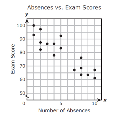
Mrs. Collins made a scatterplot to show the relationship between the number of absences and a student’s final exam score. Based on this scatterplot, a student with 12 absences should get approximately what score on the final exam?

a)

60

b)

92

c)

70

d)

76

42.

Which sentence describes the relationship shown on this scatter plot?

a)

As the temperature decreases, the visitors increase.

b)

As the temperature increases, the number of visitors increases.

c)

As the visitors increase, the temperature decreases.

d)

No correlation

43.

Mrs. Collins made a scatterplot to show the relationship between the number of absences and a student’s final exam score. Based on this scatterplot, a student with 6 absences should get approximately what score on the final exam?

a)

85

b)

92

c)

70

d)

76

44.

Based on the graph, if Joe earned $400, how many hours did he work?

a)

25 hours

b)

35 hours

c)

45 hours

d)

15 hours

45.
The following scatter plot shows Pam's training as she prepares to run a 6 mile race at the end of the month.  Which of the following would be a reasonable approximation for the length of time it would take for her to run 6 miles? 
a)
A. 50 min
b)
B. 80 min
c)
C. 45 min
d)
D. 60 min
46.

Based on the scatterplot, which of the following conclusions about the relationship between her height and weight is true?

a)

There is a negative relationship between height and weight

b)

There is a positive relationship between height and weight

c)

There is a constant relationship between height and weight

d)

There is no relationship between height and weight

47.
What is the correlation between length of running start and distance of jump?
a)
positive:  the further you run the further you jump
b)
negative: the less you run the less distance of your jump
c)
positive: the further your running start the less your distance
48.
What represents the x axis?
a)
ABC Company
b)
Hours Worked
c)
Amount Earned in Dollars
d)
Hours in Car
49.
A trucking company keeps track of the number of miles each of its drivers logs each week.  Describe the correlation between the number of miles a driver logs and the drivers age.
a)
There is a positive correlation.
b)
There is a negative correlation.
c)
There is no correlation.
d)
There is a parallel correlation
50.
a)
14 cm
b)
5.6 cm
c)
10 cm
d)
17.5 cm
51.

What is the correlation for the following Scatter Plot.

a)

Weak Positive

b)

No Correlation

c)

Strong Negative

d)

Weak Negative

e)

Strong Positive

52.

What is the correlation for the following Scatter Plot.

a)

Weak Positive

b)

No Correlation

c)

Strong Negative

d)

Weak Negative

e)

Strong Positive

53.

What is the correlation for the following Scatter Plot.

a)

Weak Positive

b)

No Correlation

c)

Strong Negative

d)

Weak Negative

e)

Strong Positive

54.

Given the following Scatter Plot, select the option that is most likely the r value.

a)

r=.27r=.27

b)

r=−.862r=-.862

c)

r=.934r=.934

d)

r=.54r=.54

55.

Given the following Scatter Plot, select the option that is most likely the r value.

a)

r=−.45r=-.45

b)

r=−.981r=-.981

c)

r=.728r=.728

d)

r=.12r=.12

56.

Given the following Scatter Plot, select the option that is most likely the r value.

a)

r=−.1r=-.1

b)

r=−.981r=-.981

c)

r=.92r=.92

d)

r=.765r=.765

57.

Correlation coefficient is the statistic that measures the strength and direction of a linear association between two quantitative variables.

a)

True

b)

False

58.

If r=0, there is a strong correlation.

a)

True

b)

False

59.

r = -0.3 is considered to have...

a)

moderate negative correlation

b)

weak negative correlation

c)

no correlation

d)

strong negative correlation

60.

Estimate the correlation coefficient for this scatterplot.

a)

A) r = -0.9

b)

B) r = 1

c)

C) r = 0.9

d)

D) r = -1

61.
Determine the Correlation Coefficient and decide whether it is weak, moderate, or strong.
a)
0.07 weak
b)
-0.26 weak
c)
-0.26 moderate
d)
0.07 strong
62.
Determine the Correlation Coefficient and decide whether it is weak, moderate, or strong.
a)
-0.19 weak
b)
-0.19 moderate
c)
0.04 weak
d)
0.04 strong
63.
What type of association does this graph have?
a)
positive 
b)
negative
c)
none
d)
all of the above
64.
What type of association does this graph have?
a)
positive
b)
negative
c)
none
d)
all of the above
65.
The coefficient of determination tells us: 
a)
The correlation and all the things that go with it. 
b)
The answer to the question being asked.
c)
The percentage of data that is on the line of best fit.
d)
The equation to the line of best fit.
66.
What can we determine from the correlation coefficient? 
a)
Style + Type
b)
Percentage + Direction
c)
Strength + Direction
d)
Strength + Style
67.
Describe the correlation in the graph shown.
a)
Strong Negative
b)
Strong Positive
c)
Weak Negative
d)
Weak Positive
68.
Describe the correlation in the graph shown.
a)
Strong Negative
b)
Strong Positive
c)
Weak Negative
d)
No Correlation
69.
Describe the correlation in the graph shown.
a)
Strong Negative
b)
Strong Positive
c)
Weak Negative
d)
Weak Positive
70.
Describe the correlation in the graph shown.
a)
No Correlation
b)
Strong Negative
c)
Weak Positive
d)
Weak Negative
71.
The correlation coefficient is a number "r" such that: 
a)
-1<r<1
b)
-1>r>1
c)
-1≤r≤1
d)
-1≥r≤1
72.
r=0.3
a)
Strong positive 
b)
Weak positive
c)
Strong negative
d)
Weak negative 
73.
r=-0.89
a)
Strong positive 
b)
Weak positive 
c)
Strong negative 
d)
Weak negative 
74.
What does a correlation coefficient of
r = 0.99999 mean?
a)
strong positive correlation
b)
strong negative correlation
c)
weak positive correlation
d)
weak negative correlation
75.
A perfect positive correlation has a correlation coefficient of ____. 
a)
1
b)
-1
c)
0
76.
A perfect negative correlation has a correlation coefficient of ____. 
a)
1
b)
-1
c)
0
77.
Describe the correlation in the graph shown.
a)
Strong Negative
b)
Strong Positive
c)
Weak Negative
d)
Weak Positive
78.
What type of correlation (association)?
The outside temperature and the amount of layers you wear. 
a)
Positive correlation
b)
Negative correlation
c)
No correlation
79.
The number of siblings you have and your weight. 
a)
Positive correlation
b)
Negative correlation
c)
No correlation
80.
As x increases, y decreases.
a)
no correlation
b)
negative correlation
c)
correlation coefficient
d)
positive correlation