
 Worksheets
7th Academic Math Data & Population Inferences
Total questions: 106
Worksheet time: 9hrs 24mins
Which graph has the highest mode?


Which graph has the smallest mode?
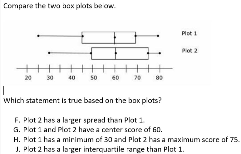
Which statement is true based on the box plots?
Plot 2 has a larger spread than plot 1.
Plot 1 and plot 2 have a center score of 60.
Plot 1 has a minimum of 30 and plot 2 has a maximum score of 75.
Plot 2 has a larger IQR than plot 1.
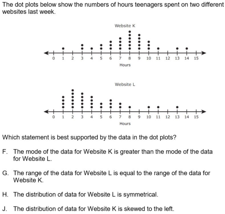
Answer the question pictured.
F
G
H
J

A random sample of 21 students at Daulton Elementary and at Spenser Elementary is asked how many sibling they have. The results are pictured.
When comparing the two populations, which statement is NOT supported by the data?
The students at Spenser Elementary tend to have more siblings than the students at Daulton Elementary.
The range in the data for Daulton Elementary is the same as the range in the data for Spenser Elementary.
The median number of siblings for Daulton Elementary is larger than the median number of siblings for Spenser Elementary.
The students at both elementary schools tend to have 2 or more siblings.

The 7th grade class participated in the following fitness challenges. If there are 250 students total, how many participated in weight lifting?
20
8
80

Based on the circle graph, if 45 girls played basketball, how many girls are there total in athletics?
150
100
70
115

If there are 180 girls in athletics, how many girls play soccer and basketball?
54
81
45
120

Which of the following statements best describes the data?
Yu and Jose have the same amount of strikeouts as Carlos.
Mark has twice as many strikeouts as Jose.
Carlos accounts for more than 25% of the total strikeouts.
One half of the total strikeouts are made by Justin and Yu

The bar graph shows the approximate number of visitors at a state park. What percentage of visitors went to a state park in 2011? Hint: Percent proportion
20%
40%
60%
80%

Hint: four or more includes four; less than two does not include two.
8
6
2
18

The dot plot shows the number of movies students watched at the movie theater in a month. What percentage of students watched 3 or less movies in a month?
27%
44%
22%
50%

According to the pie chart, what uses the most water in a house?
Shower
Faucet
Clothes Washer
Toilet
According to the pie chart, how much of a house's water usage is for showers?
26.7%
13.7%
21.7%
16.8%
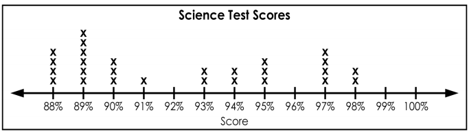


Which table represents the data in the graph?


Which graph matches the table of values (not percents)?


A survey was taken at Montross Middle School. The students were asked what their favorite sport was and the results are shown in the bar graph. What circle graph represents the same data set?


Which car has the biggest maximum jump?
Car A
Car B

Which has a greater interquartile range?
Airplane A
Airplane B
Both the same

Which statement is true?
Airplane A has a lesser median
Airplane B has a greater range
Airplane A has a less predictable flight length
Airplane B a lesser IQR

The range of the data for Fun Fit is less than the range of the data for Greg’s Gym.
The median for Greg’s Gym is less than the median for Fun Fit.
The minimum attendance for Fun Fit is less than the minimum attendance for Greg’s Gym.
The interquartile range for Greg’s Gym is greater than the interquartile range for Fun Fit.

The minimum temperature for Reybold is lower than the minimum temperature for Picktown.
The median for Reybold and Picktown are equal.
The first quartile for Reybold is greater than the first quartile for Picktown.
Picktown has a greater interquartile range than Reybold.

What percentage of Group A earns between $1100 and $1400?
25%
50%
75%
100%

What percentage of Airplane B flies at least 195 in.?
25%
50%
75%
100%

Which statement is true about the sales of Stores A and B?
100% of Store B's sales were more than Store A.
Store A had more sales than Store B.
Store A had the single day with the most sales.
Store B's minimum is equal to Store A's median.

Which statement is true about Group A and B's earnings?
Group A earned more overall than Group B.
Group B's lower quartile is equal to Group A's median.
100% of Group B's earnings were more than 25% of Group A's.
Both groups earned at most $2000.

If 200 people were surveyed, approximately how many people like pepperoni and cheese as their topping?
100 people
150 people
50 people
75%

Mary is recording her plant's growth in a journal. How many inches has the plant grown from week 1 to 7?
22
18
14
There are 200 students in the band. The band director conducted a random survey of 25 of the band members to determine their favorite flavor of cupcake for their next party. The results are shown below.
- 9 students want chocolate
- 11 students want vanilla
- 5 students want strawberry
Based on the survey, which of these is the best prediction of the cupcakes wanted by the 200 band members?
There are 16 students who want strawberry or vanilla.
There are 16 more students who want vanilla than chocolate.
There are 48 more students who want strawberry than vanilla.
There are 128 students who want strawberry or chocolate.


Which car has the biggest maximum jump?
Car A
Car B

Which car has the widest range of jumping distance?
Car A
Car B
Both the same
Which has a greater interquartile range?
Airplane A
Airplane B
Both the same
Which statement is true?
Airplane A has a lesser median
Airplane B has a greater range
Airplane A has a less predictable flight length
Airplane B a lesser IQR
The range of the data for Fun Fit is less than the range of the data for Greg’s Gym.
The median for Greg’s Gym is less than the median for Fun Fit.
The minimum attendance for Fun Fit is less than the minimum attendance for Greg’s Gym.
The interquartile range for Greg’s Gym is greater than the interquartile range for Fun Fit.
The minimum temperature for Reybold is lower than the minimum temperature for Picktown.
The median for Reybold and Picktown are equal.
The first quartile for Reybold is greater than the first quartile for Picktown.
Picktown has a greater interquartile range than Reybold.


Science: _________ Math: __________


Cars: skewed left
Cars: Skewed left

The double dot plots show the average wait times in minutes for two popular rides at an amusement park. Compare the measures of center and variation, which ride typically has a longer wait time?
No inference can be made from the graph.
Topsy Turvy
The wait times are the same for both rides.
Rocket Blast


The dot plots show the number of miles Nina and Mark walked during a few days in April.
The median number of miles Mark walked is ___________ the median of the number of miles Nina walked.
greater than
less than
equal to
The dot plots show the number of miles Nina and Mark walked during a few days in April.
The range of the number of miles Nina traveled ____________ the range of the number of miles Mark traveled.
greater than
less than
equal to

The dot plots show the number of miles Ben and Barbara ran in the month of February.
Which statement is best supported by the information in the dot plots?
The mode of the number of miles ran by Barbara is greater than the mode number of miles ran by Ben.
The least number of miles ran by Ben is greater than the least number of miles ran by Barbara
The range of the number of miles ran by Barbara is greater than the range of he number of the miles ran by Ben
The distribution of the data is approximately symmetical in both sets of data.

The dot plots show the number of hours two students watched television in the month of June.
Which statement is best supported by the data in the dot plots?
The median number of hours Leslie watched television is equal to the median number of hours Dixie watched television.
The mode number of hours Dixie watched television is greater than the mode number of hours Leslie watched television.
Dixie had a greater range in the number of hours she watched television than Leslie.
The least number of hours Leslie watched television is equal to the least number of hours Dixie watch television.

The dot plots show the number of hours two boys played video games each day for 10 days.
Which statement is NOT supported by the information in the dot plots?
The mode of the number of hours played by Jayden is less than the mode number of hours played by Juan.
The mean of the number of hours played by Jayden is more than the mean number of hours played by Juan.
Jayden had a greater range of the number of hours played than Juan.
The maximum number of hours played by Juan is less than the maximum number of hours played by Jayden.

The dot plots show the number of siblings of students in two different classrooms.
Which statement is best supported by the data in the dot plots?
The mode of the data in Mrs. Blackfield's class is less than the mode of the data in Mr. Johnson's class.
The range of the data in Mr. Johnson's class is less than the range of the data in Mrs. Blackfield's class.
The median of the data in Mrs. Blackfield's class is greater than the range of the data in Mr. Johnson's class.
The minimum value of the data in Mr. Johnson's class is greater than the minimum value for the data in Mrs. Blackfield's class.

The dot plots show the number of minutes it takes students in Mrs. Williams's and Mr. Escobedo's class to get to school.
Which statement is NOT supported by the information in the dot plots?
The data in Mr. Escobedo's class is approximately symmetrical.
The median number of minutes it takes Mrs. Williams's students to get to school is greater than the median number of minutes it takes Mr. Escobedo's students to get to school.
The number of minutes it takes Mrs. Williams's students to get to school has a greater range than the number of minutes it takes Mr. Escobedo's students to get to school.
The maximum value of the data for Mr. Escobedo's class is less than the maximum value of the data for Mrs. Williams's class.

The dot plots show the number of ounces of chocolate in two different trail mixes.
Which statement is best supported by the data in the dot plots?
The range of the data for the Planters Trail Mix is greater than the range of the data for the Kirkland Trail Mix.
The median of the data for Kirkland Trail Mix is greater than the median of the data for Planters Trail Mix.
The distributions of the data for Planters Trail Mix and Kirkland Trail Mix are approximately symmetrical.
The minimum value of the data for Kirkland Trail Mix is less than the minimum value of the data for Planters Trail Mix.

The dot plots show the weight of different books in two stacks at the library.
Which statement is best supported by the data in the dot plots?
The mode of the data for Stack A is greater than the mode of the data for Stack B.
The range of the data for Stack B is greater than the range of the data for Stack A.
The median of the data for Stack B is less than the median of the data for Stack A.
The maximum value of the data for Stack A is equal to the maximum value of the data for Stack B.

The dot plots show the ages of students at two different arcades.
Which statement is best supported by the information in the dot plots?
The range of the age of students at Arcade A is greater than the range of age of students at Arcade B.
The distribution of the data for Arcade A and Arcade B are approximately symmetrical.
The median age of students at Arcade A is greater than the median age of students at Arcade B.
The maximum age at Arcade B is less than the maximum age at Arcade A.


What is 30% of 250?
0.12
75
0.0012
7,500

The BMS basketball team scored 30 points each game for 4 games. How many points did Kendrick (purple) score in total?
20 points
24 points
600 points
6 points

What is this circle graph about?
Spending Habits
Savings
Baseball Cards
Food
What is the total percentage represented by a circle graph?
100%
50%
40%
10%
How many sections are in the graph?
1
2
3
4
How much money was spent on food?
50%
40%
10%
100%

What foreign language is most popular?
German
Italian
French
Spanish

If 30% of the students chose French, what percent did not choose French?
10%
70%
5%
55%

What percent of the students chose Italian?
10%
30%
5%
55%
List the categories from least to greatest.
French, Italian, German, Spanish
German, Italian, French, Spanish
Italian, Spanish, French, German
German, French, Italian, Spanish

What is this circle graph about?
Savings
Food
Clothing
Patrick Family Budget
What percent of the Patrick’s budget is spent on transportation?
15%
10%
35%
25%
True or false. The Patricks do not spend any money on clothing.
True
False
How many sections are in the graph?
6
5
7
4
What percent is spent on savings and food together?
10%
25%
15%
35%

True or False: 10%, 30%, and 50% could be possible percentages for this circle graph.
True
False
What percent of money was NOT spent on savings?
20%
40%
50%
100%

Which ice cream flavor is NOT listed in the graph?
Vanilla
Chocolate
Pistachio
Strawberry
Which flavor was chosen the most?
Chocolate
Vanilla
Mint Chocolate Chip
Strawberry
Which flavor was chosen the least?
Chocolate
Vanilla
Mint Chocolate Chip
Strawberry
If 100 students were surveyed, how many chose vanilla?
35
40
18
7
100 students were surveyed, and 35 chose vanilla. True or false: if 200 students were surveyed, 70 would chose vanilla.
True
False
Ms. Cassermere finds that 15 out of 20 students in her sample pick "On My Block" as their favorite tv show. There are 100 students in 7th Grade. How many total students in 7th Grade would you expect to like "On My Block" the most? Make an equivalent fraction to solve: 2015=100?
15
27
45
75


2
4
8
16

15,760
17,560
16,760
16,660

100
150
200
250

A book store took a random survey of customers about their favorite book genre. The table shows the number of customers who selected each genre. Based on the information in the table, which inference about the favorite genre of all the customers appears to be valid?
They are certain to select Romance or Young Adult
They are less likely to select Sci-Fi than Horror, Non-Fiction or History
They are more likely to select Romance than Sci-Fi, Horror, and History
They are certain to select any genre other than History

Petunia conducted a random survey of students to determine the favorite genre of music of 50 students. The results are shown in the bar graph. Based on the information in the graph, which inference about the students is valid?
Girls like country music more than boys like rap music
More girls than boys like rock music
Boys like country music more than rock music
Boys like rock music more than girls like rap music

A survey was taken at a school of 30 students favorite food. The circle graph shows the number of students who selected each. Based on the information in the graph, which inference about the favorite food of all students appears to be valid?
It is certain that a student will choose Pizza
It is less likely that a student will choose Pasta or Hamburgers over Pizza
It is certain that a student will NOT choose Pasta
It is more likely that a student will choose Pizza over Hamburgers, Pasta, or Other combined

A random survey was conducted at an office about the workers favorite office supply. The results are shown in the table below. Based on the information in the table, which inference about favorite office supply of all the workers appears to be valid?
It is certain that an office worker will NOT choose Tape as their favorite office supply
It is certain that an office worker will choose Paper as their favorite office supply
It is more likely that an office worker will choose Pens, Staplers, or Paper Clips over Paper
More people like Staplers or Paper Clips over Pens/Pencils

A random survey was conducted with 6th and 7th graders of their favorite sport. The results are shown in the bar graph. Based on the information in the graph, which inference about all 6th and 7th graders is valid?
6th graders like Basketball more than Football
More 6th graders than 7th graders like Soccer
6th graders like Soccer more than 7th graders like Baseball
7th graders like Football more than they like Basketball

The circle graph shows the results of a random survey of students who plan to attend the school dance. Based on the information in the graph, which inference about the general population of students is valid?
More 6th graders than 7th and 8th graders plan to attend the dance
8th graders do not like to dance
It is certain that a 6th grader will attend the dance
It is more likely that a 7th grader will attend the dance than a 8th grader attending

The results of a random survey about a person's favorite pet is shown in the table. Based on the information in the table, which inference about the favorite pet of the general population appears to be valid?
It is certain that a person will choose Dog as their favorite pet
It is less likely a person will choose Dog than Cat or Fish
It is more likely a person will choose Fish or Bird than Cat
Dogs are liked more than all other animals combined

A random survey of people at the mall was taken to determine favorite color. The results are shown in the circle graph. Based on the information in the graph, which inference about the general population is valid?
It is more likely someone will choose Blue than Red or Pink
It is certain that someone will NOT choose Black
It is less likely someone will choose Red than Green, Pink, or Purple
More people like Blue than all other colors combined

The bar graph shows the results of a random survey of people about their favorite fruit. Based on the information in the graph, which inference about the general population is valid?
More men than women like apples
More men like bananas than women like strawberries
More women like strawberries than men who like apples
It is certain that a woman will choose strawberries

The results of a random survey of students about their favorite extracurricular activity are shown in the graph. Based on the information in the graph, which inference about the general population of students is valid?
Less Boys like Choir than Girls like No Activity
More Girls than Boys like Band
Girls like Choir more than Boys like Sports
An equal amount of Boys and Girls like Band

