
Font size
 Worksheets
Problem solving with comparisons of numerical data | Starter Quiz | Oak National Academy
Total questions: 6
Worksheet time: 4mins
A __________ is a visual representation for bivariate data. It can be useful when determining the nature of the relationship between the variables.
bar chart
line graph
pie chart
pictogram
scatter graph
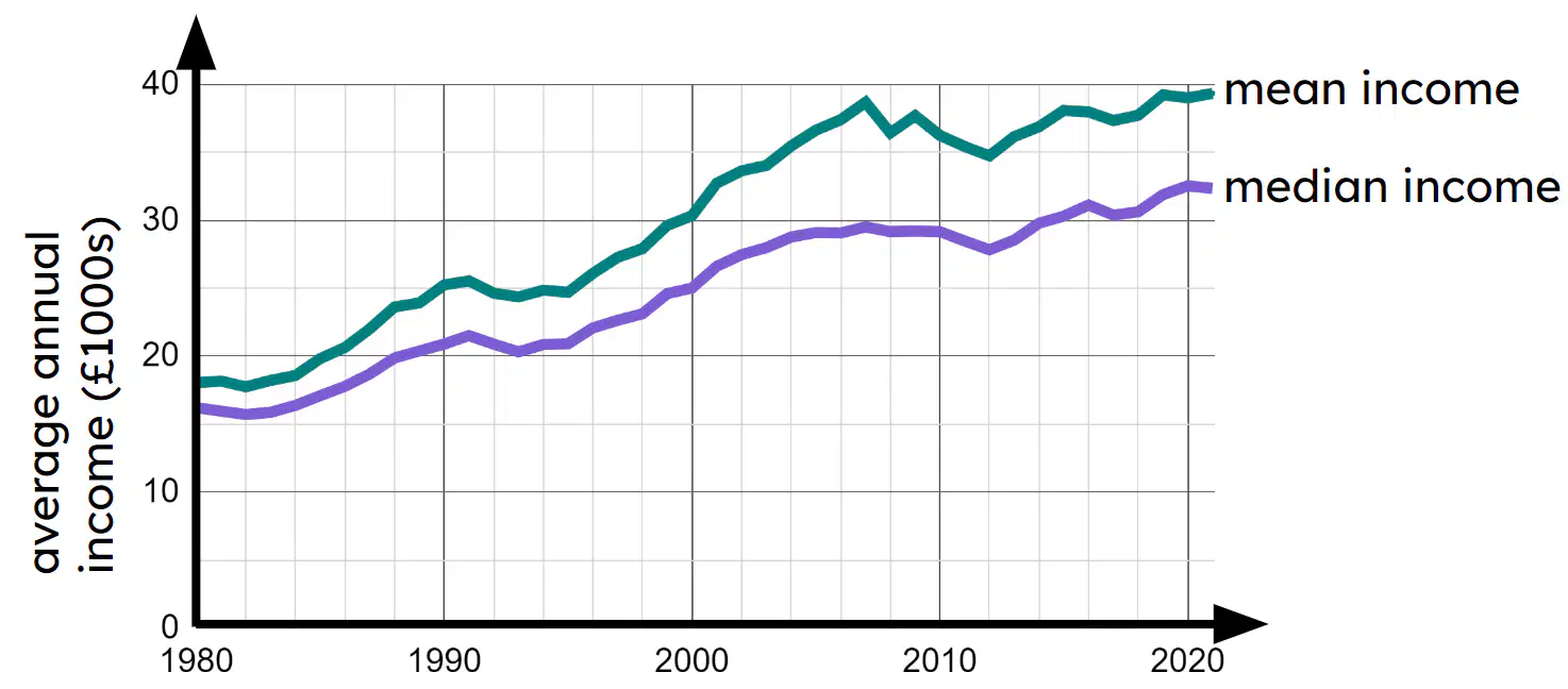
The time series below shows data from the ONS about the average annual income per person each year. Based on this graph, which statement is true?
The median annual income generally decreased from 1980 to 2020.
The median annual income generally increased from 1980 to 2020.
The median annual income generally stayed the same from 1980 to 2020.
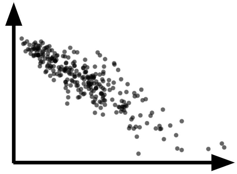
What type of correlation can be seen in the scatter graph?
negative correlation
no correlation or association
positive correlation
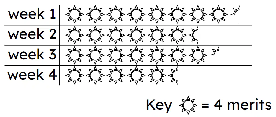
The pictogram shows how many merits Jun received each week at school. In week 3 Jun received (a) merits.
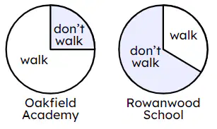
Two schools were asked how many of their pupils walk to school. The results for each school are represented in the pie charts. Which statement is true?
More pupils walk to school in Oakfield Academy than in Rowanwood School.
More pupils walk to school in Rowanwood School than in Oakfield Academy.
You cannot compare frequencies between schools using this visual representation.
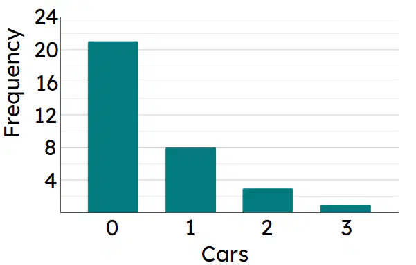
The bar chart shows the number of cars parked on driveways in a particular street. Altogether (a) cars are parked.

