
 Worksheets
Data Visualization with Qlik Cloud
Total questions: 10
Worksheet time: 10mins
What is the primary purpose of data visualization?
To make data more complex and harder to understand
To present data in a visual format for better understanding
To store large amounts of data for future analysis

Which statement best describes Qlik Sense Cloud?
A cloud-based tool designed to create, share, and analyze data
A database management software for storing large datasets
A platform used only for statistical computations

Which of the following is NOT a feature of Qlik Sense Cloud?
Creating and sharing interactive dashboards
Collaborating with multiple users in real-time
Only accessible through a desktop application without online access
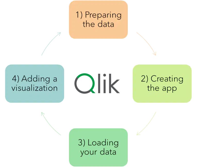
When creating a new application in Qlik Sense, what is the first step after opening the platform?
Share your dashboard with other users
Load your data into the new application
Create a chart directly without any data
What is the main difference between a dimension and a measure in Qlik Sense?
Dimensions are numerical calculations, while measures are categories or fields
Dimensions define how data is grouped (e.g., regions), while measures are the values being analyzed (e.g., sales totals)
Dimensions are only used in bar charts, and measures are used in pie charts
Which type of chart is best for showing trends over time?

Line chart

Bar chart

Pie chart
Which of these charts is most appropriate for showing the proportions of a whole?

Sankey

Line chart

Pie chart
Which type of chart is typically the best for showing comparisons between categories?

Line chart

Bar chart

Scatter plot
When creating a bar chart in Qlik Sense, which components are necessary?
Only a measure
Both a dimension and a measure
Only a dimension
Which principle is important for user experience when designing a dashboard in Qlik Sense?
Hint: Think about the DAR (Dashboard, Analysis, Reporting) method.
Always focus on adding as many charts as possible
Ensure the dashboard is structured to guide users from a high-level view to detailed analysis
Group all visualizations randomly to avoid clutter

