
 Worksheets
VA101 Balance and Alignment. White Space
Total questions: 10
Worksheet time: 4mins
What does symmetrical balance mean in design?
Elements are unbalanced to create tension
Elements radiate from a central point
Elements are mirrored evenly on both sides
Elements are aligned to a grid
Which of the following is NOT an example of asymmetrical balance?
A webpage with an image on one side and text on the other
A mandala design
A poster with larger shapes on one side and smaller, darker shapes on the other
A book cover with a small logo at the top and a large title at the bottom
Why is white space sometimes referred to as “negative space”?
It creates a negative impression in the design
It highlights the importance of alignment
It is the space that remains unused
It subtracts unnecessary clutter from the layout
Which principle helps maintain consistent positioning between text and imagery in a layout?
Balance
Contrast
Alignment
Hierarchy
White space is always white.
True
False
What type of alignment is most commonly used in books and articles in Europe?
Left-aligned
Centered
Right-aligned
Grid-aligned
What is the primary purpose of a grid in visual design?
To make the design look symmetrical
To reduce the need for white space
To emphasize asymmetrical balance
To organize elements and maintain alignment
White space in a design always improves readability.
True
False
How can asymmetrical balance create harmony in a design?
By mirroring elements on both sides
By using different elements that have equal visual weight
By relying entirely on white space
By ignoring alignment and focusing on contrast
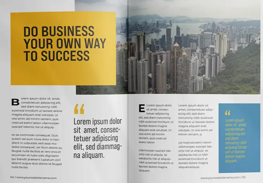
Which type of text alignment is used throughout the magazine layout?
(a)

