
 Worksheets
Empowerment Technologies
Total questions: 100
Worksheet time: 33mins
Name
Class
Date
1.
Two groups created websites for their class business project. Website A arranged all elements neatly with clear margins, while Website B scattered text boxes and buttons unevenly across the page. What principle differentiates the two websites?
a)
A. Website A maintains rhythm and proportion; Website B lacks harmony.
b)
B. Website A uses alignment and balance; Website B appears disorganized.
c)
C. Website A applies repetition and variety; Website B overuses white space.
d)
D. Website A emphasizes color contrast; Website B highlights proximity.
2.
In their Media and Information Literacy task, Group A used the same color palette and icons throughout their infographic, while Group B mixed random fonts and bright colors in every section. What principle sets their outputs apart?
a)
A. Group A practices unity and consistency; Group B lacks coherence.
b)
B. Group A uses proximity and alignment; Group B avoids proportion.
c)
C. Group A focuses on emphasis and movement; Group B maintains flow.
d)
D. Group A demonstrates contrast and rhythm; Group B achieves symmetry.
3.
Two learners designed online advertisements for a local café. Ad A used a dark background with bright yellow text that made the message readable, while Ad B used a light background with white text that blended in. What principle differentiates their designs?
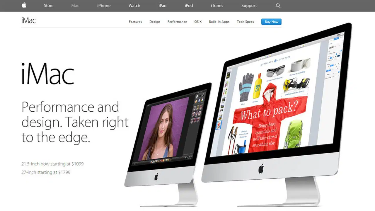
a)
A. Ad A applies rhythm and unity; Ad B uses too much repetition.
b)
B. Ad A maintains balance and alignment; Ad B adds too many icons.
c)
C. Ad A demonstrates contrast effectively; Ad B fails to apply it.
d)
D. Ad A creates emphasis through variety; Ad B limits visual flow.
4.
For their YouTube project, Learner A placed the title in a large, bold font at the center of the thumbnail, while Learner B used small text and random placements. What design principle best distinguishes their outputs?
a)
A. Learner A uses contrast and rhythm; Learner B maintains repetition.
b)
B. Learner A observes proximity and unity; Learner B creates harmony.
c)
C. Learner A practices proportion and variety; Learner B achieves balance.
d)
D. Learner A applies emphasis and hierarchy; Learner B lacks focus.
5.
Group A’s tourism brochure grouped related information and images closely together, while Group B scattered details in separate corners of the page. What layout principle differentiates their outputs?
a)
A. Group A applies contrast and alignment; Group B uses excess rhythm.
b)
B. Group A maintains repetition and symmetry; Group B adds too much variety.
c)
C. Group A uses proximity and organization; Group B lacks coherence.
d)
D. Group A practices emphasis and proportion; Group B avoids balance.
6.
What principle highlights a focal point to ensure the audience notices the most important message first?
a)
A. Contrast
b)
B. Emphasis
c)
C. Alignment
d)
D. Balance
7.
What kind of white space refers to large empty areas between major design elements like margins or sections?
a)
A. Micro white space
b)
B. Neutral white space
c)
C. Macro white space
d)
D. Dimensional white space
8.
How can white space enhance the readability of a page?
a)
A. By allowing breathing room that separates sections and text.
b)
B. By filling every area with design elements.
c)
C. By reducing margins to maximize space.
d)
D. By blending background and foreground.
9.
Miss Falceso asked the class to create a digital poster for the upcoming School Intramurals. Andrea placed all texts, logos, and pictures on the left side of the poster, making it look unbalanced. Which principle should she apply to improve her layout?
a)
A. Emphasis
b)
B. Variety
c)
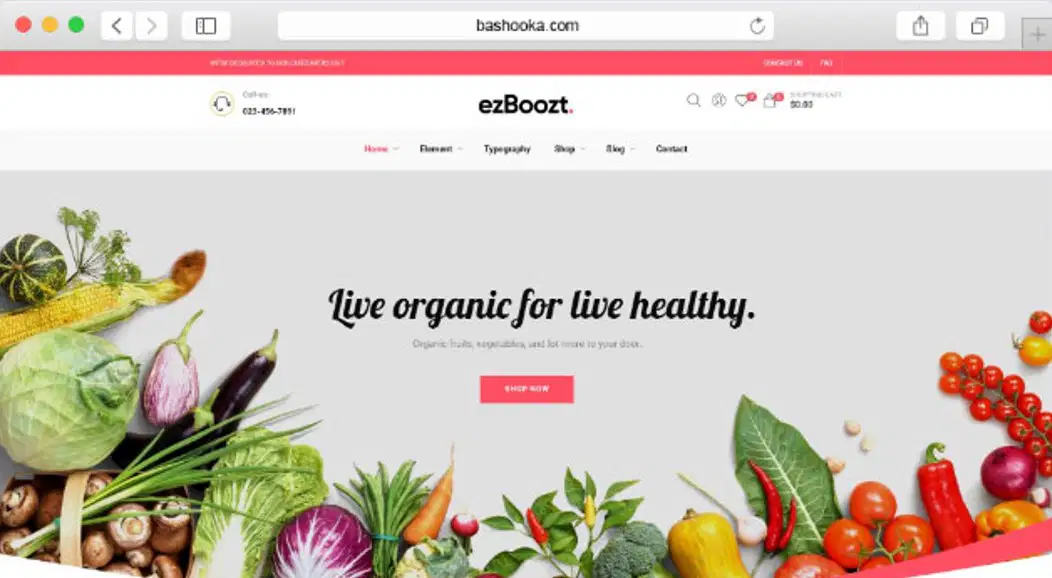
C. Contrast
d)
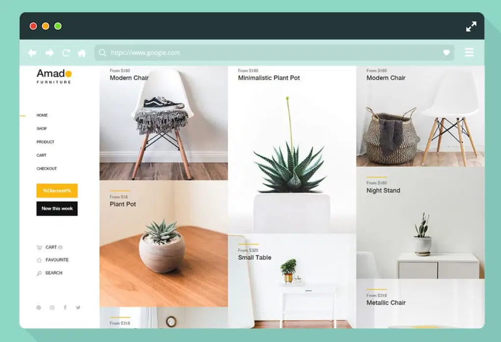
D. Balance
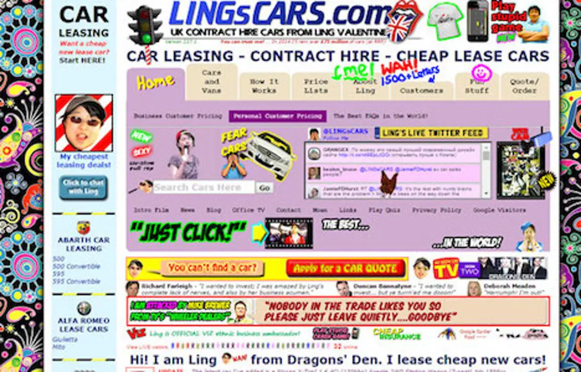
10.
Which type of balance gives a mirror-like design that is proportionally equal to the other side?
a)
a) Asymmetrical
b)
b) Symmetrical
c)
c) Semi-Balance
d)
d) Semi-Proportion
11.
What design principle is demonstrated when one side of the page has a different intensity compared to the other side?
a)
a) Symmetrical balance
b)
b) Asymmetrical balance
c)
c) Proximity
d)
d) Harmony
12.
The following website applied asymmetrical balance, EXCEPT
a)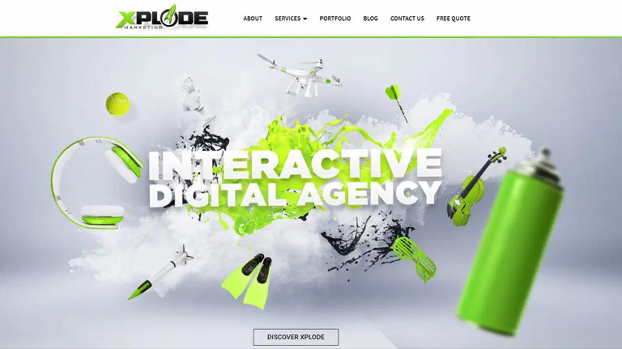
Option 1
b)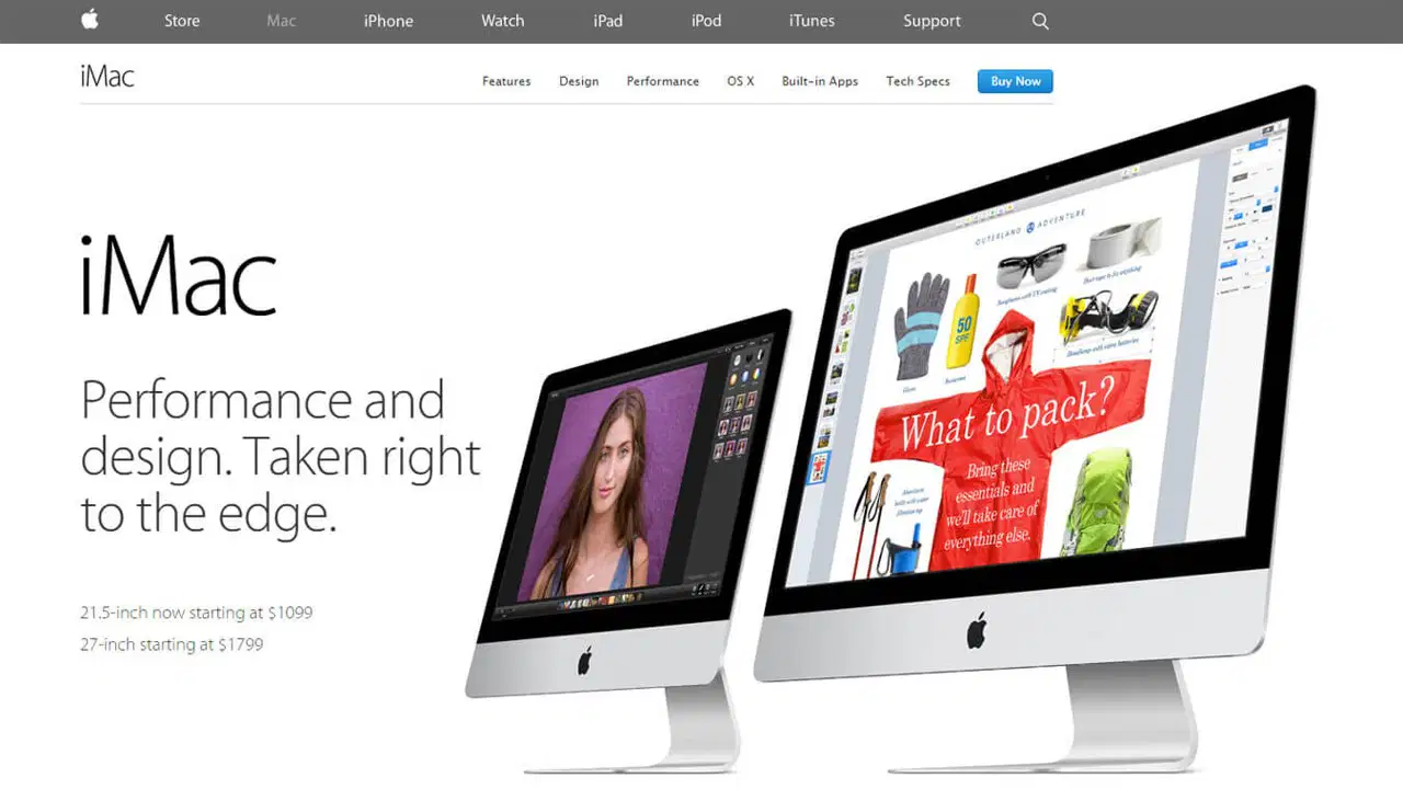
Option 2
c)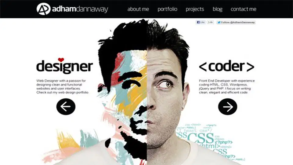
Option 3
d)
Option 4
13.
Repetition, pattern, and rhythm refer to the:
a)
a) Consistent use of different fonts
b)
b) Combining elements repeatedly to create movement
c)
c) Placement of elements symmetrically
d)
d) Grouping elements far apart
14.
Which layout principle ensures that related text boxes and images are placed close together to make the content easier to understand?
a)
A. Repetition maintains visual consistency across the layout.
b)
B. Alignment keeps elements arranged in a straight line.
c)
C. Proximity groups related items to show their relationship.
d)
D. Variety combines multiple colors to make it lively.
15.
During their ETech class, Bea designed a digital poster where the text “Clean as You Go” is written in bold red letters at the top center. Which design principle did she apply?
a)
A. Contrast improves readability by changing font color.
b)
B. Emphasis highlights the focal point of the design.
c)
C. Alignment organizes text along equal spacing.
d)
D. Balance distributes visual weight evenly.
16.
Jomar created a poster about waste segregation. He placed equal images and texts on both sides of the page, giving the design a stable look. What layout principle did he use?
a)
A. Balance provides symmetry and visual stability.
b)
B. Rhythm gives movement to the visual layout.
c)
C. Variety creates difference among visual sections.
d)
D. Contrast separates colors for better distinction.
17.
A layout that uses the same font style, color palette, and image border in every page shows what principle?
a)
A. Repetition maintains a unified and professional style.
b)
B. Variety provides diversity to prevent monotony.
c)
C. Proportion compares the size of all design elements.
d)
D. Rhythm organizes repeated lines to guide the viewer.
18.
Which of the following best describes the purpose of contrast in a layout design?
a)
A. To blend all colors and lines into one flat tone.
b)
B. To group similar elements into one composition.
c)
C. To maintain uniformity among all visual features.
d)
D. To make important details stand out from others.
19.
While creating a digital infographic, Carlo made all titles larger and bolder than the supporting details. What layout principle was applied?
a)
A. Proportion shows the relative size of elements.
b)
B. Visual hierarchy organizes information by importance.
c)
C. Movement directs the eyes across the composition.
d)
D. Unity connects all design components cohesively.
20.
Which principle helps a designer prevent a layout from appearing too crowded and makes it easier to read?
a)
A. Proportion balances sizes between elements.
b)
B. White space gives breathing room and clarity.
c)
C. Unity connects all visual components together.
d)
D. Rhythm repeats visual elements consistently.
21.
While designing a tarpaulin for the Career Orientation, Trisha made sure that all text boxes were perfectly aligned along the left edge. What design principle was applied?
a)
A. Alignment ensures organization and professionalism.
b)
B. Proximity places related ideas near one another.
c)
C. Emphasis draws attention to one main feature.
d)
D. Movement creates visual flow throughout the design.
22.
In creating a school publication layout, the designer ensured that no element looked out of place and that all parts felt connected. Which principle is reflected?
a)
A. Proximity puts together items that are unrelated.
b)
B. Contrast separates text from the image background.
c)
C. Harmony ensures a complete and consistent layout.
d)
D. Variety applies multiple colors to avoid dullness.
23.
Which situation shows a violation of proportion in design?
a)
A. The title text appears too small compared to the images.
b)
B. The white space between words is evenly distributed.
c)
C. The colors of the background are properly balanced.
d)
D. The alignment of paragraphs follows a clear edge.
24.
In making a school event banner, Dianne used thick curved lines leading from the top to the focal image at the center. Which principle did she apply?
a)
A. Balance divides the design evenly on both sides.
b)
B. Rhythm organizes elements to build repetition.
c)
C. Movement guides the viewer’s eyes through the layout.
d)
D. Variety uses multiple colors to prevent dullness.
25.
What will happen if a designer fails to apply alignment correctly?
a)
A. The layout will look disorganized and unprofessional.
b)
B. The design will appear too bright and colorful.
c)
C. The focal message will become too difficult to read.
d)
D. The text will appear evenly balanced across sections.
26.
Which situation best applies the principle of variety?
a)
A. Using identical icons and fonts throughout the brochure.
b)
B. Keeping all text justified and placed in the same format.
c)
C. Using different image angles and shades to attract interest.
d)
D. Repeating the same border in every digital page layout.
27.
A digital poster on “Climate Action” used a consistent green theme with repetitive leaf icons and matching typography. What principle was used?
a)
A. Proportion adjusts the size of texts and images.
b)
B. Balance divides the design into equal sections.
c)
C. Movement directs the attention toward the center.
d)
D. Repetition ensures familiarity and visual unity.
28.
In a digital campaign, the designer used large titles, medium subheadings, and small body text to organize information. What principle was applied?
a)
A. Visual hierarchy prioritizes the order of importance.
b)
B. Proximity groups related text sections together.
c)
C. White space removes visual clutter around text.
d)
D. Contrast emphasizes the background over images.
29.
What principle of layout is most evident in this iMac advertisement’s clean and symmetrical placement of text and images?
a)
A. Contrast is used by combining different font styles for readability.
b)
B. Rhythm is shown through repeated elements across the composition.
c)
C. Variety is applied by mixing random colors and visual directions.
d)
D. Balance is achieved by evenly distributing visual weight on both sides.
30.

The headline “Do you want more traffic?” is made large, bold, and placed at the center, drawing instant attention. What layout principle is being applied?
a)
A. Proportion is used to equalize the sizes of all graphic components.
b)
B. Unity is reached by keeping all texts and colors the same.
c)
C. Emphasis is achieved by highlighting the most important element.
d)
D. Balance is established by dividing the screen into equal halves.
31.
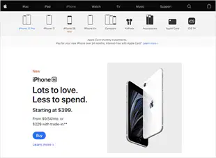
The iPhone SE layout uses a minimal white background and distinct text placement that highlights the product and the message. Which design principle is effectively demonstrated?
a)
A. Contrast is applied through mixing multiple background textures.
b)
B. Rhythm is achieved by repeating similar icons and images.
c)
C. White space enhances readability and focuses attention on the product.
d)
D. Variety is shown by applying multiple color combinations throughout.
32.

The eBay website design groups categories like “Fashion,” “Electronics,” and “Sports” into neat sections with related images. Which layout principle is best reflected?
a)
A. Proximity organizes related elements together to show connection.
b)
B. Emphasis is used to make one section larger than the others.
c)
C. Contrast separates the background from all other design elements.
d)
D. Balance equalizes all categories into perfectly symmetrical halves.
33.
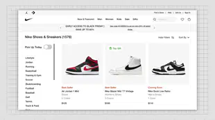
The Nike product display aligns all shoe images, prices, and labels in a clean, grid-based layout. Which principle of design best explains this approach?
a)
A. Rhythm repeats colors and patterns to form continuous flow.
b)
B. Variety mixes fonts and colors to capture visual attention.
c)
C. Contrast highlights text through complex background shading.
d)
D. Alignment ensures order and professionalism across all sections.
34.
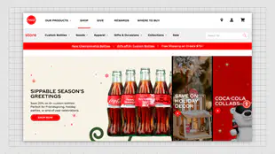
The Coca-Cola homepage shows evenly spaced elements, clear sections, and a strong use of red and white contrast that highlights the product. Which design principle is most evident?
a)
A. Contrast enhances visibility and creates focus on the brand’s main product.
b)
B. Rhythm repeats identical patterns to establish visual harmony.
c)
C. Variety uses random colors to make the site more entertaining.
d)
D. Balance divides the layout equally into symmetrical parts.
35.
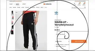
The Zalando layout applies the golden ratio spiral to align the product image and purchase button, naturally guiding the viewer’s eyes from left to right. What principle of layout does this best demonstrate?
a)
A. Repetition maintains consistent spacing between all images.
b)
B. Unity ensures all colors and images appear the same.
c)
C. Movement leads the viewer’s attention along a planned visual path.
d)
D. Proportion compares the sizes of the design elements evenly.
36.
Which font color is best to use if the background on your valentine card is red?
a)
a) Blue
b)
b) Green
c)
c) Violet
d)
d) White
37.
Harmony in design is achieved by:
a)
a) Creating multiple points of interest
b)
b) Repeating elements like color, texture, shape, and form
c)
c) Using contrasting colors only
d)
d) Mixing different unrelated design elements
38.
What role does color play in design?
a)
a) It is used to emphasize only the background
b)
b) It helps create interest and contrast
c)
c) It makes the text harder to read
d)
d) It must always be the same across all elements
39.
Monochromatic uses one color in a design. Its advantage is to create balance and to match the color in an artwork. However, this may lack energy and may look monotonous. How will you use the monochromatic scheme to create variations?
a)
a) Use complementary colors
b)
b) Adjust the saturation and value
c)
c) Change the hue of the artwork or every element
d)
d) Choose a design that is more suitable for the color scheme used
40.
Which of the following refers to the plan of creating an idea through a combination of texts, images, and other elements that are placed together artistically?
a)
a) Design
b)
b) Graphic
c)
c) Layout
d)
d) Message
41.
As a layout artist, we must know the details in arranging and accentuating the most important terms by changing its size, thickness, and spaces so the reader can navigate the highlight of the event easily. Which of the following principles best describe the statement above?
a)
a) Alignment
b)
b) Contrast
c)
c) Hierarchy
d)
d) Pattern, Repetition and Rhythm
42.
While working on a magazine layout, you notice that one side of the page feels heavier than the other because of the placement of a large image, making the design feel unbalanced. What principle can you apply to fix this?
a)
a) Increase the size of text on the opposite side to create visual weight equal to the image, balancing both sides of the layout.
b)
b) Keep the large image as it is but change its color to match the text on the opposite side of the page to create unity.
c)
c) Remove the image entirely and replace it with text to avoid having too much visual weight on one side of the layout.
d)
d) Use asymmetry to intentionally make one side heavier than the other to create a dynamic, artistic look, disregarding balance.
43.
In a website layout, the main navigation menu is aligned with the left side, while the images are centered. The alignment of these elements seems inconsistent. What impact does this misalignment have on the design?
a)
a) It creates a sense of harmony by placing elements in visually appealing but unrelated positions.
b)
b) It makes the design feel balanced because it draws attention to different parts of the page evenly.
c)
c) It disrupts the visual flow and makes the design confusing, as the eye has no clear direction to follow.
d)
d) It improves the proximity between the navigation and images, enhancing the user experience by bringing elements closer.
44.
A Grade 12 learner designed a tourism brochure with repeating wave lines at the bottom of every page. Which principle is demonstrated?
a)
A. Repetition enhances consistency and structure.
b)
B. Balance divides the visual elements symmetrically.
c)
C. White space keeps the layout free from clutter.
d)
D. Emphasis highlights one dominant focal message.
45.
During a group activity, learners are tasked with creating a brochure for a local business. One group uses different font styles, colors, and images on each page without any coordination. What principle should they apply to create a more cohesive design?
a)
a) Use emphasis by making the main title on each page larger and bolder to stand out against the rest of the content.
b)
b) Apply consistency by repeating the same color palette, font styles, and image placement across all pages to unify the brochure.
c)
c) Focus on rhythm by creating a dynamic layout with different elements on each page, even if they don’t match.
d)
d) Use proximity by spacing the elements equally across each page, even if they use different fonts and colors.
46.
Your class is creating a poster for the school’s “Clean and Green” campaign. You want to remove the messy background from a photo of a student holding a plant. Which tool should you use?
a)
A. Blur Tool
b)
B. Background Eraser
c)
C. Crop Tool
d)
D. Opacity
47.
You’re editing your class picture and want to make everyone’s faces brighter without overexposing the image. Which adjustment is best?
a)
A. Hue/Saturation
b)
B. Brightness/Contrast
c)
C. Transform
d)
D. Blur
48.
While editing your graduation photo, you accidentally erased part of your hair. What’s the best step to correct it?
a)
A. Use the Undo command
b)
B. Add a filter
c)
C. Crop the image
d)
D. Adjust brightness
49.
Your teacher asked you to make a digital poster for the “Mental Health Awareness” week. To make the message “You Matter” stand out, which tool should you apply?
a)
A. Clone Tool
b)
B. Blur Tool
c)
C. Text Tool
d)
D. Frame
50.
You want to emphasize the main subject of your travel photo by softening the background. Which tool should you use?
a)
A. Eraser Tool
b)
B. Crop Tool
c)
C. Blur Tool
d)
D. Transform
51.
You’re making a visual quote for your social media post. You want the background to appear slightly transparent so that the text is easier to read. Which setting should you modify?
a)
A. Brightness
b)
B. Frame
c)
C. Transform
d)
D. Opacity
52.
Your group is creating a digital poster for your bake sale. You want to make the cupcakes look more delicious by intensifying their colors. What tool should you use?
a)
A. Contrast
b)
B. Saturation
c)
C. Blur
d)
D. Eraser
53.
In your class photo collage, some cutouts look too sharp and don’t blend with the background. What should you apply?
a)
A. Overlay
b)
B. Feathering or Soft Eraser
c)
C. Crop Tool
d)
D. Transform
54.
You’re editing a magazine cover featuring your class officers. You place the title at the top, the photo in the center, and the slogan at the bottom. What design principle are you using?
a)
A. Visual Hierarchy
b)
B. Unity
c)
C. Harmony
d)
D. Blending
55.
Your group wants to combine three separate images — students, laptops, and the school logo — into one layout. Which principle or technique should you apply?
a)
A. Layering
b)
B. Cropping
c)
C. Erasing
d)
D. Merging
56.
Your class photo for the digital yearbook looks dull and lacks clarity due to poor lighting. You want to enhance visibility while keeping the photo natural.
a)
A. Use saturation to make the colors deeper and more intense.
b)
B. Add a color filter to give the image a different tone.
c)
C. Adjust brightness and contrast to improve light and sharpness.
d)
D. Crop out the darker parts and replace them with a lighter background.
57.
While editing your school campaign poster, the background distracts from the main message “Act Responsibly Online.” You want the text to stand out without deleting the background.
a)
A. Apply a mild blur on the background and keep the text crisp and focused.
b)
B. Lower the entire image brightness to reduce attention to the text.
c)
C. Add more images so the design looks filled and active.
d)
D. Use a gradient overlay with strong contrast to darken the overall layout.
58.
You’re improving a sunset photo of your class field trip, but the colors appear too orange and unnatural.
a)
A. Adjust the color balance to reduce warm tones and restore natural hues.
b)
B. Apply a saturation filter to make colors richer and more vivid.
c)
C. Use a vignette effect to highlight the central subject.
d)
D. Crop the photo until the horizon looks balanced and centered.
59.
Your advocacy poster includes the slogan “Be the Voice, Not the Echo,” but it’s difficult to read because of the colorful background.
a)
A. Apply blur on the entire photo to soften the background colors.
b)
B. Reduce saturation to lessen the intensity of all hues.
c)
C. Insert the slogan using the Text Tool and adjust contrast for visibility.
d)
D. Crop the image and place the text at the top corner.
60.
Your group is designing a collage for your graduation presentation. You want each image to look evenly arranged for a clean and balanced composition.
a)
A. Apply random filters to give variety to each image.
b)
B. Place the largest photo in the center to grab attention.
c)
C. Rotate images slightly to make the design look creative.
d)
D. Use grid lines or guides to align photos and equalize spacing.
61.
The background of your class photo is messy, showing chairs and scattered bags. You want the main subjects to stand out clearly.
a)
A. Apply a light blur effect on the background to keep focus on people.
b)
B. Crop out the bottom of the image to remove distractions.
c)
C. Adjust contrast and exposure across the whole image.
d)
D. Insert additional filters to shift focus using color tones.
62.
You’re creating a banner for the school intramurals and notice that the logo and slogan seem unevenly placed.
a)
A. Add more text at the bottom to fill the empty space.
b)
B. Use strong contrast between elements to make them noticeable.
c)
C. Rearrange and align elements symmetrically for visual balance.
d)
D. Insert decorative icons on one side to make the banner dynamic.
63.
You’re designing a poster for your entrepreneurship project. You want your product photo to merge naturally with the digital background.
a)
A. Adjust the opacity of the product layer so it blends smoothly.
b)
B. Add a border frame to outline the product’s edges.
c)
C. Use the blur tool to soften the product’s sharpness.
d)
D. Increase saturation so the product appears more vivid.
64.
Some photos in your collage appear darker than others. You want them all to look consistent.
a)
A. Replace the darker photos with brighter ones from your gallery.
b)
B. Crop each photo so that only lighter areas are visible.
c)
C. Use vignette filters around all photos for harmony.
d)
D. Apply similar lighting, contrast, and tone adjustments to every image.
65.
Your digital artwork looks too crowded because every corner has elements. Your teacher suggests leaving “breathing space.”
a)
A. Leave some blank areas around the main subject to apply negative space.
b)
B. Increase color saturation to attract attention to the main subject.
c)
C. Add borders to separate each object from the others.
d)
D. Reduce the opacity of the background to clear some space.
66.
Your poster about wellness uses blue and green hues to express calmness and peace.
a)
A. Apply high contrast to highlight emotional expression.
b)
B. Use sharp red tones for visual emphasis and urgency.
c)
C. Increase saturation to make the design livelier.
d)
D. Demonstrate harmony and unity by keeping color tones consistent.
67.
You’re creating a tourism poster “Explore Romblon.” You want the beach photo and slogan to stand out at first glance.
a)
A. Add symmetry by centering all objects and text equally.
b)
B. Apply color harmony to keep tones subtle and uniform.
c)
C. Use focus and emphasis by brightening key elements slightly.
d)
D. Insert filters to create a more saturated and artistic background.
68.
Your collage looks unbalanced because most images are clustered on one side.
a)
A. Add text boxes to fill unused space.
b)
B. Overlay darker filters on the lighter side.
c)
C. Crop excess portions to make the composition smaller.
d)
D. Rearrange the layout for symmetry and equal distribution.
69.
In your composite photo, the cutout person’s lighting doesn’t match the background’s sunlight direction.
a)
A. Increase brightness to make all parts equally bright.
b)
B. Use the blur tool to hide mismatched lighting.
c)
C. Adjust the shadow and light consistency to achieve realism.
d)
D. Change color balance to correct the warm tones.
70.
Your poster looks flat and lacks depth. You want it to look more three-dimensional.
a)
A. Brighten the image to make it appear more open.
b)
B. Apply vignette filters on the edges for framing.
c)
C. Add drop shadows or highlights to create dimension and realism.
d)
D. Overlay multiple textures to fill empty areas.
71.
Your self-portrait looks cold and pale. You want to make it appear as if taken during sunset.
a)
A. Increase contrast to emphasize darker areas.
b)
B. Adjust temperature settings to add warmth and golden tones.
c)
C. Use sharpen tools to enhance skin details.
d)
D. Lower brightness to make the photo moodier.
72.
You’re finalizing a digital artwork with multiple layers. You want to save it for online submission while keeping editability.
a)
A. Merge all layers, then save a duplicate file for revisions.
b)
B. Delete extra layers before saving the image to reduce size.
c)
C. Flatten the entire image permanently to minimize storage.
d)
D. Export layers individually and combine them later.
73.
Your classmate is working on a digital banner for your school and wants to make the school logo appear glowing against a dark background to catch attention while keeping it professional.
a)
A. Increase the overall brightness of the dark background to make the logo stand out against the entire composition.
b)
B. Reduce the opacity of the logo layer slightly to lessen the harshness of its edges against the darker tones.
c)
C. Apply outer glow effects or blending modes to softly illuminate the logo without distorting its original colors.
d)
D. Add multiple layers of shadow behind the logo to create the illusion of light and make it appear highlighted.
74.
While editing your portrait for your digital portfolio, you notice that your skin tone looks overly white due to the fluorescent lighting used during the photo shoot.
a)
A. Use the Contrast and Brightness tools to emphasize facial features and make shadows appear more detailed.
b)
B. Increase the overall exposure of the photo to lighten the subject and create a brighter, cleaner visual appeal.
c)
C. Use a combination of blur and soft-focus filters to smoothen the skin texture and hide minor imperfections.
d)
D. Apply the Color Balance adjustment to restore warmth and bring back the natural and healthy skin tone of the subject.
75.
You are editing a composite photo of your classmates for a class poster, but one person looks noticeably larger than the others even though they are positioned farther in the background.
a)
A. Adjust the scale and size of the subject to correct proportion and create a more realistic visual composition.
b)
B. Modify the color temperature of the entire image to balance the tone between the foreground and the background.
c)
C. Apply depth-of-field blur effects to the background area to emphasize distance and make the image appear focused.
d)
D. Increase exposure and brightness on smaller subjects to make them appear visually equal in size and presence.
76.
What is the primary reason for having a clear purpose when designing a website?
a)
a) To make the website more colorful and vibrant.
b)
b) To ensure that users understand the main goal of the website.
c)
c) To fill the website with as many design elements as possible.
d)
d) To reduce the amount of text on the homepage.
77.
Simplicity is an important aspect of web design because:
a)
a) It increases the number of pages on the website.
b)
b) It allows designers to add more images and videos.
c)
c) It makes the website easier for users to navigate and find information.
d)
d) It encourages the use of multiple fonts and colors on the same page.
78.
What is the main function of a website's header?
a)
a) To display the main content of the website.
b)
b) To allow users to interact through comments.
c)
c) To present the logo and navigation options.
d)
d) To show the website's copyright information.
79.
Which of the following best defines "responsiveness" in web design?
a)
a) Making a website visually attractive across all devices.
b)
b) Creating a design that is colorful and interactive.
c)
c) Ensuring that the website's navigation bar is easy to use.
d)
d) Designing a website to adapt to different screen sizes like mobile devices.
80.
How does good communication help improve user experience in web design?
a)
a) It enables users to interact with website polls.
b)
b) It reduces the number of images used in the website.
c)
c) It increases the website's load time by adding more text.
d)
d) It allows users to quickly find and understand the information they need.
81.
A website is taking too long to load, and users are leaving before the content appears. After evaluating the design, you find that there are many high-resolution images on the homepage. Which principle is being violated?
a)
a) Simplicity
b)
b) Responsiveness
c)
c) Aesthetic
d)
d) Visibility
82.
A user is visiting a website on their mobile phone and notices that the text is too small to read and the images do not fit the screen properly. Which principle has likely been overlooked in the design process?
a)
a) Communication
b)
b) Load Time
c)
c) Usability
d)
d) Responsiveness
83.
You are reviewing a website for an online store and notice that the navigation is unclear, and it is difficult to find product categories. Which element or principle of web design should be improved?
a)
a) Usability
b)
b) Content
c)
c) Aesthetic
d)
d) Interaction
84.
A website has a beautiful design, but users are struggling to find the important information they need. Which principle would help prioritize the key content on the page?
a)
a) Responsiveness
b)
b) Simplicity
c)
c) Purpose
d)
d) Visibility
85.
The homepage of a website is filled with unnecessary animations and distracting background images that slow down the loading time. Which principle could be applied to fix this issue?
a)
a) Load Time
b)
b) Interaction
c)
c) Aesthetic
d)
d) Communication
86.
You are designing a website for a local business. The homepage includes multiple blocks of text and several unrelated images. Users are finding it difficult to locate key services. Which principle would improve the user experience?
a)
a) Responsiveness
b)
b) Communication
c)
c) Proximity
d)
d) Visibility
87.
A web designer adds a comment section at the bottom of the webpage to allow users to share their opinions. This decision applies which element of web design?
a)
a) Interaction
b)
b) Usability
c)
c) Responsiveness
d)
d) Simplicity
88.
After conducting a usability test, a team discovers that users are frequently confused about where they are on the site and how to navigate between pages. What should be improved in the design?
a)
a) Content
b)
b) Navigation
c)
c) Header
d)
d) Footer
89.
You notice that a website's footer includes a company's logo, social media links, privacy policies, and copyright information. What purpose does the footer serve in web design?
a)
a) It contains interactive features like polls.
b)
b) It helps establish communication with users.
c)
c) It displays the main navigation options for the website.
d)
d) It provides essential information and legal details at the bottom of each page.
90.
A photographer’s website uses high-quality images and well-organized sections, but the design feels cluttered because of many bright, contrasting colors that make the text hard to read. Which principle of web design is being compromised?
a)
a) Simplicity
b)
b) Communication
c)
c) Usability
d)
d) Aesthetic
91.
What design principle was exemplified on this website?
a)
a) Proximity
b)
b) Balance
c)
c) Emphasis
d)
d) Harmony
92.

What design principle was exemplified on this website?
a)
a) Repetition, Pattern, and Rhythm
b)
b) Alignment
c)
c) Emphasis
d)
d) Colors and Shapes
93.

What design principle was exemplified on this website?
a)
a) Colors and Shapes
b)
b) Alignment
c)
c) Hierarchy
d)
d) Balance
94.
What website design principle was exemplified on this website?
a)
a) Simplicity
b)
b) Load Time
c)
c) Purpose
d)
d) Responsiveness
95.

What website design principle was exemplified on this website?
a)
a) Simplicity
b)
b) Load Time
c)
c) Purpose
d)
d) Responsiveness
96.
What website design principle was exemplified on this website?
a)
a) Simplicity
b)
b) Load Time
c)
c) Purpose
d)
d) Responsiveness
97.
Identify the web design principle related to the issue in the layout shown below.
a)
a) Simplicity
b)
b) Load Time
c)
c) Purpose
d)
d) Responsiveness
98.

Which of the following design principles is primarily demonstrated in the organization of the website's elements?
a)
a) Alignment: Elements are aligned in a consistent manner, like the navigation bar and the product categories.
b)
b) Contrast: Elements are differentiated using color, size, or style, such as the bright colors of the "Shipping Is Free. Saving Is Easy." banner, or the different sizes of the product images.
c)
c) Proximity: Related elements are grouped together, like the navigation bar, product categories, and the "Shipping Is Free. Saving Is Easy." banner.
d)
d) Repetition: Visual elements are repeated consistently throughout the design, like the use of rounded corners on the product icons.
99.

Evaluate the website layout below in terms of the application of website design principles, considering its purpose, load time, communication, and responsiveness. Which of the following factors is most likely to negatively impact the user experience?
a)
a) Purpose: The website's purpose is unclear, making it difficult for users to understand what it offers.
b)
b) Load Time: The website appears to be visually crowded and cluttered, potentially leading to slow loading times and a frustrating user experience.
c)
c) Communication: The website uses a variety of fonts and colors, making it difficult to read and understand the information presented.
d)
d) Responsiveness: The website's layout is not optimized for different screen sizes, making it difficult to use on mobile devices.
100.

Evaluate the website layout below in terms of the application of website design principles, considering its purpose, load time, communication, and responsiveness. Which of the following factors is most clearly communicated by the design?
a)
a) Purpose: The website clearly aims to promote and sell fresh, organic vegetables.
b)
b) Load Time: The website's image-heavy design suggests it might have slow loading times.
c)
c) Communication: The website uses a combination of text and visuals to effectively convey its message.
d)
d) Responsiveness: The website's layout appears to be designed for desktop viewing and might not be optimized for mobile devices.
100 %

