
Font size
 Worksheets
Graphing Notes Practice 25-26
Total questions: 39
Worksheet time: 37mins
Rate your understanding of Graphing as a whole.
1- I am super lost
2- I get some things
3- I feel pretty good; I just need more practice
4- I feel super Confident
(a) are used to organize data as it is collected. (b) are a visual representation of the data.
The (a) is the type of measurement being used; ex time in minutes. The (b) is what the graph is counting by; ex, the numbers increase by 2's

What is the scale on the x-axis of this graph?
(a)
What does a graph's trend show you?
What is happening on the graph and how the variables affect each other
The purpose of the experiment and how the variables affect each other
The units of the variables and how the scales affect each other
The scale of the axis and how the numbers relate to each other
Match the following

Negative Correlation

Positive Correlation

Zero Correlation
Production has experienced a strong, steady growth over the whole year.


Rate your understanding of Graphing as a whole.
1- I am super lost
2- I get some things
3- I feel pretty good; I just need more practice
4- I feel super Confident

Based on the graph, what is the overall trend that you see?
Age dec = dec Distance
Age inc = dec Distance
Age inc = inc Distance
zero correlation
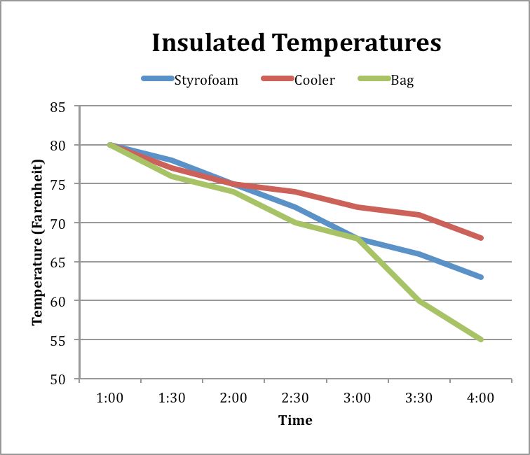
Which of the following shows the correct trend overall?
Time decc = dec Temp
Time dec = inc Temp
Time inc = inc Temp
Time inc = dec Temp
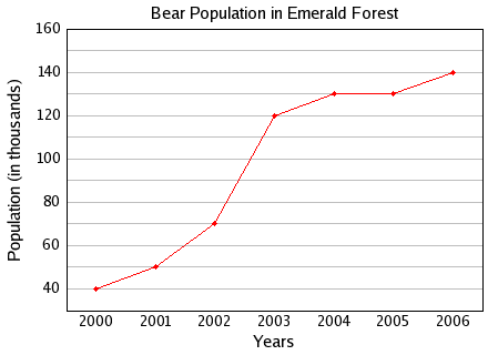
Which trend matches the graph?
Years inc = Population dec
Years inc = Population inc
Years dec = Population inc
Years dec = Population dec

Grade level inc = Math score dec
Grade level dec = Math score dec
Grade level inc = Math score inc
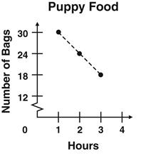
Reorder the following to create the trend
Hours inc = dec puppy food bags
Hours inc = inc number bags
Hours inc = dec number bags
Hours inc = inc puppy food bags
Which of the following describes a line graph
Shows the break down of a fixed quantity
Compares information gathered by counting
Shows trends and how data changes over time
Totals to a sum of 100
Has visually proportional parts to the data percentage
Which of the following describes a circle/pie graph
Shows the break down of a fixed quantity
Compares information gathered by counting
Shows trends and how data changes over time
Totals to a sum of 100
Has visually proportional parts to the data percentage
Which of the following describes a Bar graph
Shows the break down of a fixed quantity
Compares information gathered by counting
Shows trends and how data changes over time
Can be displayed vertically and horizontally
A chart's purpose is to
give an experimenter a place to record data
organize data by category
visually display data and trend
show trends
Rate your understanding of Graphing as a whole.
1- I am super lost
2- I get some things
3- I feel pretty good; I just need more practice
4- I feel super Confident

What do the labels on the Y-axis represent?
Number of students
Type of cars
Unkown because there is not key
Students grades

What do the labels on the x-axis represent?
Number of Cars
Type of cars
Unknown
Students grades
What do the labels on the x-axis represent?
Number of Cars
Type of cars
Unknown
Students grades

What is this graph missing?
Labeled Axis
Units
Key
Title

What is this graph missing
title
labeled x-axis
Labeled y-axis
Key
units

This chart
has inaccurate visual proportions
does not total to the correct sum
Is missing a title
is missing labels
has all of the requirements for a graph

This chart
has accurate visual proportions
does not total to the correct sum
Is missing a title
is missing labels
has all of the requirements for a graph


From Tuesday to Wednesday:


You are taking the temperature for data for your science class, the temperature is 96 degrees. What month do you predict it is?
September
July
May
December

If the hippo population trend continues, what will the population be in 2011?
12
24
42
38

If you wanted to avoid the crowd to purchase a car, which day should you NOT go to purchase a car?
Monday
Thursday
Tuesday
Friday

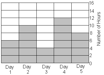
Jamie practiced for her piano recital for 5 days in a row.
She found the sum of hours she practiced on day 1 and day 3. What is the difference of that sum and the number of hours she practiced on day 4?
5
2
10
1
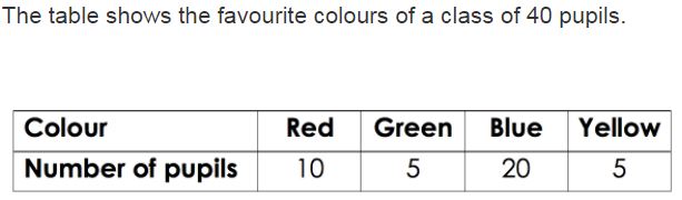
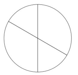
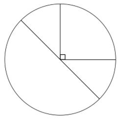
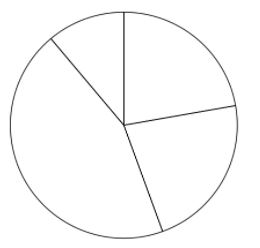
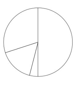
Which pie chart represents the same data as the table?
Rate your understanding of graphing .
1* I am super lost
2** I get some things but not others
3*** I feel pretty good; I just need more practice
4**** I feel super Confident

