
 Worksheets
Note 5 Typography 1
Total questions: 20
Worksheet time: 10mins
Which statement best defines x-height in type anatomy?
Height of lowercase letters excluding ascenders
Height of uppercase letters including serifs
Distance from ascender line to cap line
Width of lowercase letters across counters
Cap height is most accurately described as the distance from the baseline to the top of which letters?
Flat uppercase letters like H or E
Curved lowercase letters like a or e
Ascenders of lowercase letters like h
All uppercase letters including overshoots
Which statement best defines the baseline in typography?
The invisible line on which letters sit
The height of lowercase x relative to caps
The maximum height of uppercase letters
The distance between adjacent letterforms
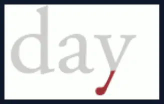
Which set lists only lowercase letters that typically include descenders?
g, j, p, q, y
b, d, h, k, l
a, c, e, n, r
m, n, u, v, w
Ascenders and descenders primarily affect which aspect of typesetting when designing lines of text?
Line spacing
Kerning pairs
Tracking width
Raster hinting
A designer needs compact text without clashing strokes across lines. Which approach addresses issues caused by long ascenders and descenders?
Increase leading slightly
Reduce tracking heavily
Switch to monospacing
Add more hinting
Which term names the fully curved stroke that encloses space in letters like ‘a’, ‘b’, or ‘o’ and directly affects character width?
Bowl
Counter
Arm
Terminal
A designer wants to emphasize tradition in printed body text while aiding long-form reading. Which classification is most appropriate?
Serif typeface with modest contrast
Sans serif typeface with geometric forms
Script typeface mimicking handwriting
Monospaced typeface for coding feel
Display typeface with ornate features
What does the term 'sans' indicate in the name 'sans serif'?
It means 'without', indicating no serif endings
It means 'simple', indicating geometric structure
It means 'plain', indicating minimal ornament
It means 'linear', indicating even stroke widths
Which statement best describes serif typefaces in contrast to other basic classifications?
They include small finishing strokes on letters
They avoid decorative terminals on all letters
They space every character with equal widths
They are intended only for very large sizes
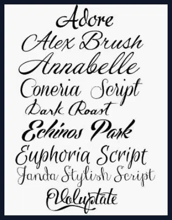
Which type classifications are primarily designed to mimic handwriting and are usually reserved for headlines and display use?
Script typefaces with calligraphic forms
Serif typefaces with bracketed serifs
Sans serif typefaces with geometric forms
Monospaced typefaces with equal widths

Display typefaces are best characterized by which combination?
Decorative forms for large sizes only
Neutral forms for dense body copy
Equal-width letters for legibility
Calligraphic strokes for invitations
Which scenario most strongly favors using a sans serif typeface?
Small text on backlit digital screens
Long-form print novels on matte paper
Formal wedding invitations with flourishes
Engraved certificates requiring fine detail
Which pairing is MOST appropriate for body copy and UI labels in a mobile app prioritizing legibility on various screens?
Sans serif for body, sans serif for labels
Modern serif for body, slab serif for labels
Slab serif for body, modern serif for labels
Script for body, slab serif for labels
Which statement best distinguishes script typefaces from monospaced typefaces?
Script mimics handwriting with connected strokes
Script uses fixed-width glyphs for alignment
Script prioritises screen code legibility
Script letters occupy equal horizontal space
Display typefaces are primarily optimised for which purpose when used at 14 points and above?
Visual impact in titles and headlines
Dense body text for long reading
Technical manuals requiring uniform width
Subtle captions emphasising neutrality
In typography, which unit system is standard for measuring type sizes and line lengths in digital publishing?
Points and picas are standard units
Inches and yards are standard units
Centimeters and meters are standard units
Pixels and megabytes are standard units
Why are standardized units like points and picas important for digital publishing across devices and software?
They ensure predictable layout consistency
They increase decorative font variety
They eliminate all manual adjustments
They speed up internet download times
Which uses appropriately match category to purpose?
Display type for headlines and large sizes
Text type for captions and body copy
Display type for footnotes and small sizes
Text type for running text at 9–12 points
Kerning primarily aims to correct which issue?
Uneven gaps between specific letter pairs
Excessive space between words in paragraphs
Inconsistent line height across paragraphs
Overall density differences across columns

