
10.2 Histograms review lesson + Quiz
Presentation
•
Mathematics
•
8th Grade
•
Practice Problem
•
Easy

William Katumba
Used 7+ times
FREE Resource
2 Slides • 57 Questions
1
2
Multiple Choice

TRUE or FALSE;
We use a histogram to represent grouped data with class intervals
3
Multiple Choice
4
Multiple Choice

Given the date below, Does it represent grouped or ungrouped data?
5
Multiple Choice
6
Multiple Choice

Tandi record the ages of some teachers in a table as seen in the image
This is grouped data.
7
Multiple Choice
Tandi record the ages of some teachers in a table as seen in the image.
Do all the age intervals have the same width? (range / class width?)
8
Multiple Select
Tandi record the ages of some teachers in a table as seen in the image.
Which groups / intervals / classes have a width / range of 3?
9
Multiple Choice
Tandi record the ages of some teachers in a table as seen in the image.
Which groups / intervals / classes have a width / range of 4?
10
Multiple Select
Tandi record the ages of some teachers in a table as seen in the image.
Which groups / intervals / classes have a width / range higher than 5?
11
Multiple Select
Tandi record the ages of some teachers in a table as seen in the image.
What do the values in the frequency column mean?
12
Multiple Select

Which class interval has the lowest frequency?
13
Multiple Choice
Which class interval has the highest frequency?
14
Multiple Choice

TRUE or FALSE;
A Histogram consists of rectangles whose areas are proportional to the frequencies in each class
15
Multiple Choice
TRUE or FALSE;
In a histogram, the width of the rectangle is equal to the class interval.
16
Multiple Choice
TRUE or FALSE;
In this chapter, we will only deal with histograms of equal class intervals
17
Multiple Choice

TRUE of FALSE
This histogram has unequal class intervals
18
Multiple Choice
What is the class width / interval / range of this histogram?
19
Multiple Choice

Find the class width of this histogram.
20
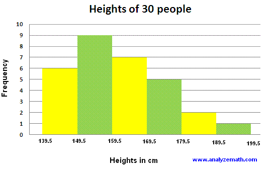
Multiple Choice
What's the total number of girls represented by this histogram.
21
Multiple Choice
How many girls have a height int he interval 150-155 according to this histogram.
22
Multiple Choice
Which class interval has the most number of girls in this histogram.
23
Multiple Choice
The tallest girl in the class will have a height between 160-165
24
Multiple Choice
The histogram shows that the heights of most girls lie between 170-175 cm
25
Multiple Choice
The histogram shows that there are more girls in the lowest class than in the highest class.
26
Multiple Choice

The histograms in the diagram show the distribution of the times taken by two different classes to complete a math assignment.
Find the number of students from 2A
27
Multiple Choice
The histograms in the diagram show the distribution of the times taken by two different classes to complete a math assignment.
Find the number of students from 2B
28
Multiple Choice
The histograms in the diagram show the distribution of the times taken by two different classes to complete a math assignment.
Find the number of students from 2A who took more than 40 minutes to complete the assignment.
29
Multiple Choice
The histograms in the diagram show the distribution of the times taken by two different classes to complete a math assignment.
Find the number of students from 2B who took more than 40 minutes to complete the assignment.
30
Multiple Choice
TRUE or FALSE;
75 % of students in 2A took more than 40 minutes to complete the assignment
31
Multiple Choice
TRUE or FALSE;
75 % of students in 2A took more than 40 minutes to complete the assignment
32
Multiple Choice
TRUE or FALSE;
Most students in 2A took between 50-60 minutes to complete the assignment
33
Multiple Choice
TRUE or FALSE;
The graph for 2A is evenly distributed
34
Multiple Choice
What percentage of students in 2B required more than 40 minutes to complete the assignment?
35
Multiple Choice
TRUE or FALSE?
The students in 2A are more capable than the students in 2B at completing this assignment.
36
Multiple Choice
Is the time taken to complete the assignment evenly distributed for 2B?
37
Multiple Choice
TRUE or FALSE
Mjjority of 2A students took more than 40 minutes to complete the assignment.
38
Multiple Choice
TRUE or FALSE
Majority of 2B students took more than 40 minutes to complete the assignment.
39
Multiple Choice
The number of students who took 20-30 minutes in 2A is the same as the number of students in 2B who took 50-60 minutes.
40
Multiple Choice

The histograms compare the heights of 50 boys and 50 girls across the same age groups.
Which graph is more evenly distributed?
41
Multiple Choice
TRUE or FALSE?
There are more boys in the lowest class than girls
42
Multiple Choice
What is the class interval for both graphs?
43
Multiple Choice
What percentage of boys is below 165 cm tall?
44
Multiple Choice
What percentage of girls is below 165 cm tall?
45
Multiple Choice
What percentage of boys is above 165 cm tall?
46
Multiple Choice
What percentage of girls is above 165 cm tall?
47
Multiple Choice

48
Multiple Choice

49
Multiple Choice
50
Multiple Choice

51
Multiple Choice

52
Multiple Choice

53
Multiple Choice

54
Multiple Choice
55
Multiple Choice

56
Multiple Choice

57
Multiple Choice

58
Multiple Choice
59
Show answer
Auto Play
Slide 1 / 59
SLIDE
