Search Header Logo
Understanding Graphs

Understanding Graphs

Assessment

Presentation

Science

8th Grade

Practice Problem

Medium

NGSS
MS-ESS1-1, MS-ESS2-5, MS-ESS3-5

+8

Standards-aligned

Created by

Shanon Layne

Used 7+ times

FREE Resource

5 Slides • 25 Questions

1

Reading and Explaining Graphs

media

What can I learn from the graphs/data tables?

2

Reading Graphs

Objective:

I will be able to read and gather information from various graphs/tables and explain what they are showing me.

3

Step 1

Find the Title and Labels

The first step in trying to figure out what a graph is telling you is finding and using the title and axis titles/labels. This is there to help tell you about what the graph is showing.

media

4

Step 2

Look at the bars/lines

The second step in understanding a graph is looking at the bars/lines. They will show data based on the labels.

media

5

Multiple Choice

Question image

Based on the graph, what is the LEAST favorite day of the week for Americans?

1

Monday

2

Tuesday

3

Friday

4

Saturday

6

Multiple Choice

Question image

Based on the graph, what is the favorite day of the week for Americans?

1

Monday

2

Wednesday

3

Friday

4

Saturday

7

Step 3

Analyze

Think about what information you are learning through the graph. What is it telling/teaching you?

media

8

Multiple Choice

Question image

Based on the graph, what conclusions might we draw about Americans?

1

Americans prefer the beginning of the work week (Monday and Tuesday) to the rest of th week

2

Americans like Tuesday a lot more than Sunday.

3

Americans like the work week (Monday to Thursday) more than the weekend.

4

Americans like the weekend (Friday, Saturday, and Sunday) more than the work week.

9

Multiple Choice

Question image

Practice- Which is the hottest month in Tokyo, Japan?

1

January

2

February

3

August

4

September

10

Multiple Choice

Question image

Practice- Which is the wettest (most precipitation) month in Tokyo, Japan? (**Hint- precipitation is shown by the bars**)

1

January

2

February

3

August

4

September

11

Multiple Choice

Question image

Practice- Which is the hottest month in Sao Paulo, Brazil?

1

June

2

July

3

I cannot tell

4

August

12

Multiple Choice

Question image

Practice- Which is the hottest month in Sao Paulo, Brazil?
How do you know?

1

September- It's got the highest orange dot

2

December- It's got the shortest bar

3

I cannot tell, this graph shows data for precipitation only.

4

I cannot tell because this graph is about Tokyo, Japan.

13

Multiple Choice

Question image

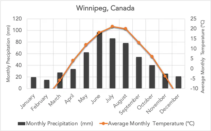
Practice- What is the wettest (most precipitation) month for Winnipeg, Canada?

1

January

2

February

3

June

4

August

14

Multiple Select

Question image

Practice- What is the driest (least precipitation) month for Winnipeg, Canada? (Choose more than 1)

1

January

2

February

3

June

4

July

15

Multiple Choice

Question image

Practice- Winnipeg, Canada is near the Arctic Circle. Why is there very little precipitation in January, February and December?

1

The city is near the Arctic Circle which would make it very cold in Jan, Feb, and Dec. This would make it too cold to rain/snow very much.

2

The city is near the Arctic Circle which would make it very hot in Jan, Feb, and Dec. This would make it too hot to rain/snow very much.

3

The city has a moderate temperature in Jan, Feb, and Dec, so it doesn't rain.

4

During Jan, Feb, and Dec the temperature is too hot, so the water cannot condense and rain.

16

Multiple Select

Question image

Practice- Winnipeg, Canada is near the Arctic Circle. What could this graph tell us about precipitation near the Arctic Circle? (choose all that are true)

1

There is more precipitation when the temperatures are colder.

2

There is more precipitation when the temperatures are warmer.

3

There is no connection between precipitation and temperatures.

4

When temperatures are below freezing (0 C) there is less precipitation.

17

Multiple Select

Question image

Practice- Winnipeg, Canada is near the Arctic Circle. What could this graph tell us about precipitation near the Arctic Circle? (choose all that are true)

Notice how the temperature (orange line) and precipitation kind of match each other. Higher temperature, higher precipitation. Temperatures below freezing are very dry.

1

There is more precipitation when the temperatures are colder.

2

There is more precipitation when the temperatures are warmer.

3

There is no connection between precipitation and temperatures.

4

When temperatures are below freezing (0 C) there is less precipitation.

18

Multiple Choice

Question image

Which month is the hottest in Cairo, Egypt?

1

July

2

January

3

March

4

December

19

Multiple Choice

Question image

Which month is the coldest in Cairo, Egypt?

1

July

2

January

3

March

4

November

20

Multiple Select

Question image

Which months have the most precipitation?

1

July

2

January

3

August

4

December

21

Multiple Select

Question image

Which months have the LEAST precipitation?

1

July

2

January

3

August

4

December

22

Multiple Select

Question image

What relationship is there between temperature and precipitation in Cairo, Egypt? (Choose all that are true)

1

When it is hot, there is less precipitation.

2

When it is cold, there is less precipitation

3

When it is hot, there is more precipitation.

4

When it is cold, there is more precipitation.

23

Multiple Choice

Question image

Evaporation is shown with an up arrow, precipitation is shown with a down arrow. The bigger the arrow the more that occurs. Which picture best shows the precipitation and evaporation in January (winter)?

1
2
3

24

Multiple Choice

Question image

Evaporation is shown with an up arrow, precipitation is shown with a down arrow. The bigger the arrow the more that occurs. Which picture best shows the precipitation and evaporation in August (summer)?

1
2
3

25

Multiple Choice

Question image

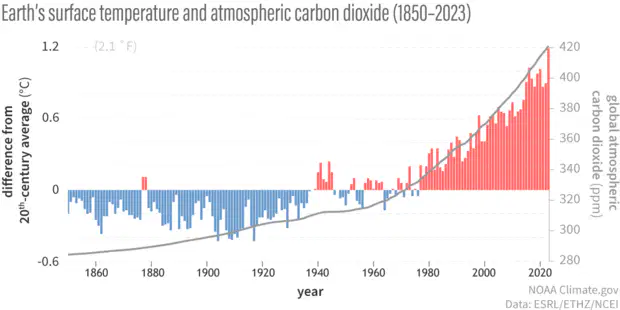
What year is the hottest according to this graph?

(Temperature is shown by the bars and is comparison to the 1900-1999 average)

1

1944

2

1918

3

2012

4

2023

26

Multiple Choice

Question image

What year is the coldest according to this graph?

(Temperature is shown by the bars and is comparison to the 1900-1999 average)

1

1944

2

1918

3

2012

4

2023

27

Multiple Choice

Question image

The gray line is showing the amount of carbon dioxide in the atmosphere.

What year has the most carbon dioxide in the atmosphere?

1

1944

2

1918

3

2012

4

2023

28

Multiple Choice

Question image

The gray line is showing the amount of carbon dioxide in the atmosphere.

What year has the least carbon dioxide in the atmosphere?

1

1944

2

1918

3

1850

4

2023

29

Multiple Choice

Question image

What question could this graph help us answer?

1

Does the temperature go up when methane levels go up?

2

Is there a connection between temperature and carbon dioxide levels?

3

Does the amount of precipitation increase when the temperature increases?

4

How does the temperature of the planet change the number of flamingos in the world?

30

Multiple Select

Question image

What statements could we draw from this graph?

1

The temperature was colder when there was less carbon dioxide in the atmosphere.

2

When the temperature is colder, there are more flamingos in the world.

3

As the carbon dioxide levels decrease, the temperature increases.

4

As the carbon dioxide levels increase, so does the temperature.

Reading and Explaining Graphs

media

What can I learn from the graphs/data tables?

Show answer

Auto Play

Slide 1 / 30

SLIDE