Differentiating Bar Graphs and Histograms
Interactive Video
•
English
•
1st - 5th Grade
•
Practice Problem
•
Medium
+6
Standards-aligned

Sophia Harris
Used 1+ times
FREE Resource
Standards-aligned
10 questions
Show all answers
1.
MULTIPLE CHOICE QUESTION
30 sec • 1 pt
What is the primary purpose of pausing the video as suggested in the introduction?
To skip parts of the video
To take notes on the discussed topics
To discuss with peers
To prepare for exams
Tags
CCSS.RI.1.7
CCSS.RI.3.7
CCSS.RL.1.7
CCSS.RL.2.7
CCSS.RL.3.7
2.
MULTIPLE CHOICE QUESTION
30 sec • 1 pt
What distinguishes a histogram from a bar graph?
Histograms cannot show categorical data
Use of various colors to represent data
Display of continuous intervals on the x-axis
Use of percentages instead of actual numbers
Tags
CCSS.6.SP.B.4
CCSS.HSS.ID.A.1
3.
MULTIPLE CHOICE QUESTION
30 sec • 1 pt
In a histogram, what does the y-axis typically represent?
Data labels
Frequency of data points
Percentage
Categories
Tags
CCSS.6.SP.B.4
CCSS.HSS.ID.A.1
4.
MULTIPLE CHOICE QUESTION
30 sec • 1 pt
How can you estimate the number of users surveyed in a histogram?
By counting the number of bars
By adding the frequencies of all intervals
By the width of the bars
By finding the highest interval
Tags
CCSS.6.SP.B.5A
5.
MULTIPLE CHOICE QUESTION
30 sec • 1 pt
What should the intervals on the x-axis of a histogram look like?
They should be of varying sizes
They should be of the same size
They should decrease in size
They should be non-numeric
Tags
CCSS.6.SP.B.4
CCSS.HSS.ID.A.1
6.
MULTIPLE CHOICE QUESTION
30 sec • 1 pt
What is the correct way to interpret data from a histogram?
Ignore the x-axis labels
Only focus on the largest bar
Estimate values by the height of the bars
Sum all the frequencies
Tags
CCSS.6.SP.B.4
CCSS.HSS.ID.A.1
7.
MULTIPLE CHOICE QUESTION
30 sec • 1 pt
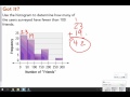
Which interval contains the most data in a given histogram?
150-199
0-49
50-99
100-149
Tags
CCSS.6.SP.B.4
CCSS.HSS.ID.A.1
Access all questions and much more by creating a free account
Create resources
Host any resource
Get auto-graded reports
Continue with Google

Continue with Email
Continue with Classlink
Continue with Clever
or continue with
Microsoft
%20(1).png)
Apple
Others
Already have an account?
Similar Resources on Wayground
Popular Resources on Wayground

15 questions
Fractions on a Number Line
Quiz
•
3rd Grade
20 questions
Equivalent Fractions
Quiz
•
3rd Grade
25 questions
Multiplication Facts
Quiz
•
5th Grade
29 questions
Alg. 1 Section 5.1 Coordinate Plane
Quiz
•
9th Grade
22 questions
fractions
Quiz
•
3rd Grade
11 questions
FOREST Effective communication
Lesson
•
KG
20 questions
Main Idea and Details
Quiz
•
5th Grade
20 questions
Context Clues
Quiz
•
6th Grade
Discover more resources for English
20 questions
Main Idea and Details
Quiz
•
5th Grade
12 questions
Figurative Language Review
Interactive video
•
5th Grade
10 questions
Theme
Quiz
•
4th Grade
20 questions
Prefix and Suffix Review
Quiz
•
3rd - 5th Grade
20 questions
Main Idea
Quiz
•
3rd Grade
20 questions
Find the Main Idea and Supporting Details
Quiz
•
3rd Grade
11 questions
Quiz: Review Simple, Compound, and Complex Sentences
Quiz
•
5th Grade
10 questions
Making Inferences
Quiz
•
3rd Grade