Fuel Efficiency and Scatter Plots
Interactive Video
•
Mathematics, Science, Other
•
6th - 8th Grade
•
Practice Problem
•
Hard

Thomas White
FREE Resource
Read more
10 questions
Show all answers
1.
MULTIPLE CHOICE QUESTION
30 sec • 1 pt
What is bivariate data?
Data involving two variables
Data involving three variables
Data involving four variables
Data involving a single variable
2.
MULTIPLE CHOICE QUESTION
30 sec • 1 pt
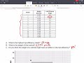
What does the example table in the video show?
The weight and fuel efficiency of car models
The speed and color of cars
The price and brand of cars
The engine size and horsepower of cars
3.
MULTIPLE CHOICE QUESTION
30 sec • 1 pt
Which car model has the highest fuel efficiency in the table?
Model number 5
Model number 8
Model number 10
Model number 2
4.
MULTIPLE CHOICE QUESTION
30 sec • 1 pt
What is the weight of the vehicle with the highest fuel efficiency?
2,550 pounds
4,000 pounds
3,000 pounds
2,800 pounds
5.
MULTIPLE CHOICE QUESTION
30 sec • 1 pt
How does the weight of a vehicle generally affect its fuel efficiency?
Heavier vehicles have higher fuel efficiency
Weight does not affect fuel efficiency
Lighter vehicles have higher fuel efficiency
Heavier vehicles have the same fuel efficiency as lighter ones
6.
MULTIPLE CHOICE QUESTION
30 sec • 1 pt
Why do heavier vehicles like semi-trucks have lower fuel efficiency?
They weigh more, making it harder to move
They are more aerodynamic
They use a different type of fuel
They have smaller engines
7.
MULTIPLE CHOICE QUESTION
30 sec • 1 pt
What is the purpose of constructing a scatter plot?
To list data in a table
To see trends in data more easily
To calculate averages
To compare data with unrelated variables
Access all questions and much more by creating a free account
Create resources
Host any resource
Get auto-graded reports
Continue with Google

Continue with Email
Continue with Classlink
Continue with Clever
or continue with
Microsoft
%20(1).png)
Apple
Others
Already have an account?
Popular Resources on Wayground

15 questions
Fractions on a Number Line
Quiz
•
3rd Grade
20 questions
Equivalent Fractions
Quiz
•
3rd Grade
25 questions
Multiplication Facts
Quiz
•
5th Grade
22 questions
fractions
Quiz
•
3rd Grade
20 questions
Main Idea and Details
Quiz
•
5th Grade
20 questions
Context Clues
Quiz
•
6th Grade
15 questions
Equivalent Fractions
Quiz
•
4th Grade
20 questions
Figurative Language Review
Quiz
•
6th Grade
Discover more resources for Mathematics
20 questions
Exponents
Quiz
•
6th Grade
22 questions
distributive property
Quiz
•
7th Grade
15 questions
Distributive Property & Review
Quiz
•
6th Grade
20 questions
Writing Algebraic Expressions
Quiz
•
6th Grade
20 questions
Ratios/Rates and Unit Rates
Quiz
•
6th Grade
20 questions
Writing and Graphing Inequalities
Quiz
•
6th Grade
15 questions
Product of Powers Property A1 U7
Quiz
•
8th Grade
20 questions
Laws of Exponents
Quiz
•
8th Grade