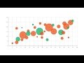
Understanding Bubble Charts Concepts
Interactive Video
•
Mathematics
•
9th - 10th Grade
•
Practice Problem
•
Hard

Patricia Brown
FREE Resource
Read more
9 questions
Show all answers
1.
MULTIPLE CHOICE QUESTION
30 sec • 1 pt
What type of graph is a bubble chart primarily considered?
A single-variable graph
A multivariable graph
A pie chart
A bar chart
2.
MULTIPLE CHOICE QUESTION
30 sec • 1 pt
In a bubble chart, what does the area of each circle represent?
The x-axis variable
A fourth variable
A third variable
The y-axis variable
3.
MULTIPLE CHOICE QUESTION
30 sec • 1 pt
How can colors be used in a bubble chart?
To represent the x-axis variable
To distinguish between categories
To indicate the size of the chart
To show the y-axis variable
4.
MULTIPLE CHOICE QUESTION
30 sec • 1 pt
What is one way time can be represented in a bubble chart?
By changing the color of the bubbles
By animating the data over time
By altering the size of the bubbles
By adjusting the x-axis
5.
MULTIPLE CHOICE QUESTION
30 sec • 1 pt
What is a typical use of bubble charts?
To compare and show relationships between categorized circles
To create a line graph
To create a pie chart
To display a single variable
6.
MULTIPLE CHOICE QUESTION
30 sec • 1 pt
What can make a bubble chart difficult to read?
Too much animation
Too many bubbles
Too many colors
Too few categories
7.
MULTIPLE CHOICE QUESTION
30 sec • 1 pt
How can interactivity help in bubble charts?
By altering the axis labels
By reducing the number of variables
By changing the chart type
By displaying hidden information
Access all questions and much more by creating a free account
Create resources
Host any resource
Get auto-graded reports
Continue with Google

Continue with Email
Continue with Classlink
Continue with Clever
or continue with
Microsoft
%20(1).png)
Apple
Others
Already have an account?
