Free Printable Population Graphs Worksheets for Year 11
Free printable Year 11 population graphs worksheets and answer keys help students master demographic data analysis, population pyramids, and statistical interpretation through engaging social studies practice problems and PDF activities.
Explore printable Population Graphs worksheets for Year 11
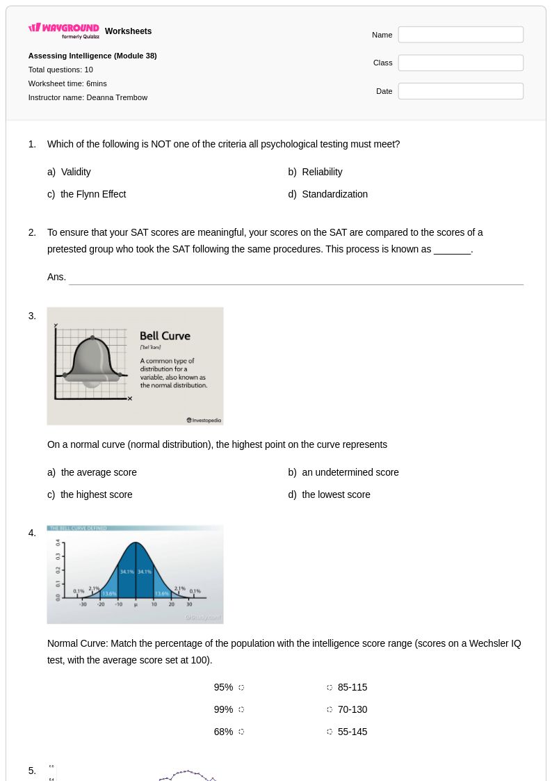
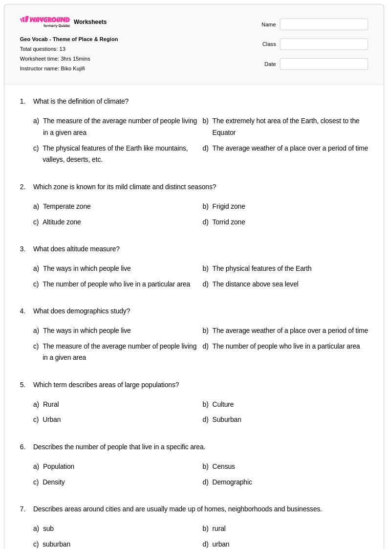
Population graphs worksheets for Year 11 geography provide students with essential practice in analyzing and interpreting demographic data through visual representations. These comprehensive resources from Wayground (formerly Quizizz) focus on developing critical skills in reading population pyramids, growth rate charts, migration patterns, and demographic transition models. Students work through practice problems that challenge them to extract meaningful information from various graph types, calculate demographic indicators, and draw conclusions about population trends in different regions and countries. Each worksheet includes detailed answer keys that guide students through the analytical process, while free printable pdf formats ensure easy classroom distribution and independent study opportunities.
Wayground (formerly Quizizz) empowers geography educators with access to millions of teacher-created population graph resources that streamline lesson planning and enhance student learning outcomes. The platform's robust search and filtering capabilities allow teachers to quickly locate worksheets aligned with specific curriculum standards and learning objectives for Year 11 demographics instruction. Differentiation tools enable educators to customize content difficulty levels, accommodating diverse learning needs within the same classroom, while flexible formatting options provide both digital and printable pdf versions for seamless integration into any teaching environment. These features support targeted remediation for struggling students, enrichment opportunities for advanced learners, and consistent skill practice that builds confidence in interpreting complex demographic data and understanding global population patterns.
FAQs
How do I teach students to read and interpret population graphs?
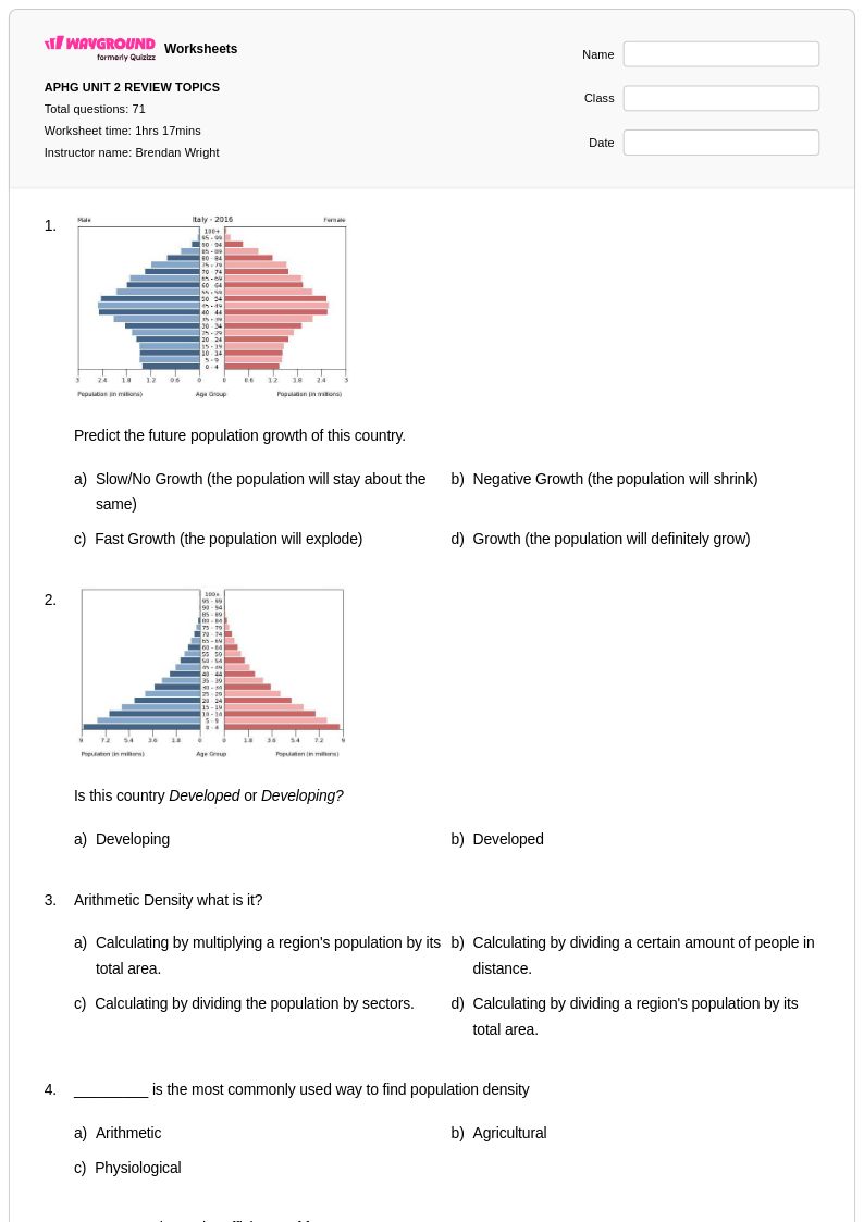
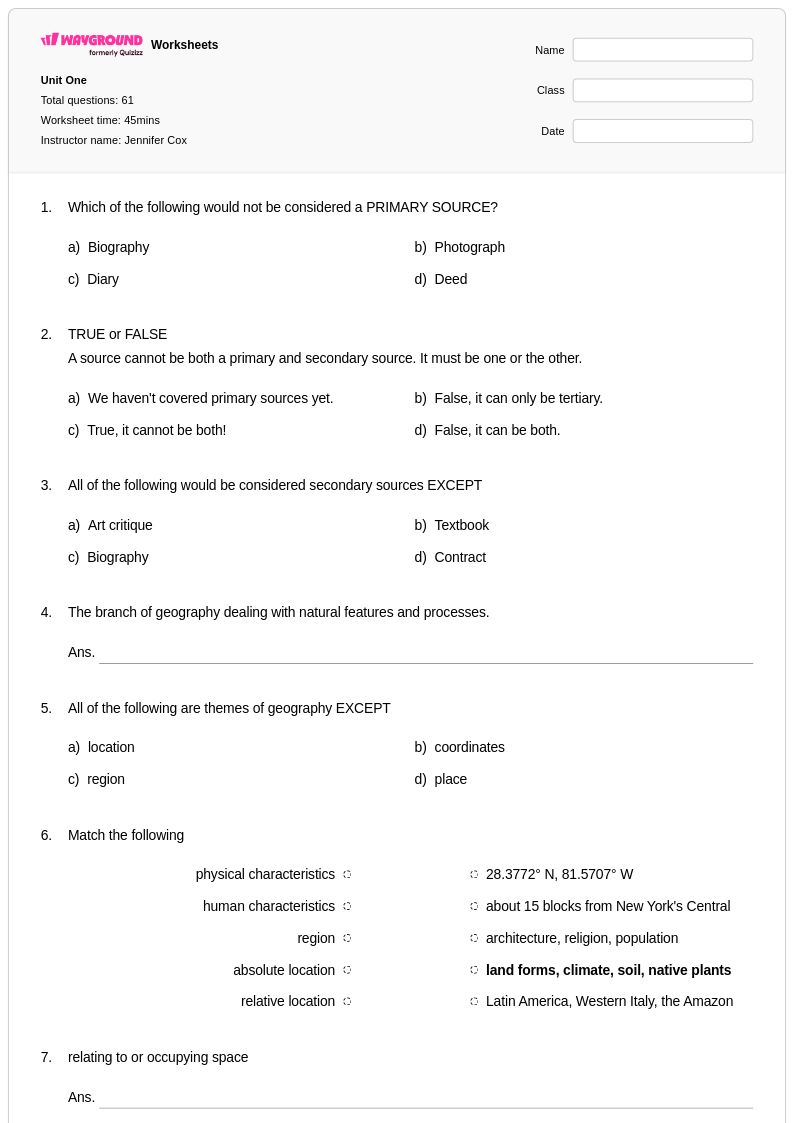
Start by introducing each graph type separately: population pyramids, growth curves, and density maps each require distinct reading strategies. Teach students to identify axes, scale, and labels before drawing conclusions, then progress to comparative analysis across regions or time periods. Using real demographic data from countries at different stages of development helps students connect abstract graph-reading skills to meaningful geographic patterns.
What types of exercises help students practice interpreting population data?
Effective practice exercises include reading population pyramids to identify age-sex distributions, calculating population growth rates from line graphs, and comparing density maps across regions. Students also benefit from problems that require them to draw evidence-based conclusions about demographic trends rather than simply reading values off a graph. Ranging practice from single-graph interpretation to multi-source analysis builds the quantitative reasoning skills needed for advanced social studies coursework.
What mistakes do students commonly make when analyzing population pyramids?
Students frequently confuse the left-right axis (male vs. female) with value judgments, and often misread bar lengths when scales are not uniform. A common misconception is assuming a wide base always indicates a growing population without accounting for mortality rates at older age groups. Students also struggle to distinguish between relative and absolute population figures, which leads to flawed comparisons between countries of very different sizes.
How can I differentiate population graph instruction for students at different skill levels?
For students who need additional support, reduce the complexity of the graph presented, such as using a two-variable line graph before introducing population pyramids, and provide sentence starters for written analysis responses. On Wayground, teachers can apply reduced answer choices for individual students to lower cognitive load during digital practice, while advanced learners receive standard or extended problem sets without any disruption to the class. Saving these accommodation settings in Wayground means they carry over to future sessions automatically.
How do I use Wayground's population graphs worksheets in my classroom?
Wayground's population graphs worksheets are available as printable PDFs for traditional classroom use and in digital formats for technology-integrated or remote learning environments. Teachers can also host the worksheets as an interactive quiz directly on Wayground, making it easy to assign and collect student work digitally. Each worksheet includes a complete answer key, supporting both guided instruction and independent student practice.
How do population graphs connect to broader human geography standards?
Population graphs are a core analytical tool in human geography, used to examine demographic transitions, urbanization, migration patterns, and resource distribution. Proficiency in reading these graphs supports standards related to spatial thinking, data analysis, and the relationship between population dynamics and geographic factors. Embedding graph practice within geographic context helps students move beyond mechanical reading skills toward genuine demographic reasoning.