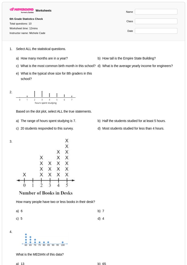
Master histogram interpretation with Wayground's comprehensive collection of free worksheets and printables, featuring practice problems and answer keys that help students analyze data distributions and draw meaningful conclusions from graphical representations.
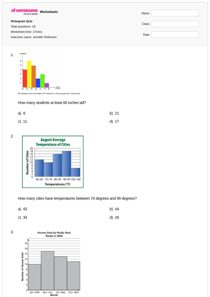
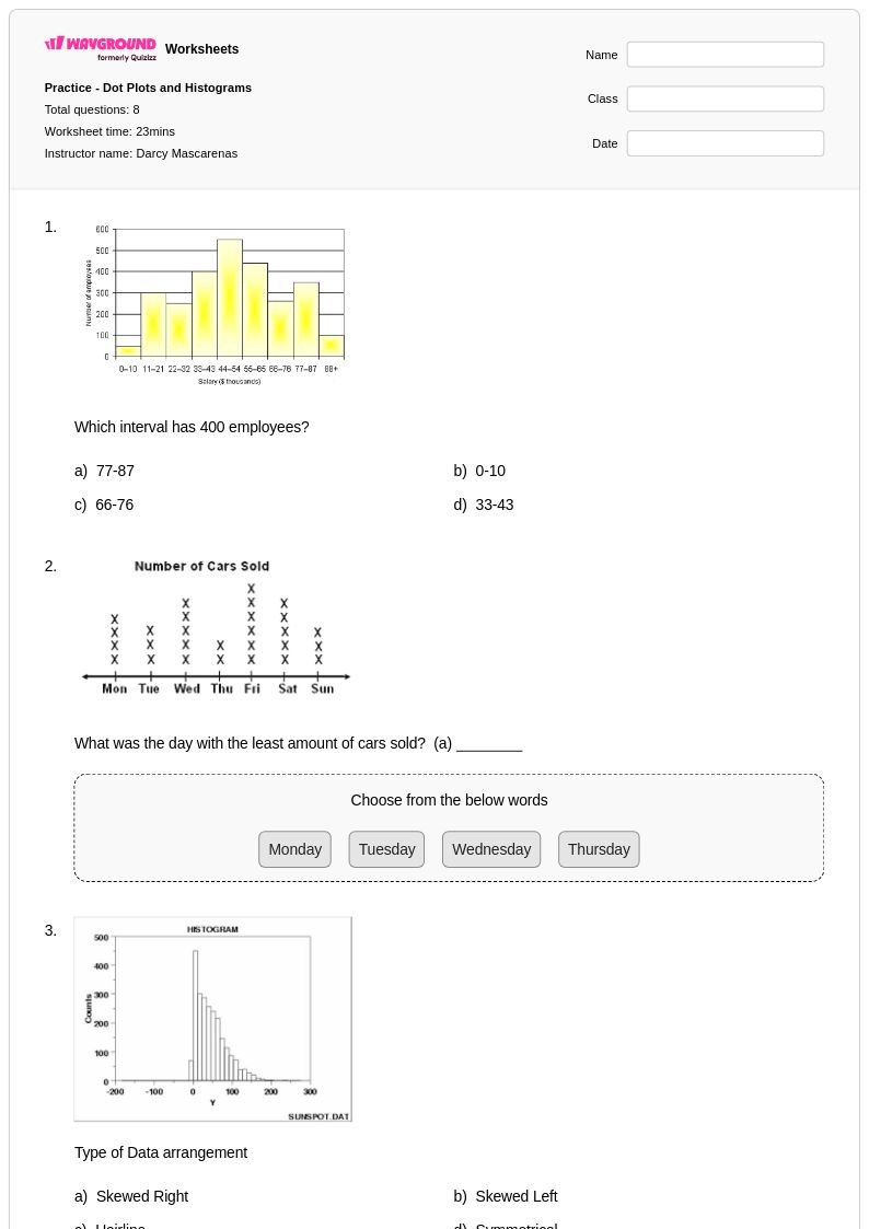
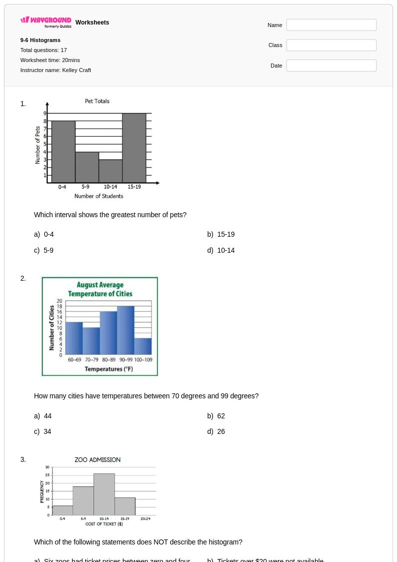
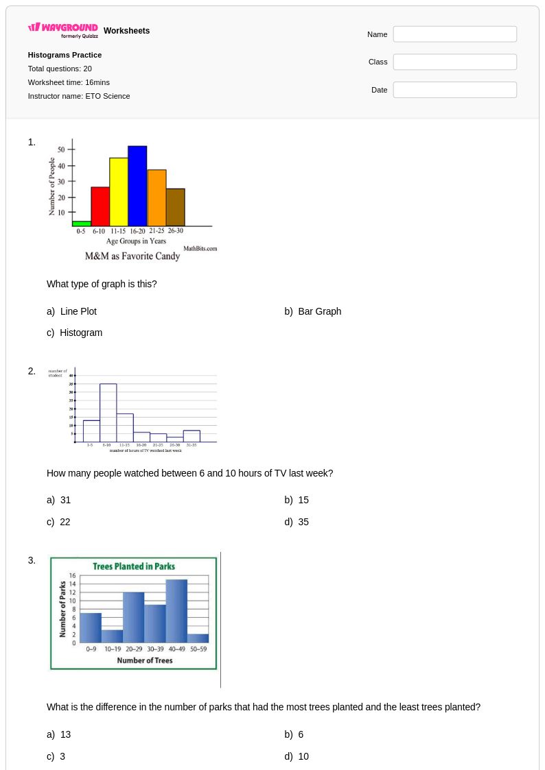
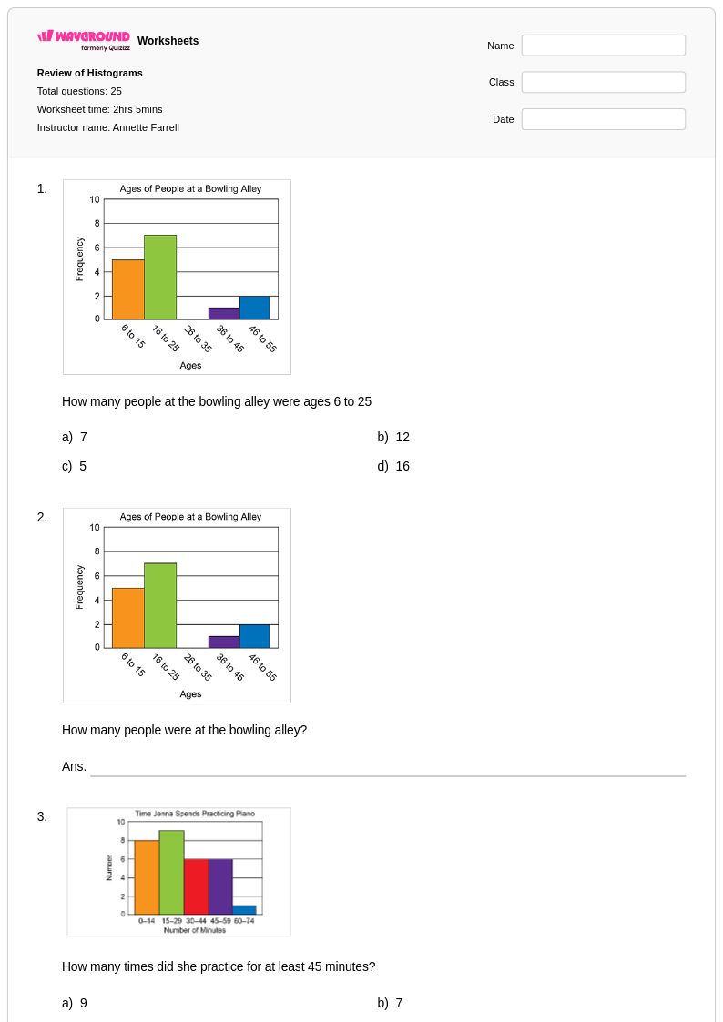
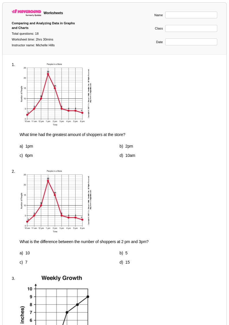
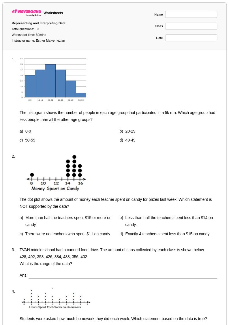
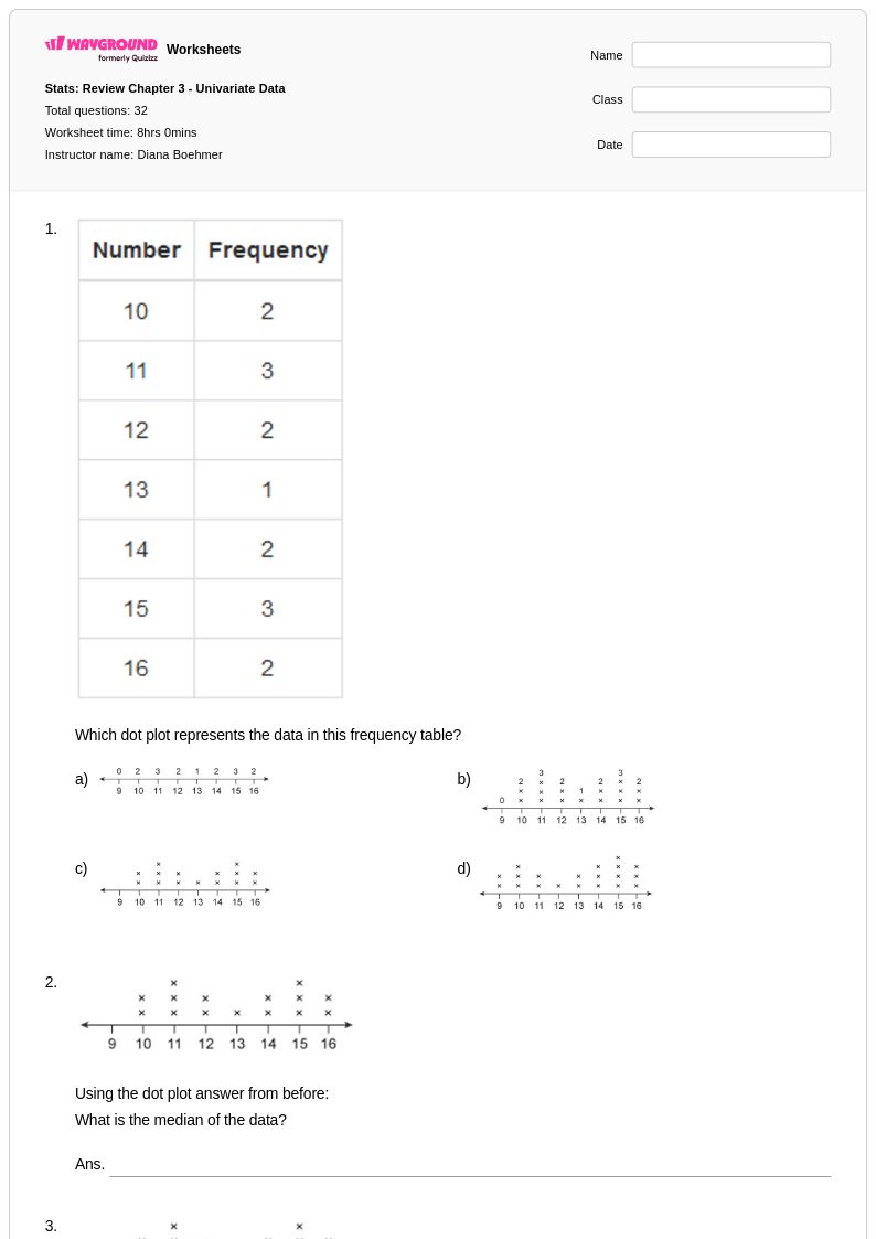
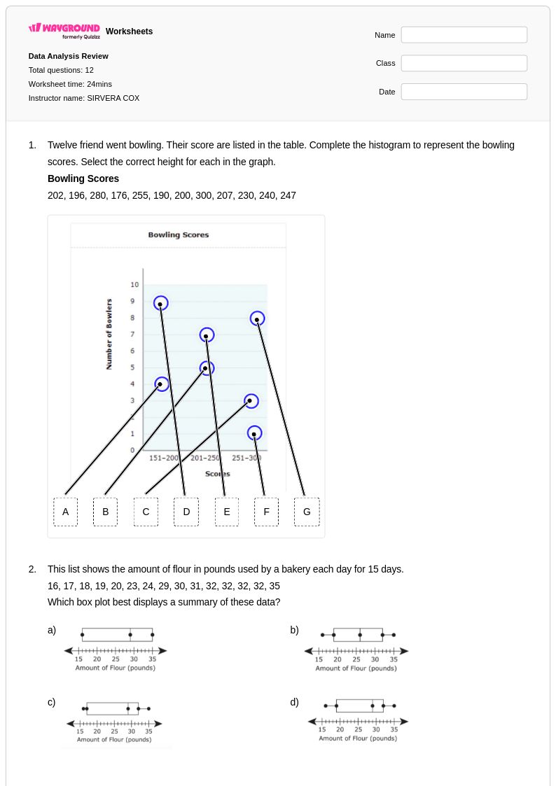
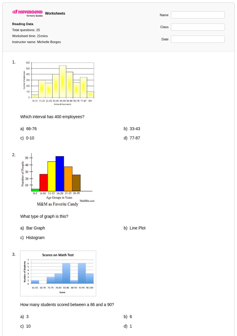
Histogram interpretation worksheets available through Wayground (formerly Quizizz) provide students with essential practice in analyzing and understanding data presented in histogram format. These comprehensive worksheets strengthen critical mathematical skills including reading frequency distributions, identifying data patterns, calculating measures of central tendency from grouped data, and drawing conclusions about data sets based on histogram characteristics. Students develop proficiency in interpreting bin ranges, understanding the relationship between bar height and frequency, and analyzing distribution shapes such as normal, skewed, and bimodal patterns. Each worksheet includes detailed answer keys and practice problems designed to build confidence in statistical reasoning, while the free printable pdf format ensures accessibility for both classroom instruction and independent study.
Wayground (formerly Quizizz) supports mathematics educators with an extensive collection of teacher-created histogram interpretation resources drawn from millions of available materials. The platform's robust search and filtering capabilities enable teachers to quickly locate worksheets aligned with specific curriculum standards and appropriate for diverse learning levels. Advanced differentiation tools allow educators to customize content difficulty and modify practice problems to meet individual student needs, while the flexible format options include both printable pdf versions and interactive digital activities. These features streamline lesson planning and provide teachers with versatile resources for targeted skill practice, remediation for struggling learners, and enrichment opportunities for advanced students working with complex data analysis concepts.
FAQs
How do I teach histogram interpretation?
Start by distinguishing histograms from bar graphs, emphasizing that histograms show frequency over continuous intervals (or 'bins') rather than for discrete categories. Use a relatable dataset, like class test scores, to build a histogram together. Focus on three key questions: What do the x- and y-axes represent? What story does the shape of the data (e.g., symmetric, skewed) tell? What happens if we change the bin size?
What exercises help students practice interpreting histograms?
Effective practice moves from basic to complex tasks. Start with questions that ask students to read frequencies for specific intervals. Progress to having them calculate the total number of data points, identify the interval containing the median, and describe the overall shape and spread of the distribution. Finally, challenge them to compare two histograms or make inferences based on the data's shape.
What are common student mistakes when reading histograms?
A primary error is confusing histograms with bar graphs and trying to read values for individual data points instead of intervals. Students also frequently misinterpret the x-axis, struggling with bin ranges (e.g., understanding that '10-20' includes values up to, but not including, 20). Another common issue is incorrectly identifying the median or mean, as they must be estimated from grouped data, not calculated precisely.
How can I use this histogram worksheet with my class?
This resource is flexible for any classroom setup. You can assign it as an interactive digital quiz on the Wayground platform or download the printable PDF for offline practice. Every worksheet includes a complete answer key. For paper assignments, you can use the Wayground for Teachers app to quickly scan and grade student work.
How do histograms fit into the Common Core math standards?
Under Common Core, histograms are a key tool for summarizing and describing data distributions, primarily within the Statistics and Probability domain for middle grades. Students first learn to display numerical data in plots on a number line, including dot plots and histograms. This skill builds toward more advanced analysis in later grades, where students compare distributions and use statistical measures to describe data sets.
How can I differentiate this topic for diverse learners?
For students needing support, use Wayground's digital accommodation tools like Read Aloud for word problems or Reduced Answer Choices to lower cognitive load on multiple-choice questions. For the worksheet itself, you can create a scaffolded version with a dyslexia-friendly font or wider spacing to improve readability for all learners.

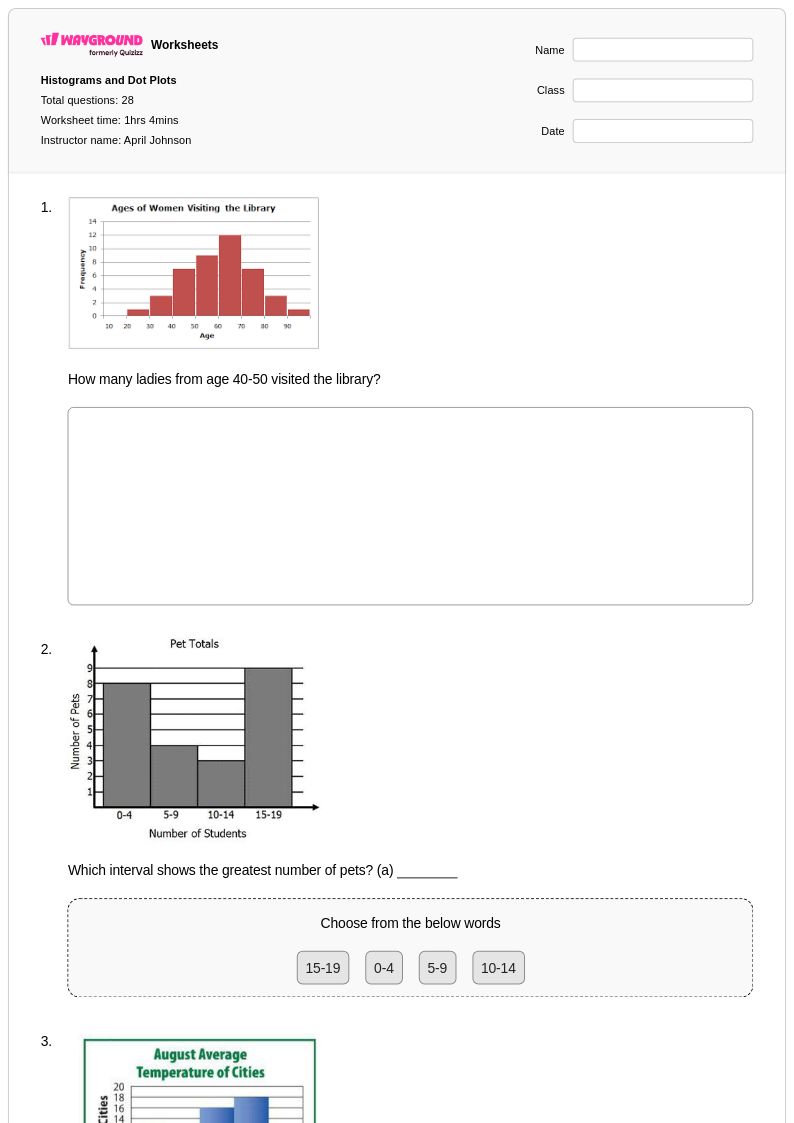
![Interpreting Visuals [7.SP.4] - Printable Histogram-interpretation Worksheets - Wayground](https://quizizz-static.s3.amazonaws.com/_media/worksheets-new/632321f8bc6a79001d175365-interpreting-visuals-7sp4)