
NEW
Font size
S
M
L
XL
 Worksheets
06 Data Analysis for Algebra Unit Review
Total questions: 60
Worksheet time: 15hrs 0mins
Name
Class
Date
1.

What kind of correlation is shown in the graph?
a)
Positive correlation
b)
Negative correlation
c)
No observed correlation
d)
Undefined correlation
2.
Roger bowled 7 games last weekend. His scores are: 155, 165, 138, 172, 127, 193, 142. What is Roger's median score?
a)
127
b)
155
c)
156
d)
193
3.
Consider the data set:
{33, 25, 42, 25, 31, 37, 46, 29, 38}
What is the third quartile (Q3) of the data?
{33, 25, 42, 25, 31, 37, 46, 29, 38}
What is the third quartile (Q3) of the data?
a)
37
b)
38
c)
40
d)
46
4.
Consider the data set:
{33, 25, 42, 25, 31, 37, 46, 29, 38}
What is the interquartile range (IQR) of the data?
{33, 25, 42, 25, 31, 37, 46, 29, 38}
What is the interquartile range (IQR) of the data?
a)
8
b)
9
c)
13
d)
21
5.

What is the median of the data set represented by this box-and-whiskers plot?
a)
200
b)
100
c)
90
d)
140
6.

Which of the following is a true statement about the box-and-whisker plots shown?
a)
Millersburg's Q1 is the same as Arcadia's minimum
b)
Arcadia's median is the same as Millersburg's median
c)
Arcadia and Millersburg had different maximum
d)
Arcadia and Millersburg have the same IQRs.
7.
Which of the following best describes the process of finding the interquartile range for a set of data?
a)
ADD the biggest and smallest numbers
b)
Place the number in order from least to greatest then find the middle.
c)
Find the difference between the Maximum and the Minimum.
d)
Subtract Q1 from Q3
8.
Which of the following data displays involves finding the Five Critical Points?
a)
Scatter Plot
b)
Box-and-Whiskers Plot
c)
Dot Plot
d)
Stem-and-Leaf Plot
9.
Which of the following are the Five Critical Points?
a)
Mean, Median, Mode, Range, and Total
b)
Minimum, Quartile 1, Median, Quartile 3, and Maximum
c)
Smallest, Q1, Q2, Q3, and Q4
d)
Minimum, Maximum, Range, Mean, and Median
10.

What is Millersburg's Q3 value?
a)
200
b)
260
c)
220
d)
140
11.

What percentage of the data in the set that is represented by this box-and-whiskers plot is between 90 and 140?
a)
25 %
b)
50%
c)
75%
d)
100%
12.

What percentage of the data in the set represented by this box-and-whiskers plot is between 40 and 150?
a)
25 %
b)
50%
c)
75%
d)
100%
13.

What percentage of the data in the set represented by this box-and-whiskers plot is between 40 and 90?
a)
25 %
b)
50%
c)
75%
d)
100%
14.
What percent does each of the 4 sections contain in a box and whisker plot?
a)
100%
b)
75%
c)
50%
d)
25%
15.
What is the term for the median of the lower half of the data?
a)
Lower Quartile (Q1)
b)
Upper Quartile (Q3)
c)
Median (Q2)
d)
Maximum
16.
What is the term for the median of the upper half of the data?
a)
Upper Quartile (Q3)
b)
Lower Quartile (Q1)
c)
Median (Q2)
d)
Minimum
17.
The _____________ is the middle element of an ordered data set.
a)
Mean
b)
Median
c)
Mode
d)
Range
18.

The mean of the data set
{ 3, 9, 2, 1, x } is 4.
Find the value of x.
{ 3, 9, 2, 1, x } is 4.
Find the value of x.
a)
3
b)
0
c)
7
d)
5
19.
The mean of five numbers is 26. The first four numbers are 10, 20, 30, and 20. Find the value of the 5th number.
a)
130
b)
80
c)
50
d)
20
20.

What is the mode of the data set that is represented by this dot plot?
a)
100
b)
20
c)
80, 85, and 90
d)
none
21.

What is the range of the data set that is represented by this dot plot?
a)
40
b)
100
c)
60
d)
45
22.

Use the graph to answer the following: How many students are between 56 and 59 inches tall?
a)
5
b)
4
c)
10
d)
8
23.
What is the definition of "mode"?
a)
The sum of the data points divided by the size of the data set
b)
The middle element of an ordered data set.
c)
The value that appears the most often in a data set.
d)
The maximum value minus the minimum value.
24.
How do you find the range?
a)
order least to greatest, then slash from each side until you reach the middle
b)
add the numbers in your data set, then divide by the amount you added
c)
look for the number that repeats the most
d)
highest number minus the lowest number
25.

What is the range of the set of data?
a)
70
b)
65
c)
80
d)
55
26.
The data set below shows the number people at the gym at 4 p.m. over the course of ten successive 10 days. Find the median of this data set.
{35, 37, 33, 30, 28, 24, 27, 19, 21, 8}
{35, 37, 33, 30, 28, 24, 27, 19, 21, 8}
a)
27
b)
27.5
c)
28
d)
30
27.
Find the mode of these numbers:
4,3,6,4,3,6,6,3,2,1,3
4,3,6,4,3,6,6,3,2,1,3
a)
3
b)
6
c)
4
d)
2
28.

Which of the equations below is a good estimate for the Line of Best Fit of the data shown in the table to the right?
a)
y= 5x+1.82
b)
y= -5x+4.82
c)
y= 1.82x + 5.02
d)
y= 1.1x + 4.2
29.

A survey was taken in Pet-Town, where everyone has a pet. The results are shown in the bar graph. If Pet-Town has a population of 1500, about how many people in this town own a hamster?
a)
300
b)
220
c)
280
d)
360
30.
This is the observed relationship between two quantities in a data set.
a)
Correlation
b)
Summation
c)
Measure
d)
Mean
31.
Correlation can be estimated by looking at this type of graph
a)
Scatter Plot
b)
Frequency Polygon
c)
Time Series Graph
d)
Ogive
32.

What type of correlation is shown in this image?
a)
Negative
b)
Positive
c)
None Observed
d)
Parabolic
33.
All good graphs need labels, except for the _____, which has a key instead.
a)
Stem-and-leaf Plot
b)
Frequency Polygon
c)
Dot Plot
d)
Pie Chart
34.
The _____ is the data that a statistical study is interested in collecting.
a)
Population
b)
Sample
c)
Data Set
d)
Field of Study
35.

The following scatter plot shows Pam's training as she prepares to run a 6 mile race at the end of the month. Use a Line of Best FIt to estimate the length of time it would take for her to run 6 miles.
a)
50 min
b)
80 min
c)
45 min
d)
60 min
36.
What percent does each of the 4 sections contain in a box and whisker plot?
a)
100%
b)
75%
c)
50%
d)
25%
37.
What is the term for the median of the lower half of the data?
a)
Lower Quartile (Q1)
b)
Upper Quartile (Q3)
c)
Median (Q2)
d)
Maximum
38.
What is the term for the median of the upper half of the data?
a)
Upper Quartile (Q3)
b)
Lower Quartile (Q1)
c)
Median (Q2)
d)
Minimum
39.
The _____________ is the middle element of an ordered data set.
a)
Mean
b)
Median
c)
Mode
d)
Range
40.

Let t = years after 1976 and P = price of milk. Use a Line of Best Fit to select the equation below that best describes the trend seen in the table.
a)
P=0.06t+1.76
b)
P=16.67t+1.76
c)
P=0.06t+3.29
d)
P=16.67t+3.29
41.
If 12 out of 15 people recycle aluminum cans, how many people out of 1 million would you expect to recycle these cans?
a)
700,000 people
b)
7,000,000 people
c)
800,000 people
d)
8,000,000 people
42.
Drake made 14 out of 20 free throw shots. About how many out of the next 30 free throw shots would you expect him to make?
a)
20
b)
21
c)
22
d)
25
43.
What is the mean of the data set that is represented by this dot plot?
a)
100
b)
~91.9
c)
95
d)
none
44.
What is the median of the data set that is represented by this dot plot?
a)
100
b)
~91.9
c)
95
d)
none
45.

Find the interquartile range (IQR) of the data set
a)
76
b)
43
c)
16
d)
92
46.

If 44 values were used for the data, about how many data values are greater than the 1st quartile (Q1)?
a)
11
b)
22
c)
33
d)
128
47.

About 50 % of the data values are greater than what value?
a)
12
b)
15
c)
22
d)
31
48.

Which value is in the top 25% of the data?
a)
16
b)
22
c)
29
d)
36
49.

Find the median of plot B
a)
30
b)
14
c)
28
d)
16
50.

What is the difference in the maxima of the two plots?
a)
18
b)
40
c)
22
d)
16
51.

What is the interquartile range (IQR) of plot A?
a)
6
b)
8
c)
15
d)
28
52.

If I want to make sure I have data in the top 50% of plot A, I should make sure to pick a number greater than what amount?
a)
14
b)
30
c)
18
d)
22
53.

If plot B has 60 numbers in it, about how many are in the box?
a)
15
b)
30
c)
60
d)
120
54.
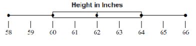
What data value is the upper quartile (Q3)?
a)
64
b)
62
c)
66
d)
58
55.

What percent of the data is between 25 and 30 on the number line?
a)
25%
b)
50%
c)
75%
d)
100%
56.

What percentage of the data is between 90 and 140?
a)
25 %
b)
50%
c)
75%
d)
100%
57.
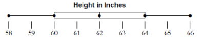
What value is the lower quartile (Q1)?
a)
66
b)
58
c)
60
d)
64
58.
Review: Simplify the expression:
5x - 2x + 22(2) - 34 + 6x =
5x - 2x + 22(2) - 34 + 6x =
a)
9x - 10
b)
19x
c)
9x + 10
d)
-1x
59.

Review: What is the slope of this line?
a)
2/1
b)
-2/1
c)
-1/2
d)
1/2
60.
As the age of the car increases, its value tends to decrease. Which scatter plot represents this relationship?
a)
b)
c)
d)
Reset

