
 Worksheets
Principles and Elements of Design
Total questions: 75
Worksheet time: 40mins
What is the first and most basic element of design?
line
shape
color
size
What is the most obvious elements of design?
color
shape
line
texture
What element of design that is defined by boundaries, such as a lines or color, and they are often used to emphasize a portion of the page?
shape
line
texture
color
What do you call the space that is commonly underutilized and misunderstood aspects of designing for the page?
negative space
space
vector shapes
shades
It is an element of design that can create a more three-dimensional appearance on this two-dimensional surface. It also helps build an immersive world.
texture
shades
space
colors
Which element of design involves line, color, texture and shapes? Words are important, but the style of the words is equally essential.
shapes and colors
typography
image quality
letters and symbols
It refers to the size of one object in relation to the other objects in a design or artwork.
scale
proportion
intention
linear
It refers to the size of the parts of an object in relationship to other parts of the same object.
proportion
scale
dominance
effects
It is defined as an area or object within the artwork that draws attention and becomes a focal point.
Emphasis
dominance
scale
shades
It refers to the visually satisfying practice of combining similar or related elements in an artwork.
harmony
emphasis
dominance
focal point
What do you call the positioning of a body of text to the left, right or center of a page?
alignment
adjustment
indention
positioning
This refers to the spatial relationship between elements on a page.
proximity
communicability
reference
intent
It is a principle of design that helps the user to understand the meaning of an artwork through its text, graphics and other elements.
communicability
proximity
scale
intent
The graphics and the text will appear related if they have been aligned vertically and horizontally.
TRUE
FALSE
Choosing complementary colors to provide contrast can make the page easier to read.
TRUE
FALSE
Alignment of text and lines in the page creates contrast and will avoid overpowering the text.
TRUE
FALSE
Good Contrast in typography grabs the attention of the reader.
TRUE
FALSE
To make the page look more organized, choose main theme colors and patterns.
TRUE
FALSE
Using many different colors can make the page look dynamic.
TRUE
FALSE
Excessive use of colors makes the page look balanced and organized.
FALSE
TRUE
Using more than two fonts in typography makes the page look organized.
FALSE
TRUE
Applying the principles of design can increase the impact of your project on your audience.
TRUE
FALSE


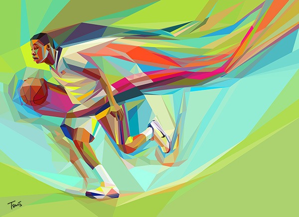
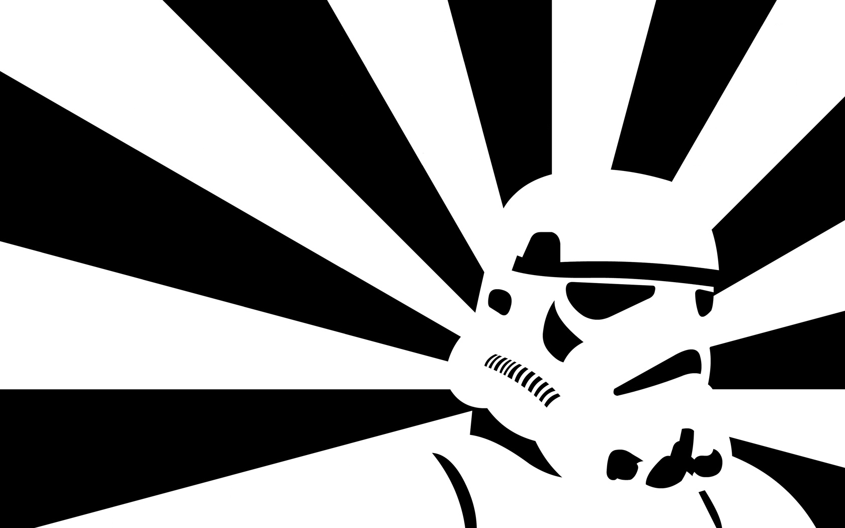

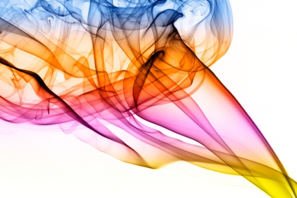
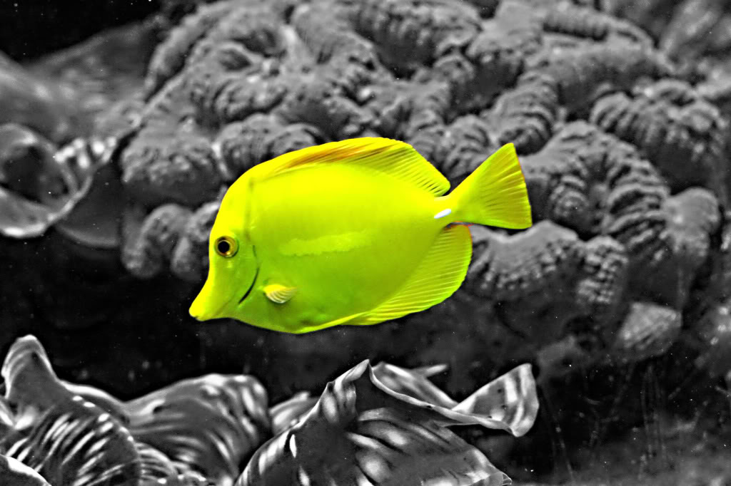


1) __________
2) asymmetrical
3) radial
design?


