
 Worksheets
Introductory Questions - Graphs
Total questions: 35
Worksheet time: 18mins

This graph shows the amount of money made by a company over time: 'c' represents time.
Which of the following interpretations fits best?
The amount increased with time
The amount decreased with time
The amount rose sharply with time
The amount maintained a steady increase

This graph shows the amount of money made by a company over time:
Which of the following interpretations fits best?
There has been a steady increase with time
There has been a steady decrease with time
The amount has stabilised over time
The amount has peaked considerably

This graph shows the amount of money made by a company over time:
Which of the following interpretations fits best?
The amount has been consistently increasing
The amount reached a peak before falling a little and then maintaining the same level
The amount has hit a trough and bounced back up
There has been a steady decrease with time

This graph shows the amount of money made by a company over time:
Which of the following interpretations fits best?
The amount has been consistently decreasing with time
The amount fell sharply
Amount has shown a steady decline
The amount fell slightly in the last few years

This graph shows the amount of money made by a company over time:
Which of the following interpretations fits best?
The sudden collapse surprised everyone
The amount levelled off with time
The amount began to recover sharply
The amount fell slightly

A histogram
A pie chart
A bar chart

A pie chart
A bar chart
A histogram

A pie chart
A bar chart
A histogram

A line graph
A flow chart
A bar chart

'1' is the x-axis and '2' is the y-axis
True or false?
True
False

How would you name the following diagram?
A Pie Chart
An Apple Chart
A Histogram
A Venn Diagram

Following a moderate increase the frequency finally __________.
dips
plateaus
declines
steeps

What name would you give the following diagram?
Pictogram
Graph
Venn Diagram
A Pie Chart

At first the frequency __________before increasing dramatically.
dips
peaks
levels
fluctuates

The ________ of increase starts off slow but continues to speed up over time.
speed
flow
rate
rise
Which of the following words is the opposite for the word 'plunge'?
rise
fall
dive
plummet
Which of the following is opposite in meaning to the word 'incline'?
Decrease
Increase
Decline
Climb
Which of the following offers a suitable translation for 'Constant'?
波动
乘
累积的
持续的

The box below is called a __________
Axis
Legend
Column
Title
Another name for a 'pie chart' is what?
A cake
A circle graph
An apple
A bar chart

Bar chart
Multi line graph
Scattergram
Venn diagram

Scattergram
Line graph
Stacked bar chart
Multi pie chart

Venn Diagram
Pie Chart
Stacked bar chart
Pictogram

A combo chart
A table
A pie chart
A key

Look at the bar graph, "Nicest Fruit". What does the x-axis show?
Types of fruit
The number of people.

Look at the bar graph, "Nicest Fruit". What does the y-axis show?
Types of fruit
Number of people.

Kendra Earned Money By Babysitting For Four Months.
Choose The Word That Completes This Sentence: In November and December, Kendra earned _________ Than in September.
...The Same Amount As
....Less
...More

Students at Center Jr. High were surveyed and asked about their favorite school after work snack. The bar graph shows the results of the survey.
Based on the graph, which statement is true?
Twice as many students chose ice cream as chose fruit for their favorite snack.
Twice as many students chose chips/ dips as chose ice cream for their favorite snack.
The same number of students chose chips/ dips as chose cheese & crackers as their favorite snack.
Fifteen more students chose ice cream as chose cheese & crackers as their favorite snack.
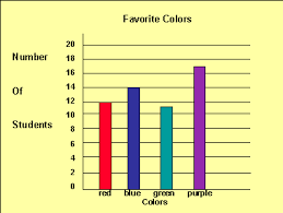
Which graph best represents the statement;
'I kept waking up, must of been the cheese!'


Which graph best represents the statement;
'Great, I got to sleep straight away and slept till morning'
Which of the graphs is most likely to have the title;
'Increase in house prices is slowing down'


What type of graph is this?
Linear
Quadratic
Cubic
Reciprocal

What type of graph is this?
Linear
Quadratic
Cubic
Reciprocal

What type of graph is this?
Linear
Pie graph
Cubic
Scatter graph

