
Font size
 Worksheets
Chapter 1 Review - Statistics CP
Total questions: 49
Worksheet time: 1hrs 9mins

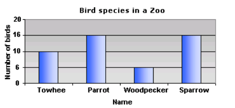
This graph represents the number of different types of bird species in a zoo. Why is it misleading?
broken scale
values on the vertical scale are not uniform (the same)
uneven spacing of values on the vertical scale
none of the above

The number of miles that Jenna cycled each week for a 7-week period is shown: 36, 42, 28, 52, 48, 36, 31 What is the median number of miles Jenna cycled?
24
39
36
52
The number of pages that Carolyn wrote in her journal each day from Monday to Friday is shown below:
9, 8, 12, 6, 10
What is the mean number of pages she wrote per day?
9
5
6
11

Find the mean number of cards decorated.
8
7
10
9


What is the shape of the dot plot shown?
skewed left
skewed right
symmetrical

What shape is the dot plot for SUV's?
skewed right
skewed left
symmetrical
none of the above

What is the outlier for this data?
90
96
102
108


88, 92, 92, 96, 98
Gabriella scored a 20 on her sixth quiz. What effect does this score have?

How many students scored more than 80%?
10
13
7
15

What is the range for the stem and leaf plot? Given 3/2=32
39
40
45
56
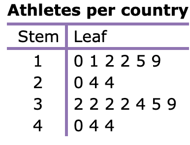
While doing a project for P. E. class, Ling researched the number of athletes competing in an international sporting event.
How many countries have exactly 32 athletes?
4
3
6
1

Find the Median?
95
97.2
96.8
98
Number of Passengers
Categorical
Quantitative
Type of Aircraft
Categorical
Quantitative
Number of Pairs of Shoes You Own
Categorical
Quantitative
Hair Color
Categorical
Quantitative
Age of Oscar Winners
Categorical
Quantitative
Which of the following is an example of categorical data?
Height
Number of Credits Earned
Grade in School
Grade Point Average
Which of the following is a categorical variable?
Flight Length
Flight Number
Number of Passengers
Fuel Consumption
Which of the following is an example of a quantitative variable?
Studio of Oscar Winners
Academy Association Membership Number
Film Genre
Age of Oscar Winner
You wish to display the data of a frequency table which shows the numbers of males or females that have been diagnosed with lung cancer. Which would be the most appropriate way to display this data in this form?
Pie Chart
Segmented Bar Chart
Stem-and-Leaf Plot
Bar Chart

What is the relative frequency of High School?
2%
50%
5%
20%
Which type of graph can be used for quantitative data?
Histogram
Bar graph
Pie Chart

How would you describe the shape of the test score distribution?
symmetric
skewed right
skewed left
uniform

What interval size was used when creating this histogram?
5
10
11
9


Choose the information that best describes this bar chart.
Far more females than males are interested in vanilla flavor.
Slightly more females than males are interested in vanilla flavor.
Far more males than females are interested in vanilla flavor.
Slightly more males than females are interested in vanilla flavor.

The number of people aged 25-35 who are concerned about arts and crafts .................. that of those aged 55-65.
doubles
triples
four times
five times
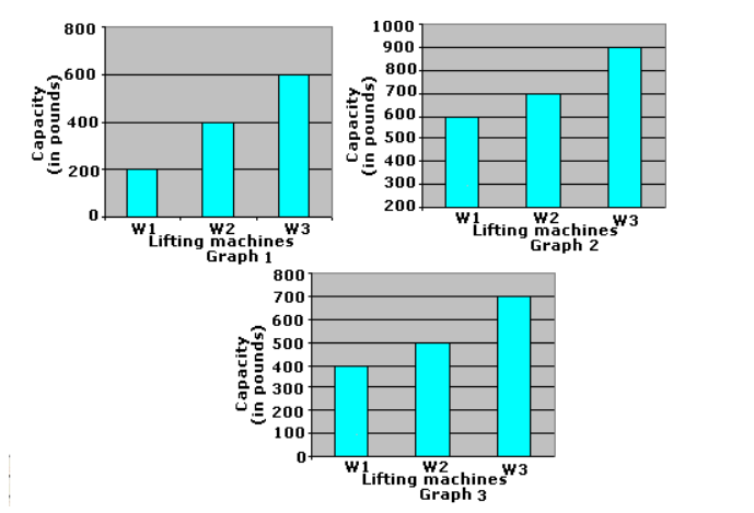
Which graph is misleading?
graph 1
graph 2
graph 3
graph 2 and 3

How many students were surveyed to collect this data?
11
13
15
17

Which graphs are used to represent categorical data? (More than one answer)
bar chart
stemplot
pie chart
dotplot
histogram

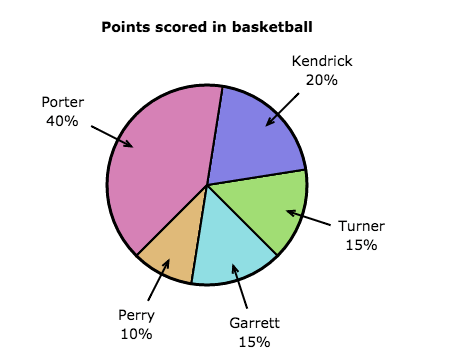
These pie charts show how people travel to work in 2 towns. In which town do more people travel to work by bike?
town A
town B
both the same
impossible to say

When your data is heavily skewed and you have outliers, which measure of central tendency should you use?
median
standard deviation
mean
interquartile range
When your data is roughly symmetric, and there are no outliers, which measure of central tendency should you use?
median
standard deviation
mean
interquartile range

