
 Worksheets
C Graph
Total questions: 25
Worksheet time: 25mins

The moon reflects different amounts of sunlight onto Earth at different times. This reflected sunlight is commonly called moonlight. The graph shows the intensity of moonlight at different times in a lunar cycle. Which moon phase most likely occurs at the time in the cycle represented by an X on the graph?


The diagrams below represent Earth’s ocean tides at four different positions of the moon. Which diagram shows the moon position that will produce the Spring Tides (highest high tides and the lowest low tides)?


An experiment is carried out to study the effect of concentration on the rate of reaction between sodium thiosulphate and hydrochloric acid.
Graph of the concentration of sodium thiosulphate against 1/time is as shown.
Based on the graph, what is the value of t, time if the experiment is repeated using sodium
thiosulphate solution 0.025 mol dm-3.
32.3 s
50.0 s
0.020 s
0.031s

Diagram 4 shows the graph of volume of carbon dioxide gas against time when 5 g of marble chips is added to 50 cm3 of 0.2 mol dm-3 hydrochloric acid. At what time the rate of reaction the highest?
t1
t2
t3
t4

What type of graph is this?
line plot
line graph
bar graph
frequency table

What type of graph is this?
Line Graph
Bar Graph
Tally Chart
Pie Chart

line graph
bar graph
circle graph
What is the name of this graph?
line plot
line graph
bar graph
frequency table

Order the letters from highest to lowest rate of reaction.
> B > C > D
> BC > D (B and C have the same rate)
> B > CD (C and D have the same rate)
> C > B > A
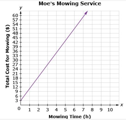
What is the general trend of this line graph?
The more you mow, the less money you make.
You make the same amount of money regardless of how long you mow.
The more you mow, the more money you make.
Mowing is dangerous.

At what rate did the temperature decrease between the 20th and 25th minutes of the experiment?
10°C in 5 min
10°C in 10 min
5°C in 5 min
5°C in 10 min

Which month had the biggest difference between the high and low temperatures?
January
April
October
November

Which day of the week had the lowest high and low temperature?
Monday
Thursday
Tuesday
Wednesday
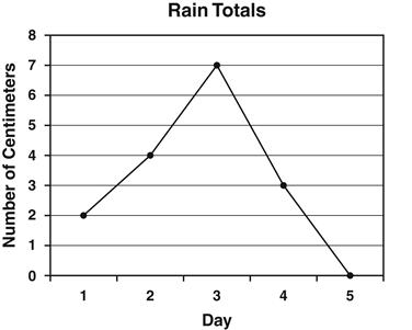
Annie recorded the amount of rain that fell each day. The results are shown in the line graph below. How many centimeters of rain fell on the third day?
2
3
4
7
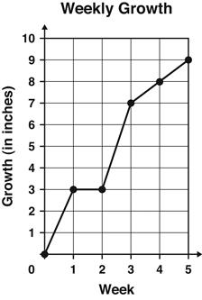
The graph shows the number of inches a plant grew each week.
Between which 2 weeks did the plant grow the MOST?
Week 1 and Week 2
Week 2 and Week 3
Week 3 and Week 4
Week 4 and Week 5

Which plant is growing at a faster rate?
Plant 1
Plant 2
They both are growing equally fast.
Not enough information
What is the primary purpose of a C Graph in scientific data analysis?
To visualize categorical data
To represent chemical reactions
To plot changes in variables over time
To display molecular structures
In a C Graph representing temperature changes, what does the slope of the line indicate?
The rate of temperature change
The initial temperature
The final temperature
The average temperature
Which of the following is a common use of C Graphs in environmental science?
Tracking pollution levels over time
Mapping animal migration patterns
Identifying plant species
Classifying soil types
When analyzing a C Graph of a chemical reaction, what does a plateau in the graph typically indicate?
The reaction has reached equilibrium
The reaction is accelerating
The reaction is starting
The reaction is complete
How can a C Graph be used to interpret experimental data in physics?
By showing the relationship between force and acceleration
By illustrating the periodic table
By mapping the human genome
By displaying the structure of atoms
In biology, a C Graph can be used to track population growth. What does an exponential curve on such a graph suggest?
A stable population
A declining population
Rapid population growth
No change in population
What type of data is best represented by a C Graph?
Quantitative data
Qualitative data
Nominal data
Ordinal data
In a C Graph showing the decay of a radioactive substance, what does the half-life represent?
The time taken for half the substance to decay
The initial amount of substance
The final amount of substance
The rate of decay
Which scientific field frequently uses C Graphs to model climate change data?
Meteorology
Botany
Zoology
Geology

