Search Header Logo
  1. Resource Library
  2. Math
  3. Data And Graphing
  4. ...
  5. 12.5 Interpret Line Graphs
12.5 Interpret Line Graphs

12.5 Interpret Line Graphs

Assessment

Presentation

Mathematics

6th Grade

Hard

CCSS
6.NS.C.6B, HSF.IF.B.4, 5.G.A.1

+1

Standards-aligned

Created by

Elizabeth Reid

Used 4+ times

FREE Resource

6 Slides • 13 Questions

1

12.5 Interpret Line Graphs

media

2

Multiple Choice

Question image

This plot represents the number of cookies eaten at a county fair for 10 different days. What is the Range?

1

30

2

50

3

31

4

4

3

Multiple Choice

Question image

This plot represents the number of cookies eaten at a county fair for 10 different days. What is the Mode?

1

7

2

8

3

88

4

88 and97

4

Multiple Choice

Question image

This plot represents the number of cookies eaten at a county fair for 10 different days. What is the Median?

1

9

2

0

3

89

4

90

5

89.5

5

media

6

media

7

8

Multiple Choice

Question image

What are the ordered pair of Point C?

1

(2,3)

2

(0, 2)

3

(2, 2)

4

(-2, 2)

9

Multiple Choice

Question image

What is the ordered pair for point D?

1

(-5,0)

2

(0,-5)

3

(0,5)

4

(-5, 0)

10

Multiple Choice

Question image

What is the ordered pair for point B?

1

(-4, 6)

2

(6,-4)

3

(6, 4)

4

(4, -6)

11

Multiple Choice

Question image

What is the ordered pair for point A?

1

(1,1)

2

(0,0)

3

(0, 1)

4

(1, 0)

12

media

13

media

1

Need Another Example?

2

3

4

5

Step-by-Step Example

1.

Make a line graph of the data of Earth’s
Population. Describe the change in Earth’s
population from 1750 to 2000.

The data include numbers from 790 million to
6,080 million. So, a scale from 0 to 10,000 million
and an interval of 1,000 million are reasonable.

Let the horizontal axis represent the year. Let the vertical axis
represent the population. Label the horizontal and vertical axes.

Plot and connect the points for each year.

Label the graph with a title.

Earth’s population has increased drastically from 1750 to 2000.

14

Multiple Choice

Question image

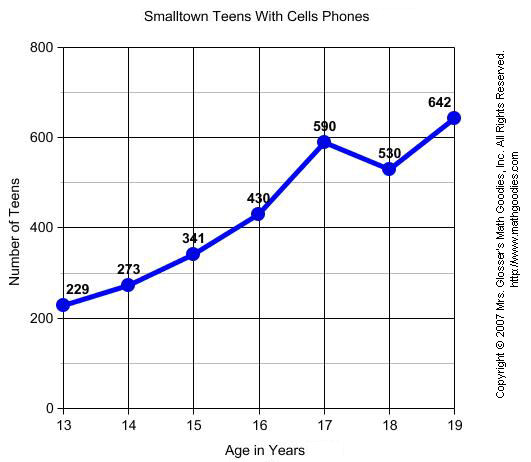
What label is along the y-axis in this graph?

1

Copyright 2007

2

Lines

3

Age in Years

4

Number of Teens

15

Multiple Choice

Question image

What is the general trend of this line graph?

1

The more you mow, the less money you make.

2

You make the same amount of money regardless of how long you mow.

3

The more you mow, the more money you make.

4

Mowing is dangerous.

16

Multiple Choice

Question image

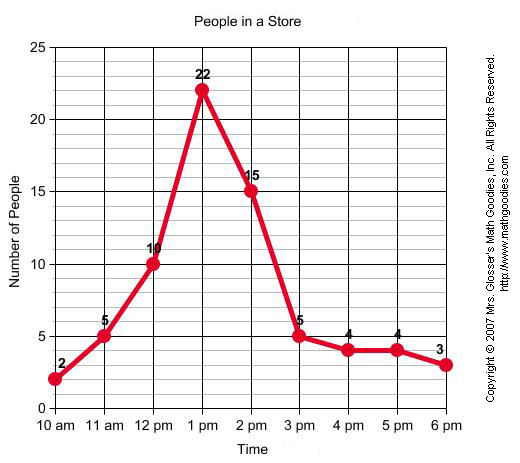
At what time were the greatest amount of shoppers at the store?

1

10am

2

1pm

3

6pm

4

2pm

17

Multiple Choice

Question image

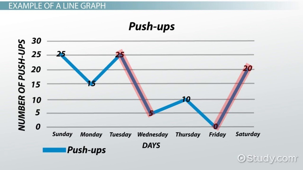
Between which two days was the greatest decrease in push-ups?

1

Friday and Saturday

2

Tuesday and Wednesday

3

Sunday and Monday

4

Thursday and Friday

18

Multiple Choice

Question image

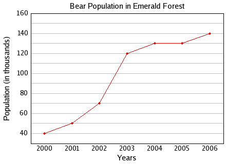
What was the bear population in 2001?

1

40,000

2

50

3

50,000

4

5

19

Multiple Choice

Question image

Between which two years did the bear population remain constant or the same?

1

2004 and 2005

2

2001 and 2002

3

2005 and 2006

4

2000 and 2001

12.5 Interpret Line Graphs

media

Show answer

Auto Play

Slide 1 / 19

SLIDE