
Unit Review: Florida - Data Displays & Interpretation
Authored by Arah Anderson
Mathematics
9th - 12th Grade
CCSS covered
Used 2+ times


AI Actions
Add similar questions
Adjust reading levels
Convert to real-world scenario
Translate activity
More...
Content View
Student View
17 questions
Show all answers
1.
MULTIPLE CHOICE QUESTION
30 sec • 1 pt
The student counselors at your school are analyzing how study habits might affect academic performance. They conducted a survey asking students two questions:
How many hours per week do you spend completing Algebra 1 assignments?
What was your final grade in Algebra 1?
Which of the following is the most appropriate graph to represent the relationship between the two variables in this data set?
Scatter plot because it involves numerical variables.
Bar graph because it involves categorical variables.
Box plot because it involves numerical variables.
Stem-and-leaf plot because it involves categorical variables.
Stem-and-leaf plot because it involves categorical variables. - no response given
Answer explanation
A scatter plot is the most appropriate graph for this data set because it displays the relationship between two numerical variables: hours spent on assignments and final grades in Algebra 1.
2.
MULTIPLE CHOICE QUESTION
30 sec • 1 pt
The student council at FLCCA is working on a school-wide data project to better understand student habits and preferences. They collected the following data sets:
Data Set A: favorite school club (Art, Choir, or Dance)
Data Set B: preferred learning style (Visual, Auditory, or Kinesthetic)
Which of the following is the most appropriate graph to represent the relationship between the two variables in this data set?
Circle graph because it involves a univariate categorical variable.
Line graph because it involves bivariate numerical variables.
Segmented bar chart because it involves bivariate categorical variables.
Frequency table because it involves a univariate numerical variable.
Answer explanation
The correct choice is a segmented bar chart because it effectively represents the relationship between two categorical variables: favorite school club and preferred learning style.
3.
MULTIPLE CHOICE QUESTION
30 sec • 1 pt
At FLCCA, the librarian wants to encourage reading. She tracks how many books each student reads in a month. After collecting the data from 250 students, she wants to see how reading habits vary across the school.
Select the words that correctly finish the statement below:
The most appropriate method to represent the data above would be a
histogram
bivariate
numerical
categorical
Answer explanation
The data collected on the number of books read by students is numerical, as it involves counting. A numerical method is best to represent this data, allowing for analysis of reading habits across the school.
4.
CATEGORIZE QUESTION
3 mins • 1 pt
Organize these options into the right categories
Groups:
(a) Numerical
,
(b) Categorical
,
(c) Bivariate
,
(d) Univariate
salaries of employees
Blue, brown, grey
hours and test scores
box and whisker plot
5.
MULTIPLE SELECT QUESTION
45 sec • 1 pt
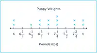
Select the words that correctly finish the statement below for the line plot shown.
data represents one variable
data is classified as univariate
data applies to numbers
data set is numerical
Answer explanation
The correct choices indicate that the data in the line plot represents one variable, is classified as univariate, applies to numbers, and is numerical, all of which are characteristics of a line plot.
Tags
CCSS.3.MD.B.4
6.
MULTIPLE CHOICE QUESTION
30 sec • 1 pt
A recent study found that schools with more math tutors tend to have higher math passing rates. Based on this information, which of the following best explains the relationship between the number of tutors and passing rates?
Tutors directly cause students to pass
Passing rates cause schools to hire more tutors
There is a correlation between the number tutors and passing rates, but this does not necessarily mean one causes the other.
Students only pass because they see a tutor
Answer explanation
The study indicates a correlation between the number of tutors and passing rates, but this does not imply that one directly causes the other. Other factors may influence both variables.
Tags
CCSS.HSS.ID.C.9
7.
MULTIPLE CHOICE QUESTION
30 sec • 1 pt
A research team analyzed two scenarios:
Neighborhoods with more parks per square mile tend to report higher levels of physical activity among residents.
After a city introduced a tax on sugary drinks, there was a measurable decrease in the average daily sugar consumption among its population.
Which of the following best explains the difference between these two observations?
Both observations demonstrate causation because they are based on observed changes.
The parks data shows correlation, while the sugary drink tax suggests causation due to a direct policy intervention and observed effect.
The parks data proves causation, while the sugary drink tax only shows correlation.
Both observations only show correlation, not causation.
Answer explanation
The parks data shows correlation since higher park density correlates with physical activity, but does not imply causation. In contrast, the sugary drink tax indicates causation due to a direct policy change leading to reduced sugar consumption.
Tags
CCSS.HSS.ID.C.9
Access all questions and much more by creating a free account
Create resources
Host any resource
Get auto-graded reports

Continue with Google

Continue with Email

Continue with Classlink

Continue with Clever
or continue with

Microsoft
%20(1).png)
Apple

Others
Already have an account?

