Brand assets
Everything you need to show off the Wayground brand the
right way - logos, colors, and more, all in one place.
Logo
Our logo comes in two colorways. Which one you use depends on what sits behind it. When contrast is close, pick the version that reads clearly at a glance.
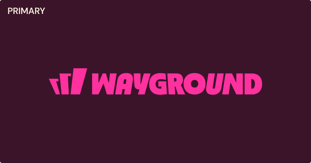
Magenta on dark backgrounds. Use this version over blackberry, black, photography, or any deep color.
Blackberry on light backgrounds. Use this version over white, oat, peach, or any pale color.
Note: These graphics belong to Wayground and are protected by law. Please don't edit them, fold them into your own branding, or use them to imply a connection to Wayground without our permission. If you're unsure whether your use is covered, contact us.
What not to do
Besides the standard rules for all logos (no warping, stretching, or distortion), there are also a few specific guidelines for how our logo should be used.
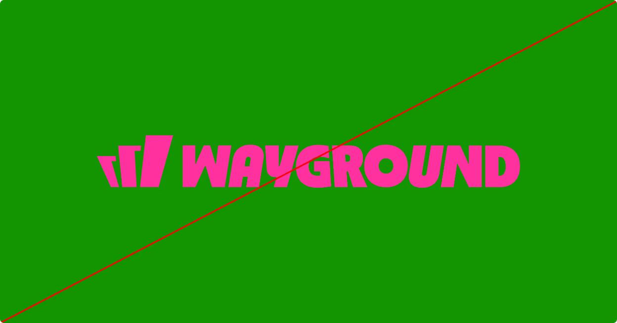
Don’t use colors outside the Wayground palette
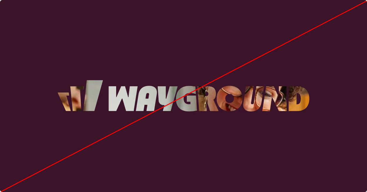
Don’t mask the wordmark
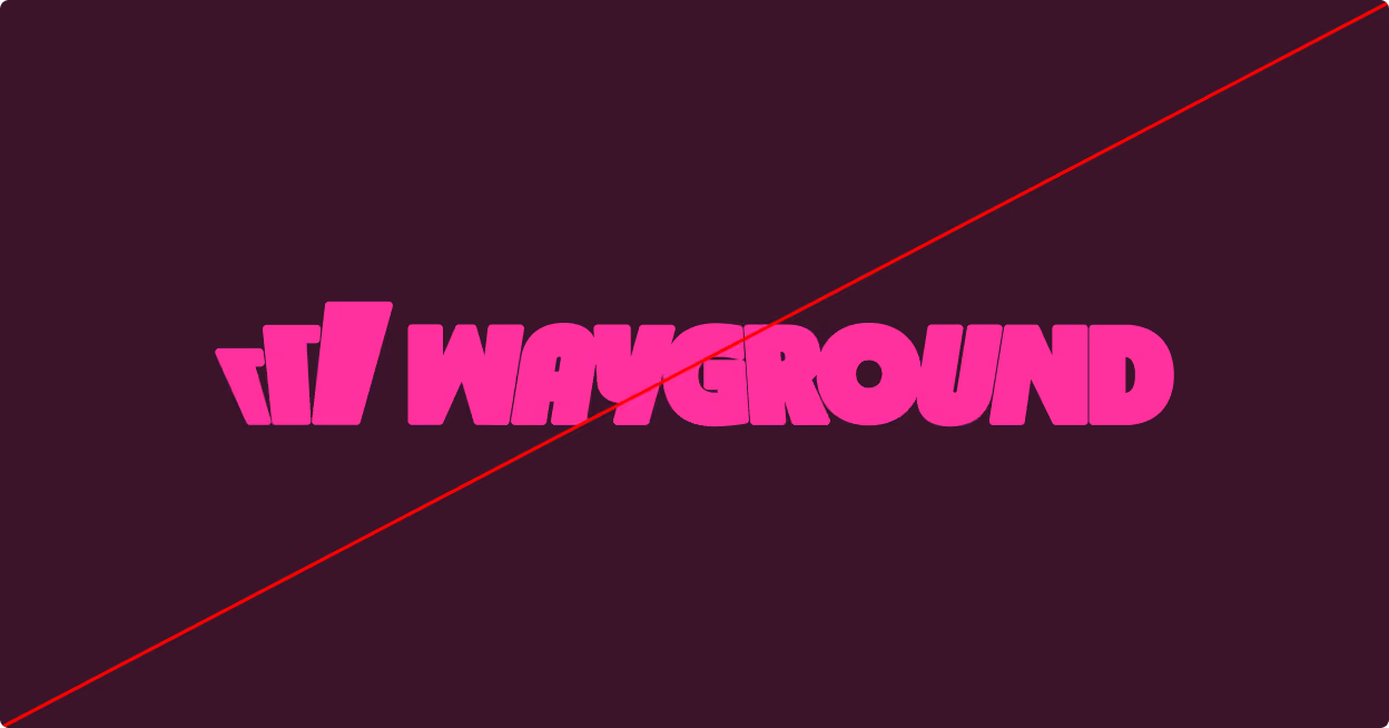
Don’t outline, add effects, or add elements to the wordmark
Do not type Wayground in any other fonts to use as a logo
Colors
Blackberry and magenta carry the brand. Oat and peach support them.
.avif)