Worksheets
Data Graphing Practice
Total questions: 75
Worksheet time: 2hrs 36mins

Which type of graph is this?
Histogram
Bar Graph
Scatter Plot
Pie graph

What type of graph is this?
Bar graph
Histogram
Pie Chart
Line graph

Which type of graph shows change over time?
bar graph
line graph
circle graph
Scatter Plot


The variable that is measured.
Controlled Variable
Dependent Variable
Independent Variable

According to this graph, which is the most popular skittle?
(a)

According to this graph, how many students spend less than 3 hours on homework?
3
9
12
5

Summarizes information being represented on ANY graph
Title
x axis title
y axis title
z axis title

Legend or key
Helps viewer read the data
Another name for data table
Numbers used on the graph
Colors used on the graph

Pie/circle graphs represent what kind of data
comparison of amounts
shows change over time
shows parts of a whole
spread of the data

Bar graphs represent what kind of data
comparison of amounts
shows change over time
shows parts of a whole
spread of the data

Line graphs represent what kind of data
comparison of amounts
shows change over time
shows parts of a whole
spread of the data

What would make the best title for this graph?
Colors I like best
Candy colors
Comparison Graph
# of Colors in Smarties Candies


What conclusions can you draw from this graph?
The deer population went down over time.
The deer population went up over time.
The dear population went up quickly, then down, but then stayed the same.
There are less dear because of hunters
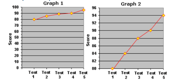
A sneaky student wants to impress his parents by showing them a graph of his performance progress on the last 5 science tests.
Which graph should he use to impress his parents?
Graph 1
Graph 2
Neither
Both


According to the pie chart, how much of a house's water usage is for showers?
26.7%
13.7%
21.7%
16.8%

What 2 pieces of evidence could be used to support the claim "As height increases so does weight"?
A 37" kid is 70lbs
See the graph
As people grow they get more cells which weigh more so their overall weight would increase as well.
A 55" kid is 150lbs

What reasoning could be provided to support the the claim "The size of the television has no correlation to the amount of time a person watches it"?
People with bigger TVs always watch more TV.
The size of the TV is unrelated to how much TV people watch.
See the graph.
The size of television probably has more to do with how much money people make and are wiling to spend on the TV or the size of their room, not how much actually watch it.

What would be the best CLAIM statement for this graph?
Water closer to the surface is able to absorb more heat energy from the sun so it is warmer than the deeper water, which cannot be reached by the sunlight.
As the water depth increases, the temperature decreases.
As water depth decreases, the temperature increases.
See the graph

What reasoning could be used to support the claim "As practice time increases, strikes also increase"?
When you practice more you get more strikeouts.
The graph shows it.
More practice increases muscle memory, strength and coordination which are skills necessary to consistently hit a strike.
You get more strikeouts with more practice.

Which graph has the X axis and Y axis labeled correctly?
A
B
It depends on the data, either could be correct.
Neither are correct.
Scale
Value used for each grid line
Range
Difference between highest & lowest values
Axis Labels
Summarize what is being tracked on each axis
Title
Summaries the information being represented
Key
Shows what the different colors represent on the graph



The cooler the temperature, the louder the crickets chirp.
The crickets cannot chirp at temperatures lower than 10 degrees C.
The warmer the temperature, the more often crickets chirp.
The temperature and the chirping of crickets are not related.


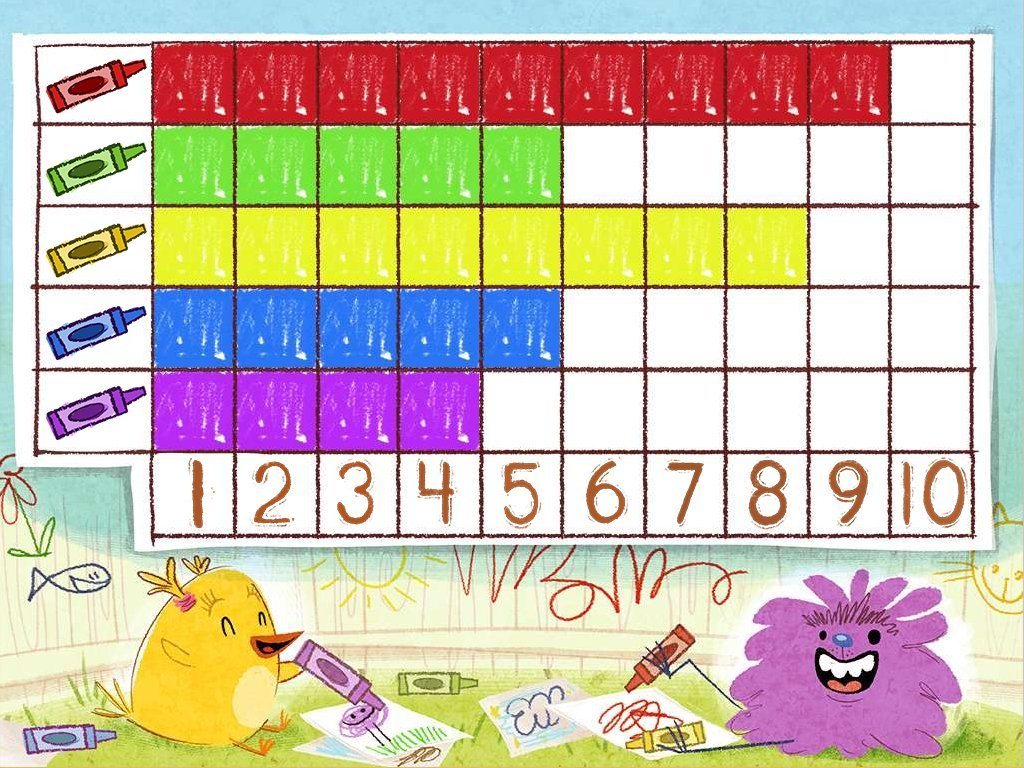
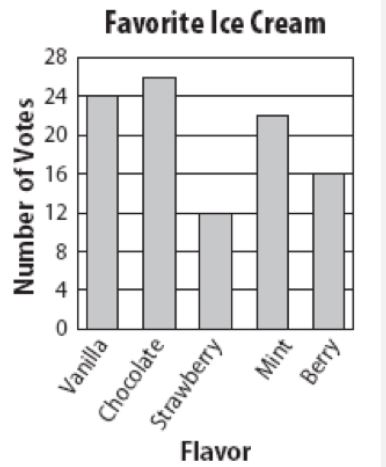


Which table represents the data in the graph?


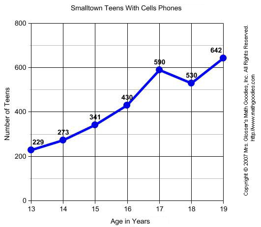
What label is along the y-axis in this graph?
Copyright 2007
Lines
Age in Years
Number of Teens


What is missing in this graph?
accuracy
label for y axis
units for y axis
title

Which of the following is missing on this graph?
title
scale
label on the y axis
your mom

Which is found on the y axis on this graph?
school year
expenditure per student
attendance
the x axis

In making a graph for this data, what would you put on the x axis?
time
number of bacteria
reproducing E. Coli
temperature
Which way does the x-axis line go on a graph?
Horizontally (left to right)
Vertically (up and down)
Diagonally (upper left to lower right)
Diagonally (Lower left to upper right)
What is the range of data on an axis called?
key
scale
interval
What is the value of each line on an axis called?
key
scale
interval
What says what colors and symbols on the graph mean?
key
interval
scale

What type of graph is this?
Bar
Circle
Line
Pictograph

How does the temperature of planets change further from the sun?
the temperature gets hotter
the temperature gets colder
What planet is the hottest in the solar system?
Venus
Mars
Earth
Jupiter
Saturn

What uses the most water in the home?
Showers
Washing Machine
Dishwasher
Toilet