
 Worksheets
Topic 1 - Scientific Thinking/ Graphical Methods
Total questions: 76
Worksheet time: 2hrs 2mins
17 years into minutes
525,600 minutes
625,000 minutes
345,000 minutes
476,000 minutes
565,900 seconds into days
3.5 days
4 days
6.5 days
6 days
What is 0.658 rounded to 1 significant figure?
0
0.66
0.7
0.658
Round 0.010229 to four significant figures
1022
1023
0.01023
0.01022
What is 78.5 rounded to one significant figure?
79
78.5
70
80
What is 7.555 rounded to two significant figures?
7.6
7.5
70
76
7.60
Round the following value to one significant figure...
8291
8000
9000
7000
8300
What is 78.5 rounded to one significant figure?
79
78.5
70
80
Round 509.96 to 4 significant figures
509.9
509.0
510.0
510
How many significant figures in 20.3400
4
6
5
2
Accuracy is
Measurements that are close together
Measurements that are close to the true value
How close measurements are to the true value
How close together measurements are to each other
25,000,000 + 26,000.02
25,026,000.02
25,026,000
26,000,000
25,000,000

3 centimeters = _____ meters
0.03
30
300
0.003

14 milligrams = ______ centigrams
1.4
14
0.014
0.14

What unit would you use to measure the temperature?
Celsius
Meters
Grams
Liters

Categorical data such as eye color and birthplace is called __________
qualitative
quantitative
Numeric and measurable types of data such as height, age, scores, cost are called __________
qualitative
quantitative
The average is called the __________
mean
median
mode
range
_________ are numbers that are far away from all other data values in the set.
Mode
Histogram
Outliers
Range
The mode score on the Algebra test was 94. Which of these interpretations must be correct?
99 was the highest score
More students received a 94 than any other score
No student scored below a 50
A score of 91 was slightly below the average
To find the average of a set of numbers, add all the numbers in the data set and divide by __________
2
largest number
smallest number
the number of items in the set

What type of correlation best describes the scatter plot shown?
positive, weak
positive, strong
negative, weak
negative, strong

What type of correlation best describes the scatterplot shown.
positive, weak
positive, strong
negative, weak
no correlation

Which type of regression model does the scatter plot appear to show?
linear
exponential
quadratic


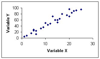


What type of correlation does this graph have?
Negative
No Correlation
positive

Which sentence describes the relationship shown on this scatter plot?
As the temperature decreases, the visitors increase.
As the temperature increases, the number of visitors increases.
As the visitors increase, the temperature decreases.
No correlation

Based on the graph, if Joe earned $400, how many hours did he work?
25 hours
35 hours
45 hours
15 hours

A connection between two or more things
Correlation
Linear
Trend Line
Scatter Plot

When the data closely resembles a line
Strong Correlation
Weak Correlation
No Correlation
Correlation

The data slightly resembles a line but is more spread out
Strong Correlation
Weak Correlation
No Correlation
Correlation
A line drawn in a scatter plot to fit most of the dots and
shows the relationship between the two sets of data
Association
Causation
Line of Best Fit
Linear Regression
A method used to find the line of best fit.
Association
Causation
Line of Best Fit
Linear Regression


If you were to conduct an experiment to determine the effect fertilizer had on a plant, which of the following should be constants? (3 correct answers)
The amount of soil in each pot
The amount of water given to each plant
The amount of fertilizer given to each plant
The amount of light each plant receives

Which of the following is an observation about this picture?
The boy has fallen off his bike.
The boy is in a lot of pain.
The boy has injuries to his knees
The boy learned his lesson about wheelies

Which of the following statements is an inference about the picture
The vase is broken.
The girls' bow is blue and purple.
The girl broke the vase.
The girl has blonde hair.
Observations like measurements are ____________ observations
quantitiative
qualitative
operational
scientific

Observation or Inference: I notice the tree by the pond has no leaves on it.
Observation
Inference
Observation or Inference: The boy fell off the branch.
Observation
Inference

Qualitative or Quantitative: There is 300 mL of liquid in this beaker.
Qualitative Observation
Quantitative Observation

Qualitative or Quantitative: I feel rough sand and a strong heat on the back of my neck.
Qualitative Observation
Quantitative Observation
This leads to that.
Observations lead to an inference
Inferences lead to an observation
Which of the following is an example of an inference:
The fish are small and seem to look the same
The water is shallow and very clear
It is a sandy and bare ecosystem
The fish are hiding from a possible predator

The scatter plots represents different types of cruise lines and the total cost.
Describe the type of association in the scatter plot.
Negative Association, as the length of the cruise increases, the cost decreases.
No Association, the length of the cruise has no effect on the total cost of the cruise.
Positive association, the length of the cruise increases, the total cost increases
The scatter plots represents different types of cruise lines and the total cost.
Are there any clusters in the data? Explain.
No, there are not any distinct or separate groups of data.
Yes, there is a group between 2 - 3 days
An (a) is a point that does not fit the overall pattern or trend of a scatter plot.
A (a) occurs in a scatter plot when there are distinct or separate groups of points

