How a Simple Redesign Doubled Teacher Usage of Inclusivity Features at Wayground
“70% increase in accommodation save rates in just one day.”
When our team shared these results in our weekly review, there was a moment of quiet reflection. In edtech, progress is often seen in small increments, so this immediate impact was quite remarkable.

But the number that really mattered to me? The 6.5 percentage point increase in weekly active teachers using accommodations. That meant thousands more students with learning differences were now receiving the personalized support they needed to succeed.
What really hit home for me as the designer here? We didn’t add a single new feature in the redesign. We simply rearranged existing elements to create a more intuitive experience.
Was there an Invisible Barrier to Inclusive Education?
First, some context: Wayground (formerly Quizizz) is an educational platform used by millions of teachers and students across U.S. K-12 schools and beyond. One of our most critical features is “Accommodations” — tools that level the playing field for students with diverse learning needs.
These accommodations include essentials like:
- Read-aloud functionality for students who process information better through audio
- Extended time options for students with processing delays
- Specialized fonts that make text more readable for students with dyslexia
- And many more
As a designer who’s spent three years at Wayground (formerly Quizizz), I’ve witnessed the transformative power of these seemingly small adjustments. When thoughtfully implemented, they can turn a struggling student’s “I can’t do this” into “I just need to approach it differently.”
Some backstory: our accommodations system was impressive on paper. It offered:
- Research-backed tools for diverse learners
- Smart recommendations based on student performance data
- Seamless import of IEP/504 tags from school systems
- Insights into what accommodations similar teachers were using
But we faced an ironic problem: while we had built powerful accessibility features for students, was the interface itself accessible for teachers to configure them?
Identifying the problem
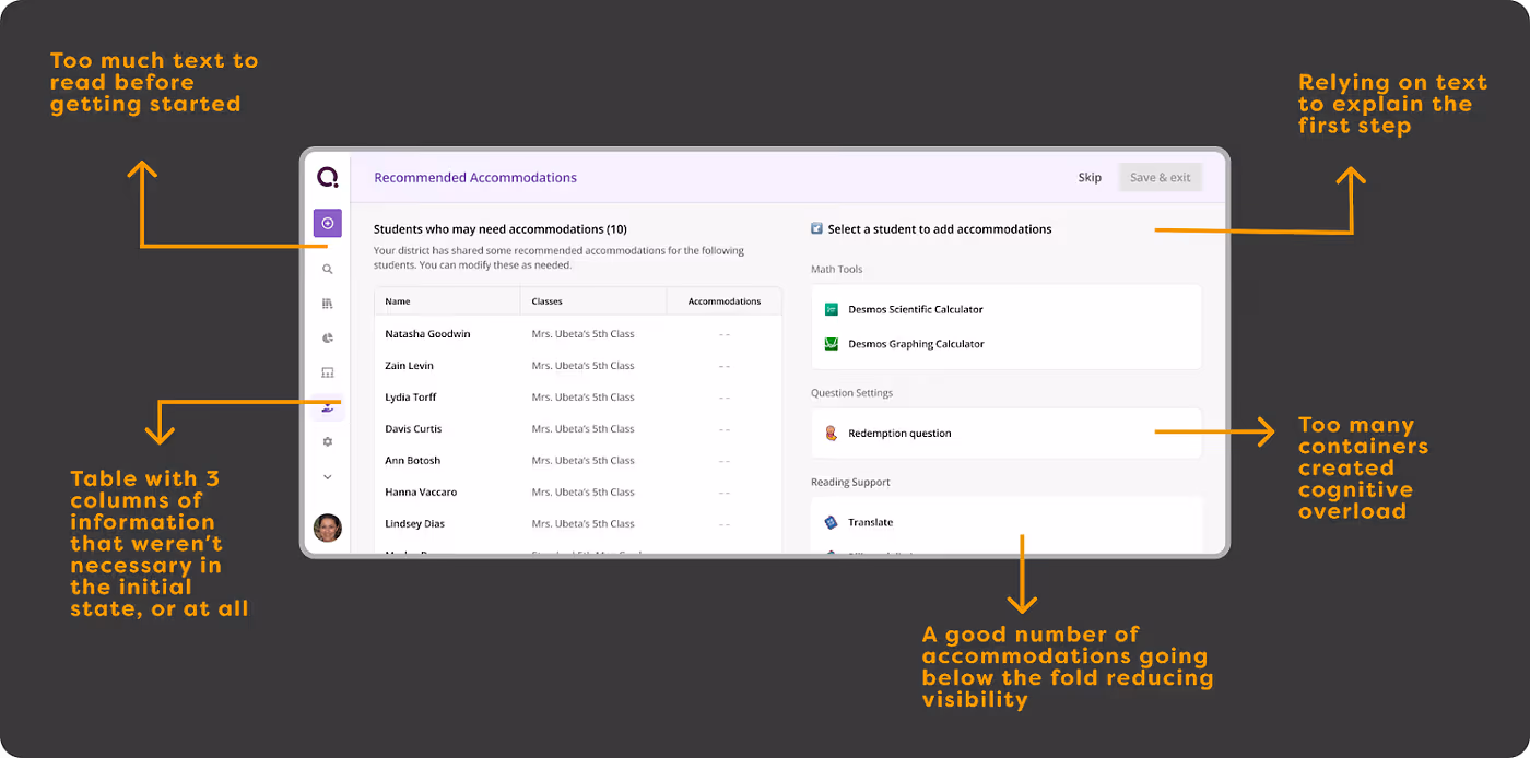
Through qualitative feedback, we knew that accommodations were a highly valued feature for our teachers. Yet, we were seeing a 97% drop-off rate from the accommodations page. Given the high intent, that number just didn’t add up — something was clearly broken.
To understand this better, we got on several calls with teachers to unpack their motivations and pain points. Here’s what we found:
- Time is a luxury teachers don’t have. On average, it took about 7 minutes to set up accommodations per teacher. For someone with just an hour of planning time a day, that’s a big ask. Our current flow simply wasn’t efficient enough. We had to ask: What could we simplify or automate?
- First impressions matter. Teachers landing on the accommodations page often assumed it would take a lot of time to understand and implement. One teacher shared, “This looks like something I’d have to schedule time for.” The interface gave off a sense of complexity.
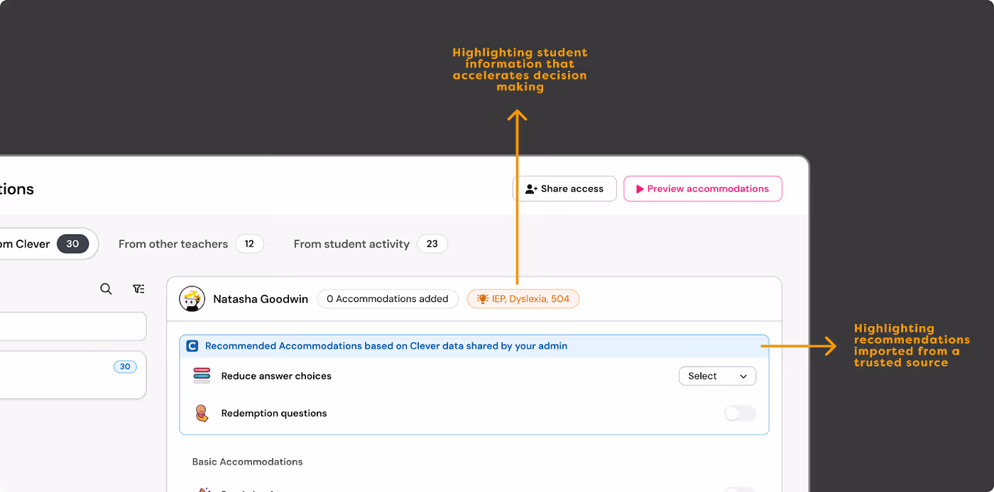
- Lack of visibility into the student experience. While a preview feature existed, it didn’t surface effectively. Our data confirmed this: teachers who saw how accommodations appeared on the student side were 7% more likely to save their setup. We had underestimated just how powerful that perspective could be.
- Unclear scope of available accommodations. Some teachers mentioned they couldn’t view the full list of accommodation options upfront. One asked, “Could we get an overview somewhere before diving in?” A simple preview or summary list could help them understand what’s possible — before they commit time to the setup process.
Our approach: The Simplicity Solution
Once we pinpointed what was going wrong, the path forward became clear: we needed to make this essential tool more accessible to the educators who rely on it. We needed a redesign!
The redesign was guided by three evidence-based UX principles:
1. Minimize cognitive load
Drawing from Nielsen’s “aesthetic and minimalist design” heuristic, we cut down on visual clutter by focusing only on what teachers really needed to see. A cleaner layout created a more approachable feel, enabling teachers to dive in immediately and take the first action.
2. Provide clear value propositions with progressive disclosure
Inspired by Miller’s information chunking theory, we restructured how information was presented. Teachers now see concise benefit statements upfront, with details revealed only when relevant or requested — reducing information overload.
3. Reduce friction in task completion
The core task is saving an accommodation for a student. Following the path of least resistance principle, we redesigned the starting point so teachers could begin with minimal effort. In the old experience, it took at least four clicks to save an accommodation. Could this be optimized?
The redesign walkthrough!
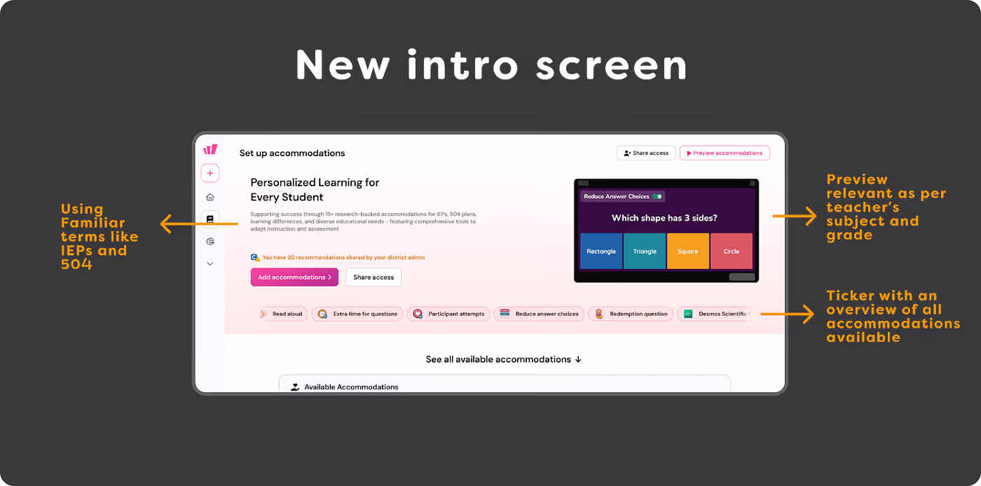
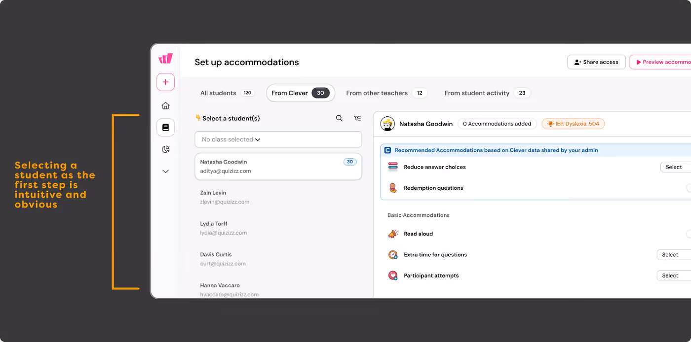
We began with the intro screen, the first touchpoint for new users. Was it driving conversion from non-users to users?
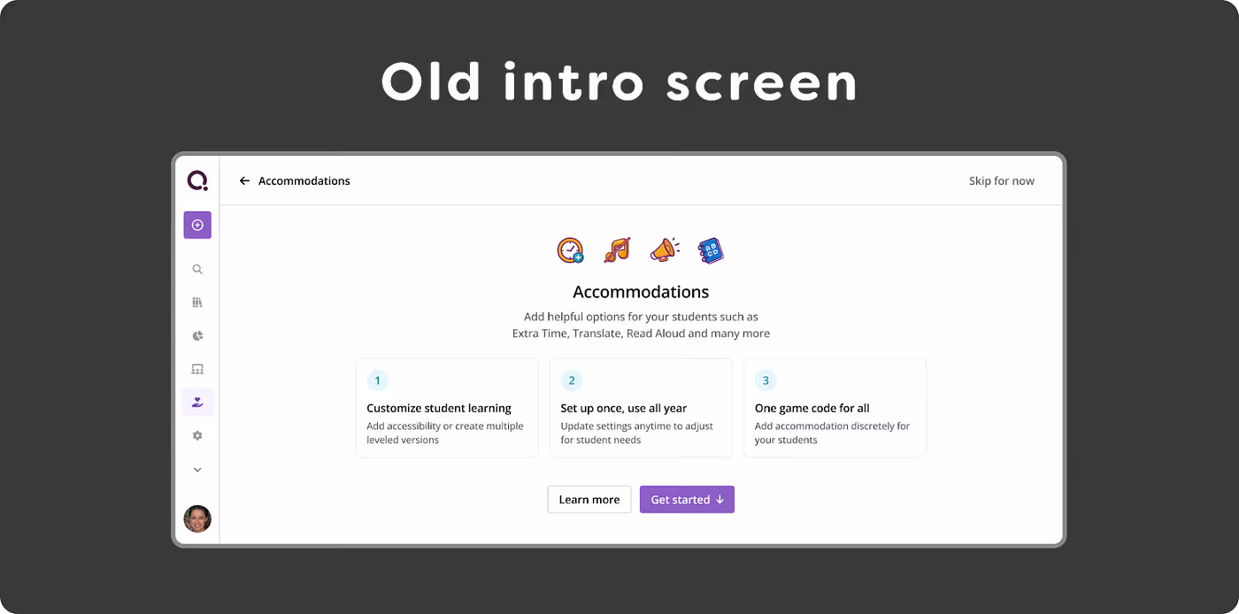
Based on our study, we aimed to address key questions a first-time user might have: What are Accommodations on Wayground (formerly Quizizz)? How do they benefit my students? Which accommodations can I use?
- We increased visibility of previews — highlighting the “AHA” moment when teachers saw accommodation benefits from the student’s perspective. This insight came from both qualitative feedback and supporting data. Previews were personalized by subject and grade.
- We used familiar terms like IEPs (Individualized Education Programs) and 504 Plans, reflecting teachers’ daily language to build trust and relevance.
- We provided a clear overview of all available accommodations for teachers.

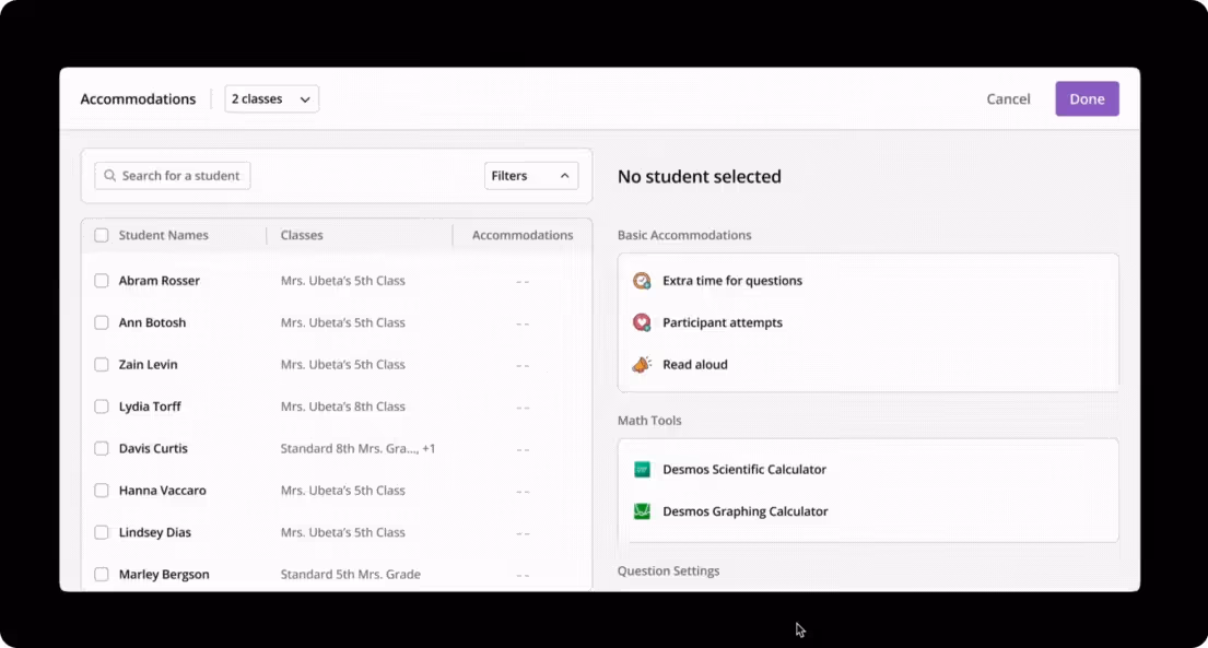
The setup page — was it guiding teachers to take the first step easily?
Both qualitative and quantitative feedback said otherwise. The initial reaction was, “This looks time-consuming; I’ll come back later.” To tackle the 97% drop-off here, we made simple, user-driven changes based on our findings:
- Reduced visible options on the initial screen by 60%.
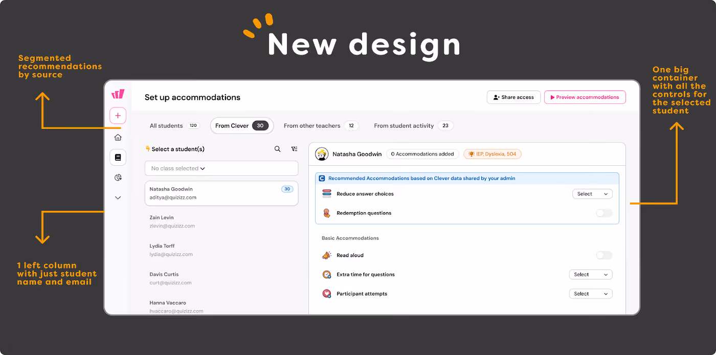
- Established an information hierarchy by highlighting key benefits and hiding secondary or repetitive details beneath layers.
- Eased the “too many things competing for attention” feeling by creating a visual hierarchy that directs focus to primary actions.
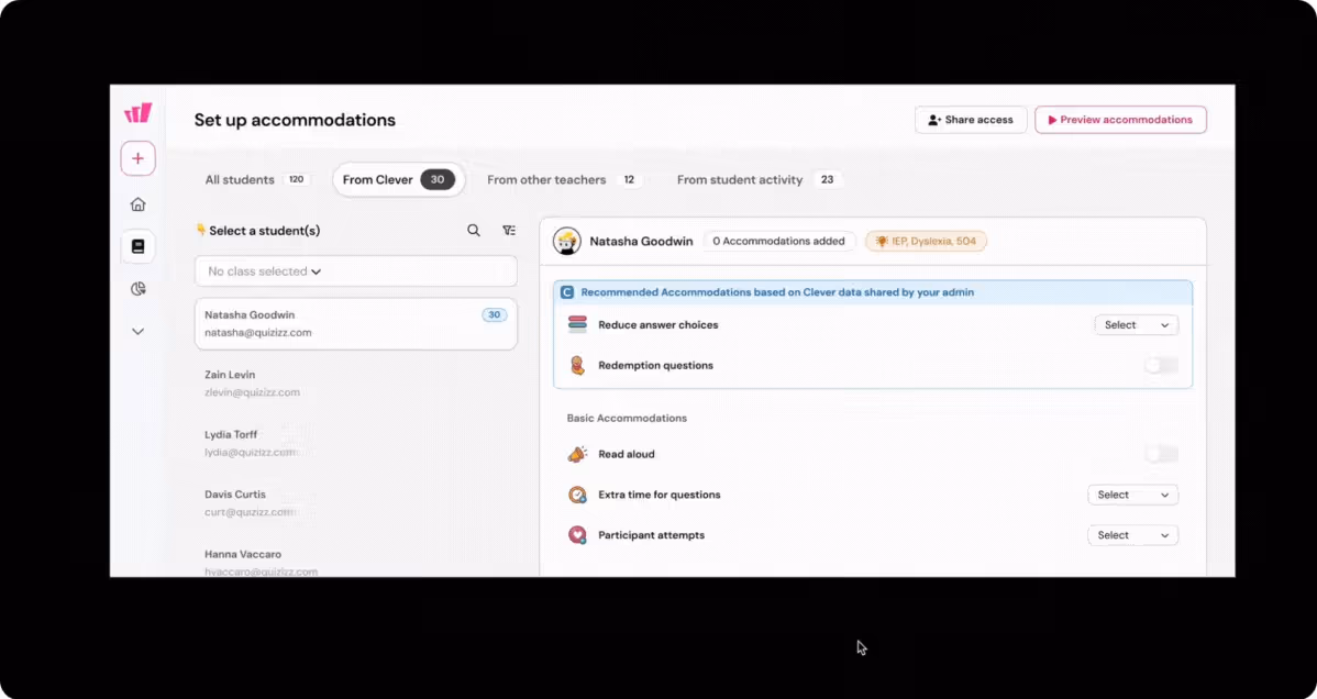
And finally, we focused on improving the task completion experience — teachers were spending an average of 7 minutes to set up accommodations. With their tight schedules, we wanted to make this process easier and faster for them
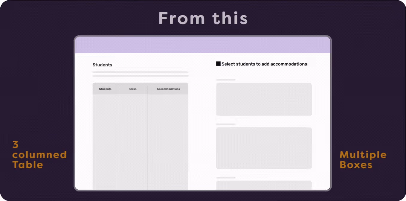
- The old flow had separate ‘read’ and ‘edit’ states when setting up accommodations for a student, requiring four steps before a teacher could add accommodations for one student. Doing this for multiple students quickly became a chore. We removed these states and now save changes instantly as settings are added.
Old experience:
New experience:

Small changes lead to big impact
We were set to release — and the very day we did, we saw immediate and significant impact.
- 100% increase in accommodation save rates within 48 hours of launch
- Setup time dropped from 7 minutes to 2 — giving teachers back precious time.
- 6.5 percentage point increase in weekly active teachers using accommodations
- Positive qualitative feedback from teachers previously intimidated by the feature
Behind these metrics are real classrooms where more students are now receiving the support they need. Each accommodation activated represents a student who might otherwise struggle to demonstrate their true capabilities.
The Bigger Lesson
This project reinforced a fundamental truth about design that’s easy to forget: Sometimes the most impactful solution need not require us to add something new — instead it’s by making what already exists more accessible.
By simply reducing cognitive load and creating clear pathways to action, we removed barriers between teachers and a feature that could meaningfully improve their students’ learning experiences.
And that’s what inclusive design is truly about — not just accommodating differences, but eliminating the obstacles that make those differences matter in the first place. This was a true team effort — made possible by the dedication of our product team, designers, engineers, data analysts, and UX researchers. And, of course, a special shoutout to our Chief Morale Officer, Rebel 🐶 in the image below.