How We Made Quizizz's Best Tools Impossible to Ignore

From one long list of quizzes to a “swim lane” buffet of assessments, interactive videos, lessons, flashcards, and comprehension passages

TL;DR
We stopped treating every resource like a 20‑question quiz, reshaped Search to match how teachers actually browse, and watched usage of our “hidden” formats pop 🚀 — all without hurting the quizzes that pay the bills.
“I had no idea Quizizz could do that.” — Almost everybody
Quizizz evolved from a quiz platform to a complete teaching toolkit. But we had a problem — nobody knew about these amazing features! Like gems, some of our best features had to be dug out. Talk about failing our own pop quiz on communication.

1. When One-Size-Fits-None: The Assessment-Optimized UI Problem
Quizizz evolved to offer distinct formats:
- Assessments — Quizzes for review with variety of questions (our bread & butter),
- Lessons — Multimedia presentation slides with embedded questions
- Interactive Videos (IV) — Videos embedded with questions
- Flashcards—Bite-sized vocabulary drills
- Comprehension Passages — Text excerpts with questions
The problem? Everything was optimised for assessments. Teachers couldn’t properly evaluate other formats. Let’s narrow it down to IVs and Lessons for now:

Now let us look at our search results page to see how a teacher can hover over a list item to see the preview.
#1 for Assessments, #2 for Interactive Videos (IV)


Note how the teacher has to hover over each list item to get a glimpse of the video. Painful, isn’t it?
2. The Video Discovery Problem: Designing for How Teachers Actually Look for Content
Picture this: a video about photosynthesis pauses at a key moment — pop! — a question appears asking what students just learned. That’s an interactive video! It keeps students engaged because they know questions could appear any second. As one teacher put it, “It’s like having a hall monitor for attention spans!”
Our research revealed a fundamental mismatch in how teachers evaluate different content types:

“I need to see the video first — that’s non-negotiable. If I show something inappropriate to my 3rd graders, that’s a parent phone call I don’t want to make!” — Elementary teacher
This led to our breakthrough insight: Design for how teachers actually behave, not for product consistency. Think about it: if Tinder had been designed for the “use case” of dating, it might have been a grid view of profile cards with CTAs. But that’s not how speed dating works in real life! Similarly, teachers weren’t browsing videos in lists — they were using YouTube-style interfaces.
So we redesigned our video search (see below for before and after) to feel more like the video platforms teachers already knew and loved. The results? Teachers found videos more easily and usage increased dramatically. At a later point of time, this principle rippled into lessons/presentations too, adding visual previews for teachers to do their essential “vibe check” before selecting content.
3. The Discovery Challenge: From Experiments to Interlacing
Even with better video search, we faced a new problem: if teachers only used the assessments, how would they discover our other formats?
We tried several recommendation approaches like below:

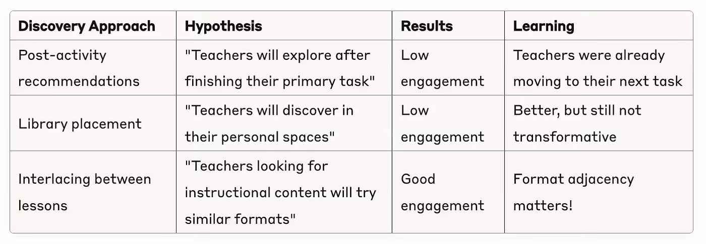
In the third approach above, we tried “interlacing” interactive video cards between lesson results — like sneaking veggies into a kid’s chocolate snacks!
We tested two specific approaches:


4. The Bold Move: Breaking the List with Swim Lanes
Interlacing helped, but what we needed was escape velocity. The above approaches were like hot air balloons — they gave us lift, but not the rocket fuel we needed to truly break orbit. It was time to rethink our search results page — the holy grail of our product.
Instead of a single long list of mostly assessments, we created “swim lanes” — horizontal sections for each resource type, showing the top results for each.


Not everyone loved the idea at first:
“How can this be easier than a simple list?”
“Why are we hiding assessments behind a tab?!”
“Is this the final design?”
We released to 20% and waited.
5. The Results: Swim Lanes for the Win!
A few weeks later, the data told an exciting story: teachers were breaking out of their assessment-only habits! We saw non-quiz format usage nearly double, with more teachers trying interactive videos and presentations each week. The diversity of classroom activities improved as educators discovered our full teaching toolkit.
6. The Surprising “Lessons” We Learned
Some of these experiments revealed powerful insights that could apply to any product:
- Match Preview to Commitment
Video thumbnails > quiz list for videos; slide preview > title list for lessons. Design for how users actually evaluate content, not for consistency across your product. - Reduce Choice to Increase Clicks
One solid IV suggestion beat five hover-to-reveal options (Section #3). Similarly, our swim lanes showed fewer results per format than the original endless list. In both cases, when we reduced options, engagement went up. The paradox of choice is real — curated results build confidence in decision-making. - Breadth Builds Trust
Showing variety up front reduces second-guessing (“Maybe Quizizz does have what I need”). Swim lanes exposed our full toolbox, making teachers more likely to find what they needed. - Two Paths Serve Different Users
Power users who know exactly what they want go straight to format-specific tabs. Explorers who are browsing discover new formats through the lanes. This dual-path approach serves both user types. - Behavior-Driven Flexibility
Lanes reorder by the need: type “photosynthesis lesson” → Lesson lane floats to the top; search “states of matter vocabulary” → Flashcards lane comes up first. We can also adjust based on seasonality, teacher history, or trending topics. This flexibility lets us subtly influence teacher decisions and reduce choice paralysis. The system feels like it’s reading their minds, removing dilemmas by prioritizing what they’re most likely to need. - Micro-Rollouts Calm Fears
20% flight + real metrics turns “That’ll never work” into “Ship it.” Starting with a small percentage of users helped us prove the concept and overcome internal resistance.
7. Conclusion: Be Brave Enough to Break Things
Sometimes the biggest improvements come from challenging your fundamental assumptions. Breaking away from our traditional list view — which had worked for years — was scary but necessary.
By designing for how teachers actually behave, not just how we wanted them to, we transformed Quizizz from “just a quiz platform” to a complete teaching toolkit that teachers actually use.
It truly takes a village to raise a search results page. This transformation wouldn’t have been possible without our past and present designers, product team, engineers, data analysts, and researchers who all contributed their expertise and were willing to take risks together. Every insight, prototype, line of code (real & vibe), and data point played a crucial role in this journey.